Style combination · Contrasts
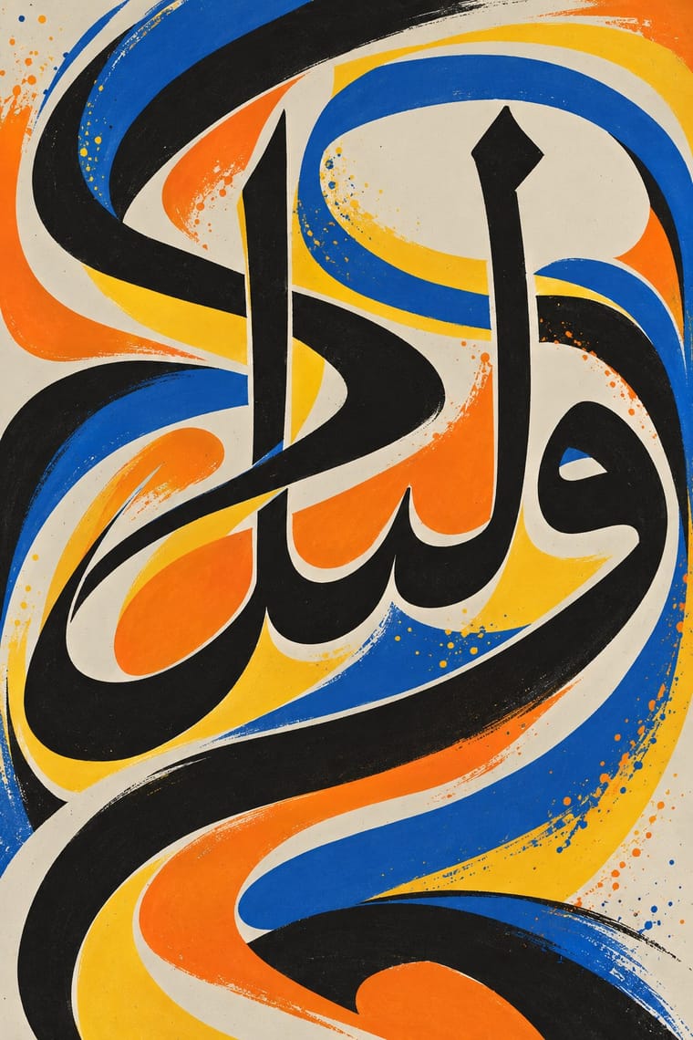
Arabic Calligraffiti × International Typographic Style
A neutral grotesque on a modular grid is the opposite of one sweeping Arabic gesture; put a small Swiss caption block against a calligraffiti wall for a sharp bilingual identity.
Mix them and make something Arabic Calligraffiti International Typographic Style
01
What each style brings
Each part of the design comes from the style with the stronger say in it, and each style gives at least two.
Arabic Calligraffiti International Typographic Style
- Type from Arabic Calligraffiti
- Colour from International Typographic Style
- Form from Arabic Calligraffiti
- Composition from International Typographic Style
-
Arabic Calligraffiti avoids modular grid: this is where the two pull against each other, which is the point of the contrast.
- Surface from Arabic Calligraffiti
02
The type
Open fonts standing in for each style’s own type, which is often hand-drawn or commercial.
Display · Arabic Calligraffiti
New
Rakkas, standing in for Freehand Arabic script sprayed or painted rather than written with a reed pen, after calligraphy but without its rules or a uniform hand (as the Museum für Islamische Kunst describes eL Seed's work)
Text · International Typographic Style
A post-war refinement of the New Typography in which the mathematical grid, objective photography and neo-grotesque sans-serifs were used to communicate with clarity and neutrality. Taught at the Basel and Zurich schools, it became the default language of international corporate and institutional communication.
Inter; International Typographic Style used Akzidenz-Grotesk and Helvetica
03
The colours
The ground and leading colours come from International Typographic Style, with a counter-accent from Arabic Calligraffiti. The ink reads on the ground at 4.5:1 or more.
Arabic Calligraffiti International Typographic Style
-
#f2f0e9ground · 36% -
#111111ink · 14% -
#e1251baccent · 18% -
#f07f1eaccent · 14% -
#1f4e9caccent · 10% -
#f6c32baccent · 8%
As CSS
:root {
  --ground: #f2f0e9;
  --ink: #111111;
  --accent-1: #e1251b;
  --accent-2: #f07f1e;
  --accent-3: #1f4e9c;
  --accent-4: #f6c32b;
  --font-display: "Rakkas", cursive;
  --font-text: "Inter", sans-serif;
}
Use it with care
Arabic Calligraffiti: Many works carry Qur'anic verses, the names of God or devotional sayings, written on mosques and in religious communities: never use such text as texture or put it on floors, footwear or throwaway items, and have every Arabic or Persian word read and approved by a fluent reader before it is painted or printed. The style stretches and interlaces letters, so put a Qur'anic verse or a name of God into it only when a skilled Arabic-script writer composes it and the mosque or community approves it, as at the Jara Mosque; never digitally warp, crop or mirror existing sacred text. Never fill a design with invented pseudo-Arabic, which image models readily produce; do not ask an image model for eL Seed's Liquid Alphabet or any named writer's hand, and never present a generated wall as their work. The best-known walls rest on the consent of governors, imams, priests and residents, so get the owner's permission (spraying without it is a crime in most places), work with the people of the place, and commission and credit Arabic-script writers rather than faking the script for a brand.
04
The two styles

05
More combinations
With Arabic Calligraffiti
- Contemporary Arabic & Dual-Script Type Design Pairs well · Set names, dates and captions in a dual-script type family beside a calligraffiti wall, so the gesture stays the image and the information stays legible.
- Islamic Geometric & Calligraphic Tradition Pairs well · Run a strict geometric band or tiling behind freely written letters, as Zepha sets Arabic script among geometric shapes, so the piece answers its classical source.
- Baybayin Revival Graphics Pairs well · Kabuay applies calligraphy and graffiti methods to baybayin; borrow calligraffiti's large painted gesture for murals, but keep each glyph legible and correctly spelled.
- Syrian Revolution Graphics (Kafranbel Banners & Poster Collectives) Pairs well · Scale a brushed slogan from the poster up to a wall with calligraffiti's architectural sweep, keeping the words short and checked by a fluent reader.
With International Typographic Style
- Art Nouveau Contrasts · Ornamental curves against an orthogonal grid make a strong deliberate tension.
- Brutalist Web Design Pairs well · Strip the grid to raw HTML defaults to get a rawer, contemporary take on Swiss honesty.
- Psychedelic Poster Contrasts · Its exact opposite on legibility; borrow one swirling element to break a too-cold Swiss layout.
- Japanese Postwar Modernism Pairs well · Add Japanese restraint and emblematic colour fields to the grid for warmth without losing order.
- American Traditional Tattoo Flash Contrasts · Rational grid and sans-serif against sentimental, hand-lettered emblems: one flash motif on a Swiss layout makes a sharp contrast.
- Graffiti & Hip-Hop Graphics Contrasts · Put a single tag or throw-up over a strict Swiss grid to stage the clash between institutional order and a street voice.
- Pop Art Graphics Contrasts · Set one loud appropriated Pop image inside a strict grid with a neutral grotesque so the irony reads as deliberate rather than chaotic.
- Italian Painted Film Poster (Rome Studios) Contrasts · Grid, restraint and photographic objectivity are the opposite of a crowded painted montage.