Style combination · Pairs well
Amazigh Sign System × Contemporary Arabic
Matched Arabic–Latin families such as Qandus and Awal add Tifinagh as a third script. Give Tifinagh the same weight and baseline as its partners on trilingual signs.
Mix them and make something Amazigh Sign System Contemporary Arabic
01
What each style brings
Each part of the design comes from the style with the stronger say in it, and each style gives at least two.
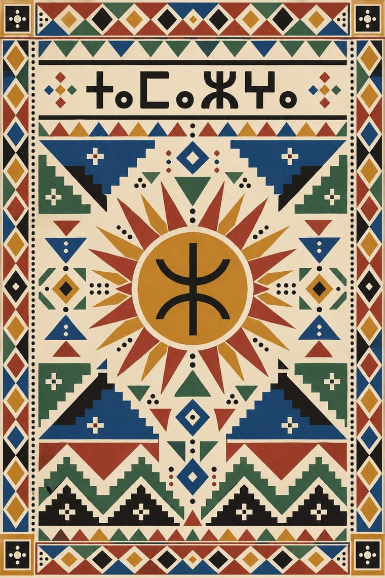
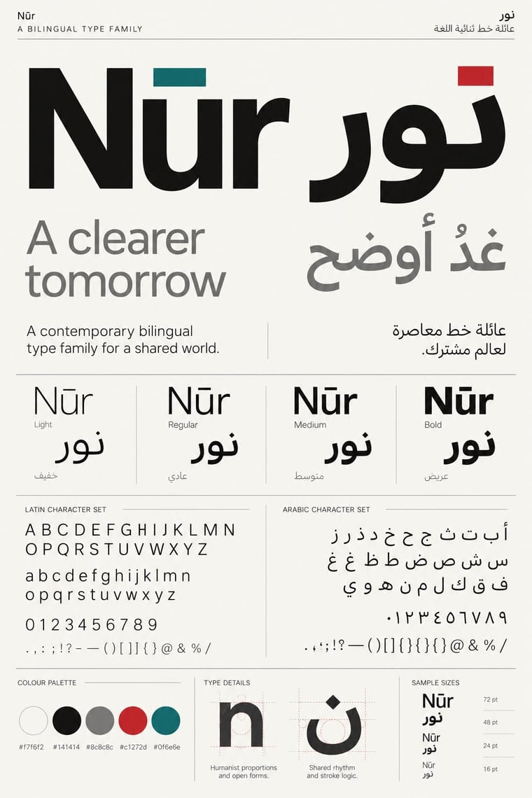
Amazigh Sign System & Tifinagh Contemporary Arabic & Dual-Script Type Design
- Type from Contemporary Arabic
- Colour from Amazigh Sign System
- Form from Amazigh Sign System
- Composition from Contemporary Arabic
- Surface from Amazigh Sign System
02
The type
Open fonts standing in for each style’s own type, which is often hand-drawn or commercial.
Display · Contemporary Arabic
Civic
Fira Sans, standing in for Frutiger Arabic and Helvetica Arabic (Nadine Chahine)
Text · Amazigh Sign System
The visual language shared by Amazigh communities from the Rif, Atlas and Kabylie to the Aurès and the Tuareg Sahara. Women weave a common repertoire of geometric signs (lozenges, chevrons, triangles, crosses, zigzags, dots) into rugs and capes, paint it on pottery and tattoo it on the face, and smiths, many of them Jewish in Morocco and Kabylie until the 1950s, cast and engrave it in silver. Its script, Tifinagh, descends from Libyco-Berber writing. Since 2003 Neo-Tifinagh has marked Amazigh identity on Moroccan public signs; the red yaz ⵣ has stood on the Amazigh flag since 1970.
Jost; Amazigh Sign System used IRCAM standard Neo-Tifinagh and Noto Sans Tifinagh
03
The colours
The ground and leading colours come from Amazigh Sign System, with a counter-accent from Contemporary Arabic. The ink reads on the ground at 4.5:1 or more.
Amazigh Sign System & Tifinagh Contemporary Arabic & Dual-Script Type Design
-
#efe7d6ground · 36% -
#1b1916ink · 14% -
#c48a2caccent · 18% -
#c1272daccent · 14% -
#0f6e6eaccent · 10% -
#1f4f8faccent · 8%
As CSS
:root {
  --ground: #efe7d6;
  --ink: #1b1916;
  --accent-1: #c48a2c;
  --accent-2: #c1272d;
  --accent-3: #0f6e6e;
  --accent-4: #1f4f8f;
  --font-display: "Fira Sans", sans-serif;
  --font-text: "Jost", sans-serif;
}
Use it with care
Amazigh Sign System & Tifinagh: These signs belong to living Amazigh communities, and much of the repertoire is women's work: weavers, potters, and older women whose facial tattoos belong to a fading practice that many Moroccans now regard as sacrilegious. Signs and jewellery are worn for protection against the evil eye and to mark region, tribe and life stage, so do not merge regional motifs into a generic 'Berber' pattern or put tattoo signs on throwaway goods. The best-known photographs of Kabyle women's facial tattoos, Marc Garanger's portraits of 1960, were made by a French army conscript for compulsory identity cards, with the women made to unveil; do not use them as neutral pattern sources, and prefer documentation made with the women's consent or by Amazigh researchers. The choice of script is itself political: IRCAM's 2003 adoption of Neo-Tifinagh was a palace compromise that many Amazigh activists criticised, most Moroccan speakers and Kabyle writers use Latin script, and Tuareg Tifinagh is its own living variant. Have any Tifinagh text spelled and checked by a speaker and set it in a proper Unicode font rather than inventing pseudo-letters. The yaz and the Amazigh flag are political emblems of the Amazigh identity movement, and the flag was banned in Algeria during the 2019 Hirak. Much historical Moroccan and Kabyle 'Berber' silver was made by Jewish silversmiths, and Tuareg pieces by Tuareg smiths: credit them accurately, commission and credit Amazigh weavers, potters and type designers, and do not sell printed 'Berber' rug pattern as hand-woven.
Contemporary Arabic & Dual-Script Type Design: Arabic must be set with correct contextual shaping and right-to-left direction; disconnected or reversed letters are a common and offensive error. Have every Arabic word checked by a fluent reader, avoid setting Qur'anic verses or the names of God and the Prophet as decorative texture, and commission or credit Arabic type designers rather than deriving Arabic glyphs from a Latin font.
04
The two styles
05
More combinations
With Amazigh Sign System
- Adinkra & Kente Symbol Systems Contrasts · Both are sign systems that carry meaning, but adinkra stamps named symbols into a ruled grid of squares. Amazigh weavers and tattooists vary the size and spacing of their signs by hand within bands and lattices, and share them with a script.
- Bògòlanfini Mud Cloth Contrasts · Bògòlan leaves pale signs in a dark mud-painted ground, while Beni Ouarain rugs and Kabyle pots draw dark signs on cream wool or white slip. Black-ground Amazigh weavings, such as Middle Atlas tent bands and the akhnif cape, are the exception; there, tell the two apart by the stepped, woven construction rather than by the ground.
- Islamic Geometric & Calligraphic Tradition Contrasts · Islamic pattern builds compass-drawn star tilings and calligraphic hierarchy; Amazigh signs are freehand, stroke-built and non-calligraphic. Choose one logic for a Maghrebi brief instead of blending them into generic 'Moroccan' pattern.
- Baybayin Revival Graphics Contrasts · Both turn a revived script into an identity sign, but Tifinagh is carried by a woven and painted geometric repertoire and appears on public signage, while baybayin is a looped brush or pen hand used almost only as emblem; do not swap one script's look for the other's.
- Diné (Navajo) Weaving Design Contrasts · Both are rug-weaving traditions of stepped geometry, made largely by women. Amazigh weavers share a repertoire of protective signs with pots, silver and tattoos, and let a lattice drift or break off by hand, while a Diné rug is one field planned and mirrored around a centre, in a grammar and palette set by period and region. Do not merge them into a generic 'tribal rug'.
With Contemporary Arabic
- Corporate Identity Modernism Pairs well · Roll a matched Arabic–Latin family through a standards manual so both scripts carry the identity with equal authority.
- Urdu Katib Lithography Contrasts · The katib's stacked Nastaʿlīq cascade is everything a screen-optimised Arabic sans gives up; quote it where warmth and history matter more than efficiency.
- International Typographic Style Pairs well · Use a strict, mirrored grid and a neutral sans so Arabic and Latin columns align in rhythm and weight.
- Machine-Age Simplified Arabic Type Pairs well · Its digital successor: dual-script families pair Arabic with a matched Latin while keeping the firm baseline, even colour and reduced stacking that simplification made familiar. 29LT's UA Neo (2013), detached revivals of Khattar's Unified Arabic, is where the two touch.
- Ottoman Tughra & Dîvânî Chancery Calligraphy Pairs well · Keep hand-drawn calligraphy for the mark itself and set the running text in a well-made contemporary Arabic typeface with a matched Latin companion, instead of imitating Dîvânî in body text.
- Post-Binary Typography (Bye Bye Binary and Inclusive French Type) Contrasts · Both extend a typeface's character set for a language need, but dual-script design matches two scripts for neutral, institutional legibility, while post-binary type invents new characters within one script and keeps them visible as a political statement.
- Early Turkish Republican Graphic Design Contrasts · Turkey replaced Arabic letters with Latin in 1928, and Emin Barın carried calligraphic habits into the new script; contemporary dual-script type design keeps both scripts and matches them as equals. Compare the two to show replacement against coexistence.
- Bulaq (Amiriyya) Naskh Book Printing Pairs well · Set long reading text in an Amiri-style calligraphic Naskh and use a low-contrast contemporary Arabic sans for headings, captions and screens, so each register does one job.