Style combination · Pairs well
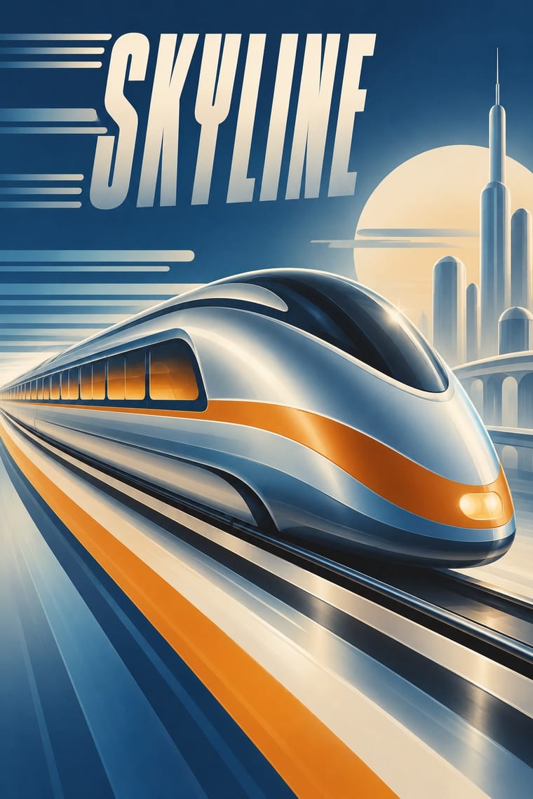
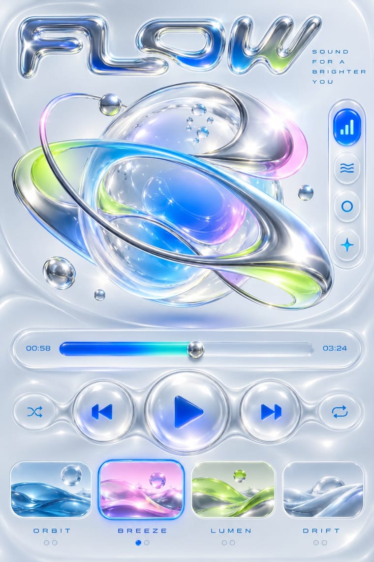
Streamline Moderne × Y2K Futurism
Y2K chrome and gloss rhyme with Streamline airbrush; blend them for a retro-futurist tech brand.
01
What each style brings
Each part of the design comes from the style with the stronger say in it, and each style gives at least two.
Streamline Moderne Y2K Futurism
- Type from Y2K Futurism
- Colour from Streamline Moderne
- Form from Streamline Moderne
- Composition from Streamline Moderne
- Surface from Y2K Futurism
02
The type
Open fonts standing in for each style’s own type, which is often hand-drawn or commercial.
Text · Streamline Moderne
The late, chiefly American phase of Art Deco, in which aerodynamic science became a visual language for a Depression-era culture hungry for progress. Industrial designers and illustrators wrapped trains, radios, diners and posters in teardrop curves, horizontal speed lines, rounded corners and airbrushed chrome, selling the 'World of Tomorrow' at the 1939 New York World's Fair.
Jost; Streamline Moderne used Huxley Vertical and Agency Gothic
03
The colours
The ground and leading colours come from Streamline Moderne, with a counter-accent from Y2K Futurism. The ink reads on the ground at 4.5:1 or more.
Streamline Moderne Y2K Futurism
-
#e8dcc2ground · 36% -
#2b2b2bink · 14% -
#d9822baccent · 18% -
#1f6fffaccent · 14% -
#1f3a5faccent · 10% -
#0095b6accent · 8%
As CSS
:root {
  --ground: #e8dcc2;
  --ink: #2b2b2b;
  --accent-1: #d9822b;
  --accent-2: #1f6fff;
  --accent-3: #1f3a5f;
  --accent-4: #0095b6;
  --font-display: "Michroma", sans-serif;
  --font-text: "Jost", sans-serif;
}
04
The two styles
05
More combinations
With Streamline Moderne
- Googie & Atomic Age Pairs well · Googie is Streamline's post-war heir; combine their curves and speed lines for retro diner, travel or automotive branding.
- WPA Silkscreen Posters Pairs well · Both are 1930s American; mix WPA flat silkscreen colour with Streamline speed lines for Depression-era Americana.
- Ma & Wabi-sabi Aesthetics Contrasts · Weathered imperfection against polished chrome: use the foil to question a shiny narrative of progress.
- Italian Futurism Pairs well · Combine Futurist lines of force with Streamline speed lines to give transport or tech brands a kinetic retro-futurist voice.
- Art Deco Pairs well · Fold Streamline speed lines and rounded corners into a Deco layout to move from stepped geometry toward aerodynamic sweep.
With Y2K Futurism
- Googie & Atomic Age Pairs well · Add Googie starbursts and orbit lines to Y2K chrome for a retro-futurism that spans mid-century and millennial optimism.
- Ma & Wabi-sabi Aesthetics Contrasts · Weathered, imperfect materiality is the exact opposite of frictionless chrome; one raw texture can ground a too-slick render.
- Frutiger Aero Pairs well · Soften chrome into glass and swap cosmic voids for skies and water to move from Y2K toward Aero's eco-optimism.
- Acid Graphics / New Ugly Pairs well · Acid graphics inherits its chrome and liquid metal; push Y2K renders toward distortion and spiky type for a harder contemporary edge.
- Techno-Futurist Graphics Pairs well · Add Y2K chrome and translucent plastics to techno-futurist pictograms for a late-1990s consumer-electronics look.
- Media-Player & Desktop Skins (Winamp-Era Skinning) Contrasts · Y2K's light candy grounds, translucency and blobs in marketing and print against the skins' dense dark-metal consoles; borrow one translucent blob to lift a heavy chrome player toward the millennium mood.
- Rave & Acid House Graphics Pairs well · Share chrome, gradients and techno optimism; combine them for a late-1990s club-to-millennium look.
- Global Village Coffeehouse Contrasts · CARI notes the pendulum swung from GVC back to minimalist, tech and clean looks such as Y2K; set chrome and translucent blue against terracotta and scratchboard marks to show that turn in one spread.