Style combination · Pairs well
Techno-Futurist Graphics × Y2K Futurism
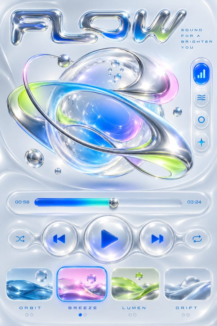
Add Y2K chrome and translucent plastics to techno-futurist pictograms for a late-1990s consumer-electronics look.
Mix them and make something Techno-Futurist Graphics Y2K Futurism
01
What each style brings
Each part of the design comes from the style with the stronger say in it, and each style gives at least two.
Techno-Futurist Graphics Y2K Futurism
- Type from Y2K Futurism
- Colour from Techno-Futurist Graphics
- Form from Techno-Futurist Graphics
- Composition from Techno-Futurist Graphics
- Surface from Y2K Futurism
02
The type
Open fonts standing in for each style’s own type, which is often hand-drawn or commercial.
Text · Techno-Futurist Graphics
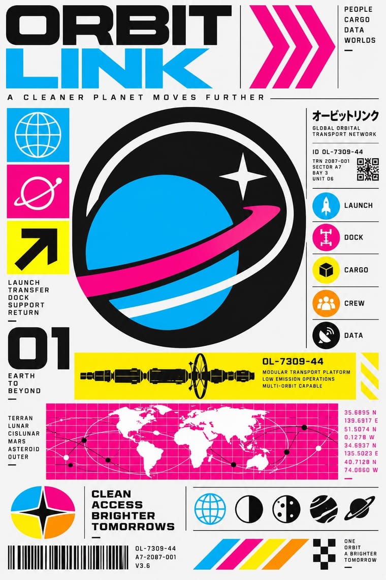
Electronic-music and video-game graphics of the late 1980s and 1990s that turned corporate modernism into a sci-fi consumer fantasy. Grids, Helvetica, pictograms, barcodes, warning labels and invented corporate logos were recombined with katakana, manga cuteness and early 3D, producing slick, flat, information-saturated surfaces that both celebrated and satirised technology and branding.
Inter; Techno-Futurist Graphics used Helvetica and Eurostile / Microgramma
03
The colours
The ground and leading colours come from Techno-Futurist Graphics, with a counter-accent from Y2K Futurism. The ink reads on the ground at 4.5:1 or more.
Techno-Futurist Graphics Y2K Futurism
-
#f5f5f5ground · 36% -
#111111ink · 14% -
#00aeefaccent · 18% -
#1f6fffaccent · 14% -
#ec008caccent · 10% -
#0095b6accent · 8%
As CSS
:root {
  --ground: #f5f5f5;
  --ink: #111111;
  --accent-1: #00aeef;
  --accent-2: #1f6fff;
  --accent-3: #ec008c;
  --accent-4: #0095b6;
  --font-display: "Michroma", sans-serif;
  --font-text: "Inter", sans-serif;
}
04
The two styles
05
More combinations
With Techno-Futurist Graphics
- Kawaii Design Pairs well · Drop a flat, cute mascot into a dense corporate-parody layout to soften its satire, as 1990s Tokyo studios did.
- Corporate Identity Modernism Contrasts · Use the sincere corporate identity manual as the straight version that techno-futurism parodies.
- Arts & Crafts Movement Contrasts · Handmade, nature-derived craft is its anti-matter; a single hand-drawn element in a techno layout reads as a glitch of humanity.
- Fantasy User Interface (FUI) & Sci-Fi HUD Pairs well · Techno-futurism's invented corporate logos, pictograms and warning labels make convincing in-world branding for FUI screens. Use them on boot screens and on the agencies and corporations whose software the characters run.
- Acid Graphics / New Ugly Pairs well · Borrow The Designers Republic's corporate-parody logos and tiny technical captions to give acid layouts a systematic backbone.
- Superflat Pairs well · groovisions, whose Chappie figure showed in the 2001 Superflat exhibition, links the two; set Superflat characters inside techno-futurist logos, grids and katakana captions for a slicker, more corporate parody.
- Afrofuturist Design Pairs well · Combine interface graphics and chrome with ancestral pattern so technology feels owned rather than imported.
With Y2K Futurism
- Googie & Atomic Age Pairs well · Add Googie starbursts and orbit lines to Y2K chrome for a retro-futurism that spans mid-century and millennial optimism.
- Ma & Wabi-sabi Aesthetics Contrasts · Weathered, imperfect materiality is the exact opposite of frictionless chrome; one raw texture can ground a too-slick render.
- Frutiger Aero Pairs well · Soften chrome into glass and swap cosmic voids for skies and water to move from Y2K toward Aero's eco-optimism.
- Acid Graphics / New Ugly Pairs well · Acid graphics inherits its chrome and liquid metal; push Y2K renders toward distortion and spiky type for a harder contemporary edge.
- Media-Player & Desktop Skins (Winamp-Era Skinning) Contrasts · Y2K's light candy grounds, translucency and blobs in marketing and print against the skins' dense dark-metal consoles; borrow one translucent blob to lift a heavy chrome player toward the millennium mood.
- Rave & Acid House Graphics Pairs well · Share chrome, gradients and techno optimism; combine them for a late-1990s club-to-millennium look.
- Global Village Coffeehouse Contrasts · CARI notes the pendulum swung from GVC back to minimalist, tech and clean looks such as Y2K; set chrome and translucent blue against terracotta and scratchboard marks to show that turn in one spread.
- Claymorphism & Soft 3D Contrasts · Both float rounded 3D renders on pale grounds, but Y2K is chrome, liquid metal and translucent candy plastic sold as the future; keep claymorphism opaque, soft and cute, with satin or matte surfaces and at most a soft highlight, and borrow chrome only for a retro-tech joke.