Style combination · Pairs well
Italian Futurism × Streamline Moderne
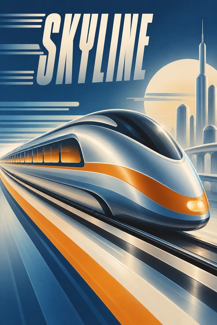
Combine Futurist lines of force with Streamline speed lines to give transport or tech brands a kinetic retro-futurist voice.
Mix them and make something Italian Futurism Streamline Moderne
01
What each style brings
Each part of the design comes from the style with the stronger say in it, and each style gives at least two.
Italian Futurism Streamline Moderne
- Type from Italian Futurism
- Colour from Streamline Moderne
- Form from Streamline Moderne
- Composition from Italian Futurism
- Surface from Streamline Moderne
02
The type
Open fonts standing in for each style’s own type, which is often hand-drawn or commercial.
Display · Italian Futurism
Circuit
Alfa Slab One, standing in for Mixed jobbing grotesques, Egyptians and Didones from the printer's case
Text · Streamline Moderne
The late, chiefly American phase of Art Deco, in which aerodynamic science became a visual language for a Depression-era culture hungry for progress. Industrial designers and illustrators wrapped trains, radios, diners and posters in teardrop curves, horizontal speed lines, rounded corners and airbrushed chrome, selling the 'World of Tomorrow' at the 1939 New York World's Fair.
Jost; Streamline Moderne used Huxley Vertical and Agency Gothic
03
The colours
The ground and leading colours come from Streamline Moderne, with a counter-accent from Italian Futurism. The ink reads on the ground at 4.5:1 or more.
Italian Futurism Streamline Moderne
-
#e8dcc2ground · 36% -
#2b2b2bink · 14% -
#d9822baccent · 18% -
#f2b705accent · 14% -
#1f3a5faccent · 10% -
#d22b1faccent · 8%
As CSS
:root {
  --ground: #e8dcc2;
  --ink: #2b2b2b;
  --accent-1: #d9822b;
  --accent-2: #f2b705;
  --accent-3: #1f3a5f;
  --accent-4: #d22b1f;
  --font-display: "Alfa Slab One", serif;
  --font-text: "Jost", sans-serif;
}
04
The two styles
05
More combinations
With Italian Futurism
- International Typographic Style Contrasts · Drop one explosive words-in-freedom burst into a calm Swiss grid; the surrounding order makes the noise legible.
- Arts & Crafts Movement Contrasts · Arts & Crafts handwork is everything Futurism wanted to burn; juxtapose them to stage machine against hand.
- Russian Constructivism Pairs well · Discipline Futurist dynamism with Constructivist bars and photomontage so a diagonal layout still delivers one clear message.
- Italian Liberty Poster (Ricordi and the Stile Liberty Affiche) Pairs well · A later movement that Liberty poster simplification only anticipates: harder geometry and dynamic silhouettes, kept here within lithographic colour.
- Vorticism & BLAST Typography Contrasts · Its parent scatters words in freedom along curves and diagonals; Vorticism keeps the same shouting sizes on level, stacked lines, so decide whether the page should explode or stand like a wall.
With Streamline Moderne
- Googie & Atomic Age Pairs well · Googie is Streamline's post-war heir; combine their curves and speed lines for retro diner, travel or automotive branding.
- WPA Silkscreen Posters Pairs well · Both are 1930s American; mix WPA flat silkscreen colour with Streamline speed lines for Depression-era Americana.
- Ma & Wabi-sabi Aesthetics Contrasts · Weathered imperfection against polished chrome: use the foil to question a shiny narrative of progress.
- Y2K Futurism Pairs well · Y2K chrome and gloss rhyme with Streamline airbrush; blend them for a retro-futurist tech brand.
- Art Deco Pairs well · Fold Streamline speed lines and rounded corners into a Deco layout to move from stepped geometry toward aerodynamic sweep.