Style combination · Pairs well
Frutiger Aero × Y2K Futurism
Soften chrome into glass and swap cosmic voids for skies and water to move from Y2K toward Aero's eco-optimism.
01
What each style brings
Each part of the design comes from the style with the stronger say in it, and each style gives at least two.
Frutiger Aero Y2K Futurism
- Type from Frutiger Aero
- Colour from Frutiger Aero
- Form from Y2K Futurism
- Composition from Y2K Futurism
- Surface from Frutiger Aero
02
The type
Open fonts standing in for each style’s own type, which is often hand-drawn or commercial.
Text · Y2K Futurism
The optimistic, chrome-plated vision of the future that surrounded the turn of the millennium, spread by consumer electronics, music videos, games, fashion and dot-com branding. Translucent candy-coloured plastics, liquid-metal and bubble 3D renders, lens flares, wide techno sans-serifs and icy silver-and-blue palettes sold the digital age as sleek, fluid and weightless, until the dot-com crash dimmed it.
IBM Plex Mono; Y2K Futurism used Eurostile Extended and Microgramma
03
The colours
The ground and leading colours come from Frutiger Aero, with a counter-accent from Y2K Futurism. The ink reads on the ground at 4.5:1 or more.
Frutiger Aero Y2K Futurism
-
#f5fbffground · 36% -
#0b5fa5ink · 14% -
#22c3c9accent · 18% -
#1f6fffaccent · 14% -
#4fb3e8accent · 10% -
#b4f02eaccent · 8%
As CSS
:root {
  --ground: #f5fbff;
  --ink: #0b5fa5;
  --accent-1: #22c3c9;
  --accent-2: #1f6fff;
  --accent-3: #4fb3e8;
  --accent-4: #b4f02e;
  --font-display: "Fira Sans", sans-serif;
  --font-text: "IBM Plex Mono", monospace;
}
04
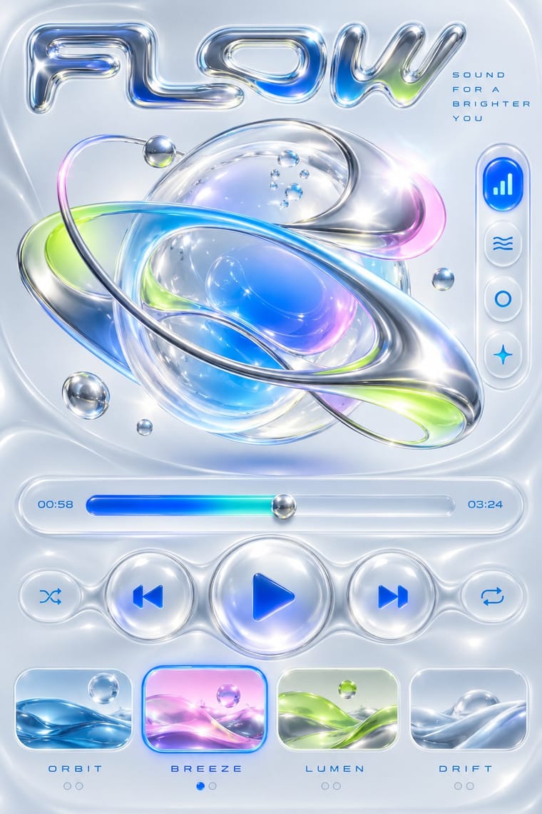
The two styles
05
More combinations
With Frutiger Aero
- Vaporwave Pairs well · Both trade on mid-2000s tech nostalgia; mix Aero bubbles and skies with vaporwave's pastel 3D for retro-internet campaigns.
- Brutalist Web Design Contrasts · Raw HTML against bubbly gloss is a sharp foil for ironic or nostalgic web projects.
- Glassmorphism Pairs well · Glassmorphism is its flatter heir; reintroduce a touch of Aero gloss and nature photography to warm up frosted-glass UI.
- Flat Design Contrasts · Flat design was the reaction that ended it; toggle gloss against flat to signal ‘then and now’ in retro tech work.
- Forum Signature Art (Sig & C4D Render Graphics) Contrasts · The same years' glossy, light and airy interface look against the sig's dark, smudged depth.
- Skeuomorphic UI Pairs well · Share gloss and depth; combine Aero's glass and nature with skeuomorphic objects for convincing 2000s-nostalgia interfaces.
- Punk & DIY Zine Contrasts · Glossy optimism is everything punk rejects; one torn xerox fragment on an aero gradient reads as instant sabotage.
- Solarpunk Contrasts · Both pair green nature with optimistic technology, but Aero renders it as glossy stock photography, bubbles and glass for a product; choose solarpunk for painted, handmade, lived-in places and shared infrastructure.
With Y2K Futurism
- Googie & Atomic Age Pairs well · Add Googie starbursts and orbit lines to Y2K chrome for a retro-futurism that spans mid-century and millennial optimism.
- Ma & Wabi-sabi Aesthetics Contrasts · Weathered, imperfect materiality is the exact opposite of frictionless chrome; one raw texture can ground a too-slick render.
- Acid Graphics / New Ugly Pairs well · Acid graphics inherits its chrome and liquid metal; push Y2K renders toward distortion and spiky type for a harder contemporary edge.
- Techno-Futurist Graphics Pairs well · Add Y2K chrome and translucent plastics to techno-futurist pictograms for a late-1990s consumer-electronics look.
- Media-Player & Desktop Skins (Winamp-Era Skinning) Contrasts · Y2K's light candy grounds, translucency and blobs in marketing and print against the skins' dense dark-metal consoles; borrow one translucent blob to lift a heavy chrome player toward the millennium mood.
- Rave & Acid House Graphics Pairs well · Share chrome, gradients and techno optimism; combine them for a late-1990s club-to-millennium look.
- Global Village Coffeehouse Contrasts · CARI notes the pendulum swung from GVC back to minimalist, tech and clean looks such as Y2K; set chrome and translucent blue against terracotta and scratchboard marks to show that turn in one spread.
- Claymorphism & Soft 3D Contrasts · Both float rounded 3D renders on pale grounds, but Y2K is chrome, liquid metal and translucent candy plastic sold as the future; keep claymorphism opaque, soft and cute, with satin or matte surfaces and at most a soft highlight, and borrow chrome only for a retro-tech joke.