Style combination · Pairs well
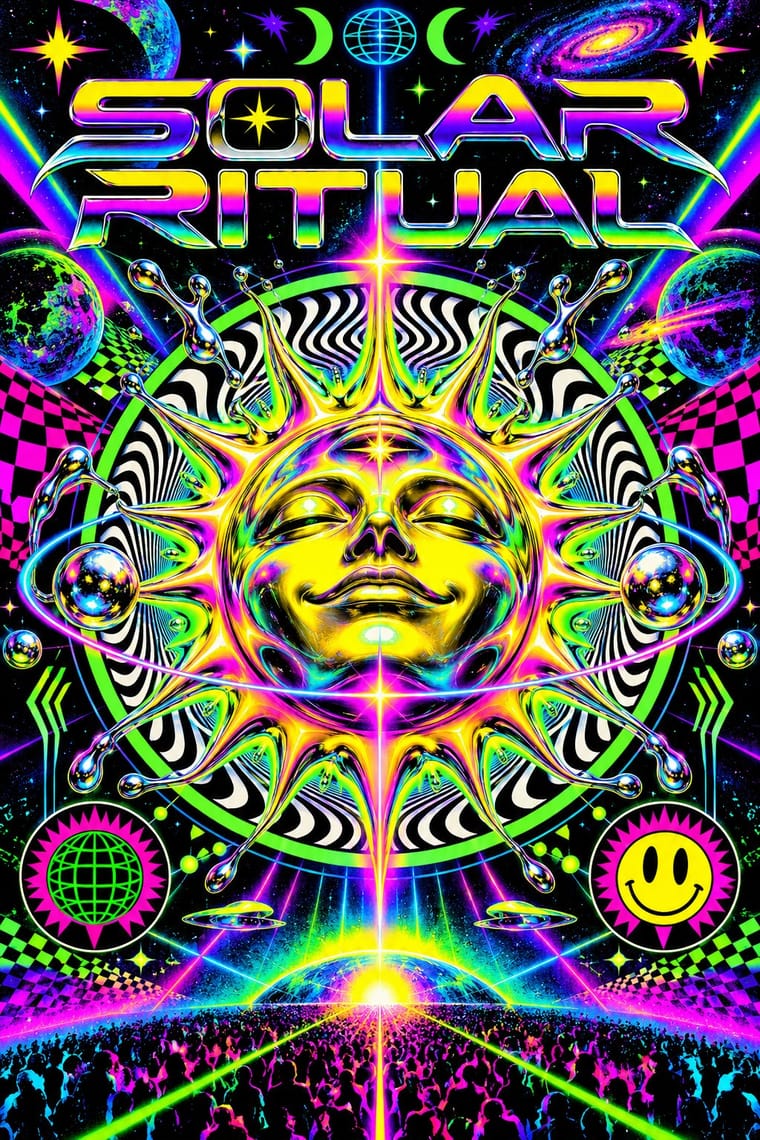
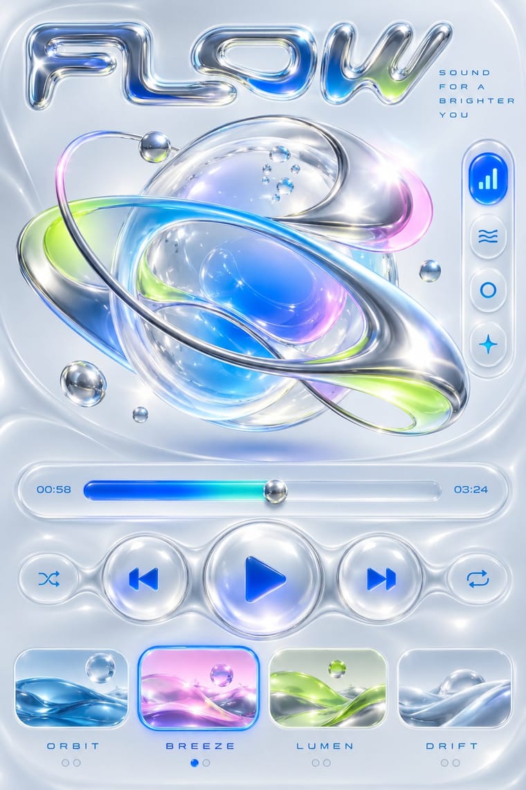
Rave × Y2K Futurism
Share chrome, gradients and techno optimism; combine them for a late-1990s club-to-millennium look.
01
What each style brings
Each part of the design comes from the style with the stronger say in it, and each style gives at least two.
Rave & Acid House Graphics Y2K Futurism
- Type from Y2K Futurism
- Colour from Rave
- Form from Rave
- Composition from Rave
- Surface from Y2K Futurism
02
The type
Open fonts standing in for each style’s own type, which is often hand-drawn or commercial.
Text · Rave
The pocket-sized promotional art of acid house, rave and early techno, handed out in record shops and car parks to advertise all-night parties. Fronts revived psychedelia through smileys, trippy eyes, fractals and airbrushed fantasy landscapes; backs crammed DJ line-ups, sound-system credits and info-line numbers. Early desktop software, chrome 3D logotypes and fluorescent or metallic inks gave it a synthetic, hedonistic glow.
IBM Plex Mono; Rave used Eurostile Extended and OCR-A
03
The colours
The ground and leading colours come from Rave, with a counter-accent from Y2K Futurism. The ink reads on the ground at 4.5:1 or more.
Rave & Acid House Graphics Y2K Futurism
-
#0a0a0aground · 36% -
#ffe600ink · 14% -
#ff00b4accent · 18% -
#1f6fffaccent · 14% -
#00e5ffaccent · 10% -
#b4f02eaccent · 8%
As CSS
:root {
  --ground: #0a0a0a;
  --ink: #ffe600;
  --accent-1: #ff00b4;
  --accent-2: #1f6fff;
  --accent-3: #00e5ff;
  --accent-4: #b4f02e;
  --font-display: "Michroma", sans-serif;
  --font-text: "IBM Plex Mono", monospace;
}
04
The two styles
05
More combinations
With Rave
- Acid Graphics / New Ugly Pairs well · Acid graphics is rave's digital heir; reuse the chrome logotype and fluorescent-on-black palette with contemporary 3D tools.
- Corporate Identity Modernism Contrasts · Rave flyers parodied corporate logos; set a sober corporate mark beside its flyer pastiche to make the détournement legible.
- Dark Tech Minimalism Contrasts · Both live on black, but one whispers and one shouts; borrow a single neon gradient to wake up a restrained dark interface.
- Brazilian Baile Funk Digital Flyer Contrasts · Both advertise a club night, but the rave flyer uses a central emblem and dense printed text, while this idiom puts a portrait group in front of one giant title.
- Demoscene Graphics (Cracktros, Demos & Text-Mode Art) Pairs well · Rave flyers and scene logos share chrome lettering on black and the same 1990s tracker-and-techno culture; animate a flyer's line-up as a demo-style scroller for party visuals.
- Psychedelic Poster Pairs well · Carry the vibrating fluorescent palette into rave-style chrome and airbrush to signal the 1960s-to-1990s lineage on purpose.
- Synthwave / Outrun Pairs well · Both put chrome logotypes and airbrushed fantasy horizons in neon on black; borrow the flyer's crammed line-up reverse to turn a synthwave key visual into a working event poster.
- Gabber and Hardcore Graphics (Rotterdam and Thunderdome) Pairs well · Shares the flyer's info-heavy format and logotype culture, but hardens psychedelia into horror and menace and avoids the gradient and iridescence.
With Y2K Futurism
- Googie & Atomic Age Pairs well · Add Googie starbursts and orbit lines to Y2K chrome for a retro-futurism that spans mid-century and millennial optimism.
- Ma & Wabi-sabi Aesthetics Contrasts · Weathered, imperfect materiality is the exact opposite of frictionless chrome; one raw texture can ground a too-slick render.
- Frutiger Aero Pairs well · Soften chrome into glass and swap cosmic voids for skies and water to move from Y2K toward Aero's eco-optimism.
- Acid Graphics / New Ugly Pairs well · Acid graphics inherits its chrome and liquid metal; push Y2K renders toward distortion and spiky type for a harder contemporary edge.
- Techno-Futurist Graphics Pairs well · Add Y2K chrome and translucent plastics to techno-futurist pictograms for a late-1990s consumer-electronics look.
- Media-Player & Desktop Skins (Winamp-Era Skinning) Contrasts · Y2K's light candy grounds, translucency and blobs in marketing and print against the skins' dense dark-metal consoles; borrow one translucent blob to lift a heavy chrome player toward the millennium mood.
- Global Village Coffeehouse Contrasts · CARI notes the pendulum swung from GVC back to minimalist, tech and clean looks such as Y2K; set chrome and translucent blue against terracotta and scratchboard marks to show that turn in one spread.
- Claymorphism & Soft 3D Contrasts · Both float rounded 3D renders on pale grounds, but Y2K is chrome, liquid metal and translucent candy plastic sold as the future; keep claymorphism opaque, soft and cute, with satin or matte surfaces and at most a soft highlight, and borrow chrome only for a retro-tech joke.