Style combination · Contrasts
Swiss Punk × Renaissance Book Typography
Classical centred book typography is the calm foil to New Wave's stepped, letterspaced lines.
Mix them and make something Swiss Punk Renaissance Book Typography
01
What each style brings
Each part of the design comes from the style with the stronger say in it, and each style gives at least two.
Swiss Punk / New Wave Typography Renaissance Book Typography
- Type from Swiss Punk
-
Renaissance Book Typography avoids grotesque & neo-grotesque: this is where the two pull against each other, which is the point of the contrast.
- Colour from Swiss Punk
- Form from Swiss Punk
- Composition from Renaissance Book Typography
-
Swiss Punk avoids classical text block and central symmetry: this is where the two pull against each other, which is the point of the contrast.
- Surface from Renaissance Book Typography
02
The type
Open fonts standing in for each style’s own type, which is often hand-drawn or commercial.
Text · Renaissance Book Typography
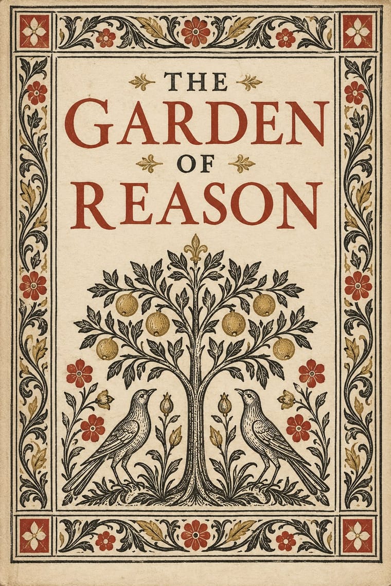
The printed book as shaped by humanist Italy and France: roman and italic types modelled on humanist handwriting, a single justified text block set in harmonious proportions within generous margins, and woodcut initials, borders and printer's devices as the only ornament. Its page became the default model of the Western book for the next five centuries.
EB Garamond; Renaissance Book Typography used Jenson's roman and Griffo's roman
03
The colours
The ground and leading colours come from Swiss Punk, with a counter-accent from Renaissance Book Typography. The ink reads on the ground at 4.5:1 or more.
Swiss Punk / New Wave Typography Renaissance Book Typography
-
#f4f1eaground · 36% -
#111111ink · 14% -
#e6007eaccent · 18% -
#b23a2baccent · 14% -
#f7d117accent · 10% -
#b8973faccent · 8%
As CSS
:root {
  --ground: #f4f1ea;
  --ink: #111111;
  --accent-1: #e6007e;
  --accent-2: #b23a2b;
  --accent-3: #f7d117;
  --accent-4: #b8973f;
  --font-display: "Inter Tight", sans-serif;
  --font-text: "EB Garamond", serif;
}
04
The two styles
05
More combinations
With Swiss Punk
- Memphis Design Pairs well · Add Memphis squiggles and pastel triangles to New Wave's floating bars for the full 1980s postmodern palette.
- Neo-Swiss Revival Pairs well · Borrow New Wave's letterspacing and stepped lines to make a contemporary neo-Swiss grid feel alive.
- British Style Press (The Face, i-D and Arena) Pairs well · Both took modernism apart in the 1980s: add Weingart's layered, tracked grotesques to a Brody spread for a more Swiss, less drawn result.
- Post-Punk Record Sleeve (Stiff, Factory, 4AD) Contrasts · Both took modernism apart in the same years: Weingart's Basel school layered type and broke the grid, while post-punk sleeves quoted one borrowed image and withheld the type; choose between layering and withholding.
- Dutch Expressive Postmodernism (Studio Dumbar & Hard Werken) Contrasts · Basel's rebellion kept the grotesque and the halftone in an abstract grid; the Dutch one brings in figures, props, painting and photographed depth. Choose Basel New Wave for abstract type textures and the Dutch idiom when the poster needs objects and a stage.
With Renaissance Book Typography
- Minimalist Graphic Design Pairs well · Keep classical page proportions and a humanist serif but strip the ornament to give minimal layouts warmth and authority.
- Arts & Crafts Movement Pairs well · Morris's Kelmscott Press revived Jenson's roman; pair a Renaissance text block with dense Arts & Crafts borders for a private-press feel.
- Gothic Blackletter & Fraktur Tradition Contrasts · The humanist roman was drawn against the gothic textura it replaced in Italy: open, round and light where blackletter is dense, broken and dark.
- Islamic Geometric & Calligraphic Tradition Pairs well · Use arabesque or moresque fleurons, as Venetian and Lyon printers did, to frame a classical text block.
- International Typographic Style Contrasts · Centred, justified and serifed versus asymmetric, ragged and sans: the clearest foil for deciding which order a page should follow.
- Ethiopian Ge'ez Manuscript & Haräg Illumination Pairs well · Ge'ez manuscripts share the logic of black text with red rubrics; borrow the principle of red for names and headings, not the sacred imagery.
- Gothic Book of Hours (Illuminated Devotional Book) Contrasts · Compare a hand-painted devotional opening with a printed humanist text page: the former gives pictures and illuminated margins a larger organising role, while the latter centres roman type and measured margins.
- Emblem Book (Motto, Picture & Epigram) Contrasts · Its parent shares the humanist roman and italic, the paper and the woodcut, but lets text carry the page with ornament at its edges; the emblem book puts a framed picture at the centre of every page and makes it part of the argument.