Style combination · Pairs well
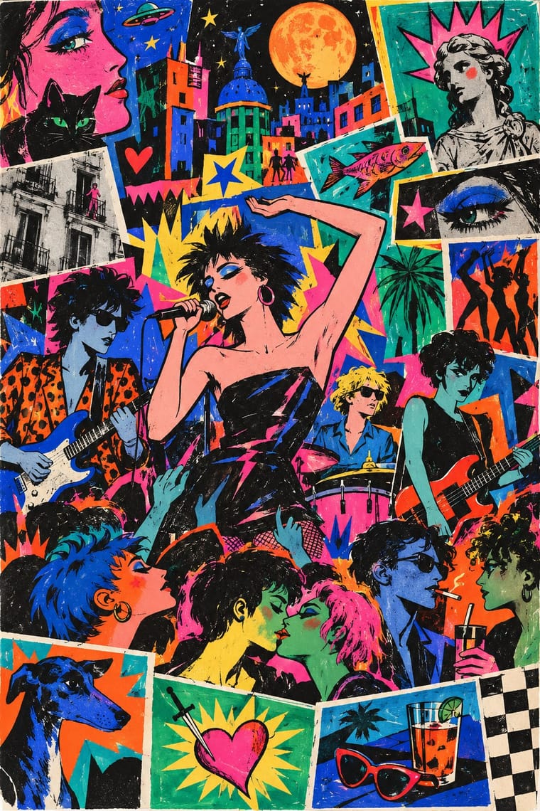
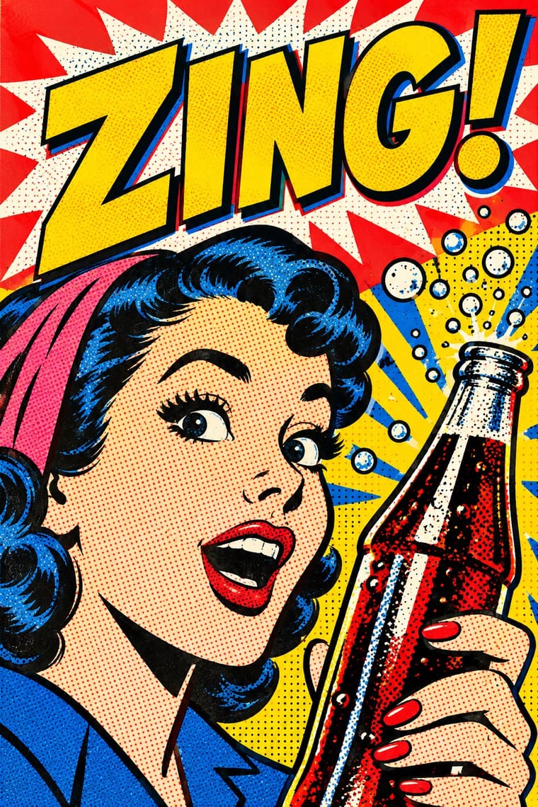
La Movida Madrileña Graphics × Pop Art Graphics
Ceesepe worked after British Pop (Peter Blake, Peter Phillips), Zulueta's posters are plainly Pop, and Mariné modelled Madrid Me Mata on Warhol's Interview: borrow Pop's enlarged, flattened images and visible print for a Movida layout, and keep the drawn people and the Spanish camp.
Mix them and make something La Movida Madrileña Graphics Pop Art Graphics
01
What each style brings
Each part of the design comes from the style with the stronger say in it, and each style gives at least two.
La Movida Madrileña Graphics Pop Art Graphics
- Type from La Movida Madrileña Graphics
- Colour from Pop Art Graphics
- Form from La Movida Madrileña Graphics
- Composition from La Movida Madrileña Graphics
- Surface from Pop Art Graphics
02
The type
Open fonts standing in for each style’s own type, which is often hand-drawn or commercial.
Display · La Movida Madrileña Graphics
Wow
Londrina Solid, standing in for Free hand lettering over cut-out images ('collage de rotulación libre') in Madrid Me Mata, whose masthead moves from a special display lettering to a plain sans ('de una tipografía especial a otra funcional de palo') and whose 'MMM' works as a zigzag of lightning
Text · Pop Art Graphics
Pop turned the commercial imagery of post-war consumer culture (comics, packaging, celebrity photographs and advertising) into both its subject and its method. Images are appropriated, enlarged, flattened and repeated; colour is bright and unmodulated; and the printing process itself, from Ben-Day dots to off-register silkscreen, is left visible as a sign of mass production.
Archivo; Pop Art Graphics used Comic-book hand lettering and Franklin Gothic
03
The colours
The ground and leading colours come from Pop Art Graphics, with a counter-accent from La Movida Madrileña Graphics. The ink reads on the ground at 4.5:1 or more.
La Movida Madrileña Graphics Pop Art Graphics
-
#fbf8f0ground · 36% -
#111111ink · 14% -
#ffd400accent · 18% -
#ff5a1faccent · 14% -
#e10600accent · 10% -
#ff2e88accent · 8%
As CSS
:root {
  --ground: #fbf8f0;
  --ink: #111111;
  --accent-1: #ffd400;
  --accent-2: #ff5a1f;
  --accent-3: #e10600;
  --accent-4: #ff2e88;
  --font-display: "Londrina Solid", cursive;
  --font-text: "Archivo", sans-serif;
}
Use it with care
La Movida Madrileña Graphics: The Movida's makers are recent and partly living (Mariné and García-Alix still work; Ceesepe died in 2018, Ouka Leele in 2022), and their works and the Madrid Me Mata, Madriz and La Luna mastheads are under copyright: draw your own figures, titles and mastheads in the shared idiom, do not ask an image model for Ceesepe's, Costus's, Ouka Leele's or Mariné's hand, and do not present a generated piece as a period work. Its Virgins and saints, at once camp and devotional, were painted by insiders who grew up under Franco's National Catholicism; turning Catholic images into a joke or a sales gimmick from outside is a different act. The Valle de los Caídos that Costus quoted, renamed Valle de Cuelgamuros under the 2022 Democratic Memory Law, was built largely by Republican political prisoners and holds over 33,000 Civil War dead of both sides, Republicans among them: its imagery is not neutral decoration. The camp idiom came from a queer scene: Costus were a couple, and both died in 1989.
04
The two styles
05
More combinations
With La Movida Madrileña Graphics
- Memphis Design Pairs well · Memphis showed its first collection in Milan in 1981, three years before Madrid Me Mata: add its clashing laminate colours, squiggles and geometric primitives to a Movida poster for a fuller 1980s postmodern look, keeping the hand-drawn figures and lettering.
- Angura Theatre Poster Contrasts · Both cram comic figures and their own country's imagery into flat, saturated colour with irony; Japan's angura posters were silkscreened for underground theatre from the mid-1960s, packed edge to edge with Meiji and Shōwa photographs, rising-sun rays and Mount Fuji around a central axis, while the Movida came after Franco's death and drew comics, hand lettering and cut-out photographs of its own people for magazines, bands and films.
- Escuela Bruguera (Spanish Humour Comics) Contrasts · Both are Spanish comics: Bruguera's Barcelona weeklies caricatured postwar losers in regular gag panels for children under Franco's censors, while Madriz and the Movida fanzines gave adults experimental, drug- and sex-aware strips, some of which barely told a story, paid for by Madrid's city council.
- Tropicália Graphic Design Contrasts · Both answer a dictatorship with ironic, saturated, hand-lettered Pop that swallows national kitsch; Tropicália did it under the regime, with cut-out photographs of singers in Art Nouveau curves, while the Movida came after Franco's death, drawing comics and sacred camp with a democratic city council paying for some of the magazines.
- Punk & DIY Zine Contrasts · The Movida grew from Madrid's punk bands and kept the photocopied fanzine and the cut-and-paste page; but where UK and US punk kept to black-and-white xerox with a fluorescent spot ink or two, ransom-note type and anger, the Movida drew its figures by hand, turned the colour up and celebrated the end of a dictatorship. Choose punk for protest, the Movida for a party.
With Pop Art Graphics
- International Typographic Style Contrasts · Set one loud appropriated Pop image inside a strict grid with a neutral grotesque so the irony reads as deliberate rather than chaotic.
- Ma & Wabi-sabi Aesthetics Contrasts · Where Pop multiplies glossy commodities, wabi-sabi values the single worn object; use one to puncture the mood of the other.
- Guna Mola Pairs well · Guna women redraw brand logos and cartoons (RCA Victor, Bullwinkle) in reverse appliqué; let that act of translation inspire Pop work, but buy or commission molas rather than imitating them.
- Neo-Brutalism Pairs well · Lift Pop's thick black outlines and flat primaries into UI cards and buttons for a confident, comic-strip interface.
- Risograph & Indie Print Culture Pairs well · Print Ben-Day dot screens in fluorescent pink and yellow riso inks to give Pop's mass-media imagery a small-run, handmade warmth.
- Screenprinted Gig & Alt-Movie Poster Pairs well · Shepard Fairey called Kozik 'the punk rock Warhol'; take Pop's appropriated cartoons and halftones and give them a gig poster's single idea and hand-lettered title.
- Finnish Bold Print (Marimekko Modernism) Pairs well · Contemporaries in saturated flat colour at a giant scale; borrow pop's isolated, enlarged object for a poster, but drop its halftone and irony to keep Marimekko's sincerity.
- Superflat Contrasts · Both turn commodities into art; take Pop's repetition and frontal commodity but swap its halftone and off-register silkscreen for Superflat's smooth vector fills and anime characters, so the print process disappears.