Style combination · Contrasts
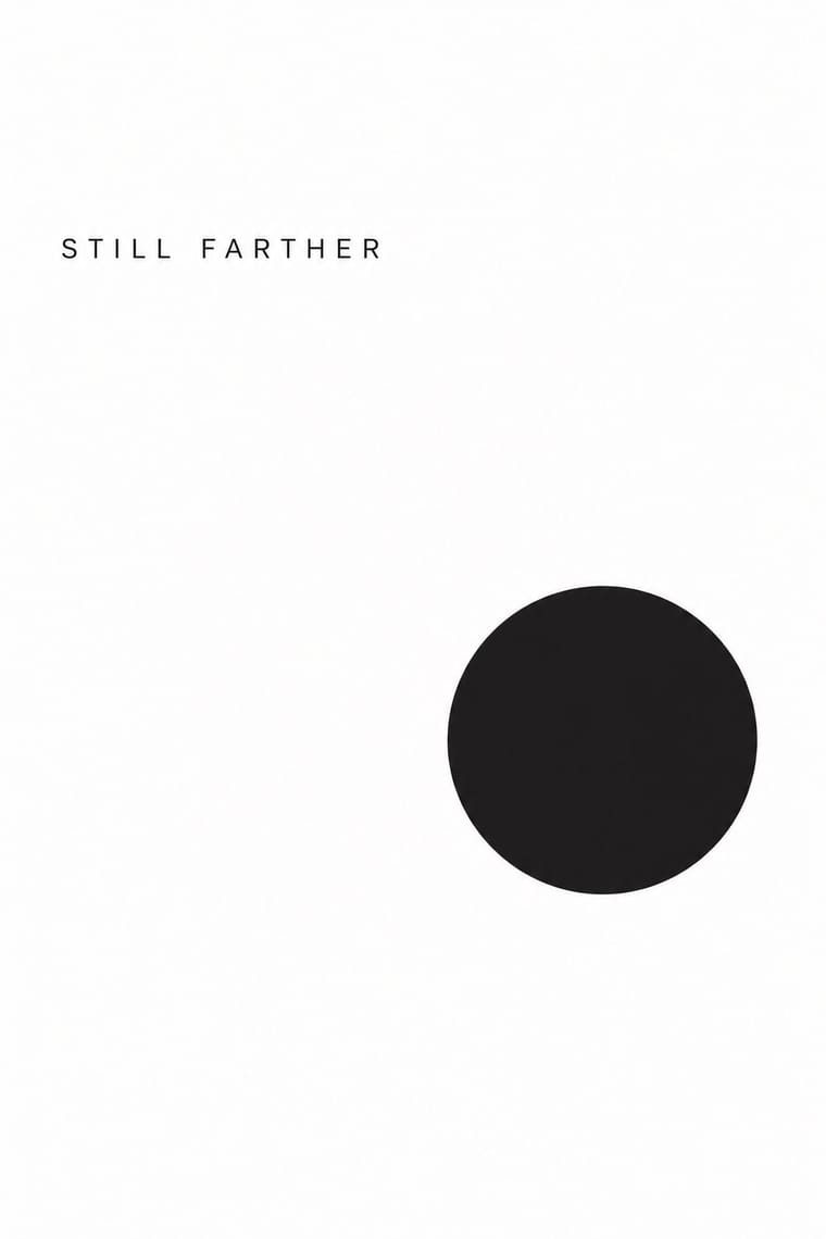
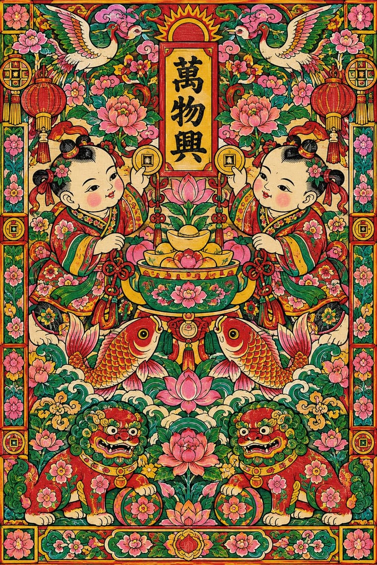
Minimalist Graphic Design × Nianhua
Isolate a single nianhua motif, such as a carp, on a blank minimalist ground to turn abundance into an emblem.
Mix them and make something Minimalist Graphic Design Nianhua
01
What each style brings
Each part of the design comes from the style with the stronger say in it, and each style gives at least two.
Minimalist Graphic Design Nianhua & Chinese Folk Print
- Type from Minimalist Graphic Design
- Colour from Minimalist Graphic Design
-
Nianhua avoids monochrome: this is where the two pull against each other, which is the point of the contrast.
- Form from Nianhua
- Composition from Minimalist Graphic Design
-
Nianhua avoids generous white space: this is where the two pull against each other, which is the point of the contrast.
- Surface from Nianhua
02
The type
Open fonts standing in for each style’s own type, which is often hand-drawn or commercial.
Display · Minimalist Graphic Design
Still
Inter Tight, standing in for Helvetica Neue (light weights)
Text · Nianhua
Woodblock pictures bought each New Year and pasted on doors, walls and kitchen shrines to invite luck and ward off harm: paired door gods, plump babies with carp, the Kitchen God, opera scenes and auspicious rebuses. A black keyline block is overprinted or hand-coloured in saturated red, green, yellow and pink, and compositions are dense, frontal and often mirrored in pairs.
Shippori Mincho; Nianhua used Kaishu and Lishu (clerical script) for auspicious couplets
03
The colours
The ground and leading colours come from Minimalist Graphic Design, with a counter-accent from Nianhua. The ink reads on the ground at 4.5:1 or more.
Minimalist Graphic Design Nianhua & Chinese Folk Print
-
#ffffffground · 36% -
#1a1a1aink · 14% -
#d9d6d0accent · 18% -
#f2c230accent · 14% -
#8c8a86accent · 10% -
#c8252caccent · 8%
As CSS
:root {
  --ground: #ffffff;
  --ink: #1a1a1a;
  --accent-1: #d9d6d0;
  --accent-2: #f2c230;
  --accent-3: #8c8a86;
  --accent-4: #c8252c;
  --font-display: "Inter Tight", sans-serif;
  --font-text: "Shippori Mincho", serif;
}
04
The two styles
05
More combinations
With Minimalist Graphic Design
- ECM Sleeve Aesthetic (Munich) Pairs well · ECM's record sleeves carry the same reduction into music since 1970: one corresponding image, a few lines of small type and a great deal of silence; borrow their wintry photograph and tiny type when a minimal layout needs mood rather than system.
- Ma & Wabi-sabi Aesthetics Pairs well · Add one imperfect texture or natural material so the emptiness feels contemplative rather than sterile.
- Memphis Design Contrasts · Memphis's clashing patterns are the antidote to minimal reticence; a single Memphis accent makes a minimal layout playful.
- Dark Tech Minimalism Pairs well · Invert the palette to near-black and keep the same reduction for a contemporary technology register.
- Neo-Andean Architecture (Cholets) Contrasts · Its exact opposite on ornament and colour; one symmetrical fluorescent panel in a white, empty layout reads as a loud statement of identity.
- Neoclassical Book Typography Pairs well · Set a single Didone headline in minimalism's empty, monochrome field for the classic luxury-fashion register.
- Renaissance Book Typography Pairs well · Keep classical page proportions and a humanist serif but strip the ornament to give minimal layouts warmth and authority.
- Afrobeat Sleeve Art Contrasts · Its exact opposite on density; a single minimal element on a Lemi-style sleeve stands out sharply, and vice versa.
With Nianhua
- Shanghai Modern & Yuefenpai Pairs well · Yuefenpai calendar posters grew from nianhua; mix its auspicious symbols with Shanghai's airbrushed modern figures.
- Indian Calendar & Bazaar Art Pairs well · Both are devotional bazaar prints; share frontal deities, saturated colour and decorative frames across a festive campaign.
- Socialist Realist Propaganda Poster Pairs well · The 1950s 'new New Year pictures' show how nianhua symmetry and colour can carry a contemporary message without losing folk warmth.
- Lubok Popular Print Pairs well · Russia's lubok is nianhua's closest counterpart, a hand-coloured market woodblock with captions and satire; share flat folk figures and rhymed text across a festive print series.
- Guochao (China-Chic National Trend) Pairs well · Redraw door gods, carp and auspicious babies as clean vector characters for limited-edition packaging, keeping each rebus's meaning intact.
- Tibetan Woodblock Print Culture (Pecha & Prayer Flags) Contrasts · Both are popular devotional woodblock prints pasted or hung for good fortune. Nianhua floods the paper with saturated figure scenes, whereas the Tibetan print keeps to one ink and lets the dyed cloth or the lines of script carry the effect.
- Taiwan Floral Cloth (Huabu) Pairs well · Both use saturated red, pink and green and the same auspicious peony, phoenix and treasure vocabulary; set a nianhua-style figure or couplet on a plain panel over a floral-cloth ground for festive New Year packaging.
- Tarot de Marseille Woodcut Cards Pairs well · Door gods and many tarot trumps are single frontal figures cut in wood and brightly coloured by hand; set them side by side for a cross-cultural series of guardian or allegorical figures.