Style combination · Contrasts
Minimalist Graphic Design × Neo-Andean Architecture
Its exact opposite on ornament and colour; one symmetrical fluorescent panel in a white, empty layout reads as a loud statement of identity.
Mix them and make something Minimalist Graphic Design Neo-Andean Architecture
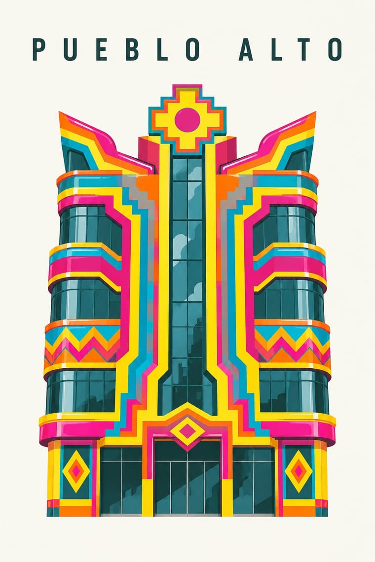
01
What each style brings
Each part of the design comes from the style with the stronger say in it, and each style gives at least two.
Minimalist Graphic Design Neo-Andean Architecture (Cholets)
- Type from Minimalist Graphic Design
- Colour from Neo-Andean Architecture
-
Minimalist Graphic Design avoids full polychrome and fluorescent & neon: this is where the two pull against each other, which is the point of the contrast.
- Form from Neo-Andean Architecture
-
Minimalist Graphic Design avoids abundant decoration: this is where the two pull against each other, which is the point of the contrast.
- Composition from Minimalist Graphic Design
-
Neo-Andean Architecture avoids generous white space: this is where the two pull against each other, which is the point of the contrast.
- Surface from Neo-Andean Architecture
02
The type
Open fonts standing in for each style’s own type, which is often hand-drawn or commercial.
Display · Minimalist Graphic Design
Luxe
Inter Tight, standing in for Helvetica Neue (light weights)
Text · Neo-Andean Architecture
The facades and party halls of El Alto, Bolivia, begun by the Aymara builder-architect Freddy Mamani in 2005 for a new Aymara merchant class. A tall block stacks shops, a salón de eventos, rental flats and the owner's rooftop chalet behind one symmetrical front of Andean crosses, diagonal planes, circles and sweeping curves drawn from Tiwanaku carving, in fluorescent colours taken from awayo cloth and set with reflective tinted glass. Ballrooms add colour gradients, LED lines, chandeliers and stained glass; recent cholets add giant pop-culture figures.
Jost; Neo-Andean Architecture used No lettering tradition of its own is documented; for graphics, draw angular, stepped display capitals from the facade's chakana and diagonal-plane geometry and Heavy geometric sans capitals cut from flat panels, like the facade's own planes, for a salón's name in Aymara or Spanish
03
The colours
The ground and leading colours come from Neo-Andean Architecture, with a counter-accent from Minimalist Graphic Design. The ink reads on the ground at 4.5:1 or more.
Minimalist Graphic Design Neo-Andean Architecture (Cholets)
-
#ffd800ground · 36% -
#2f4f4aink · 14% -
#ff8c00accent · 18% -
#8c8a86accent · 14% -
#e6007eaccent · 10% -
#00a7c8accent · 8%
As CSS
:root {
  --ground: #ffd800;
  --ink: #2f4f4a;
  --accent-1: #ff8c00;
  --accent-2: #8c8a86;
  --accent-3: #e6007e;
  --accent-4: #00a7c8;
  --font-display: "Inter Tight", sans-serif;
  --font-text: "Jost", sans-serif;
}
Use it with care
Neo-Andean Architecture (Cholets): Neo-Andean architecture is the living work of named Aymara builders, makers and their clients in El Alto, and its chakana, Tiwanaku, Pachamama and awayo motifs carry Aymara identity and ritual meaning. Credit Freddy Mamani and the other makers by name, among them facade sculptors such as Ramiro Sirpa. Do not pass the motifs off as generic 'Inca' decoration, and do not use the look as a joke about kitsch or new money: its owners built it after decades of contempt for Indigenous migrants. 'Cholet' joins chalet with cholo, a word long used as a slur against people of Indigenous origin (though some in Bolivia now reclaim it), and Mamani does not much like the label, so call the style Neo-Andean or new Andean architecture.
04
The two styles
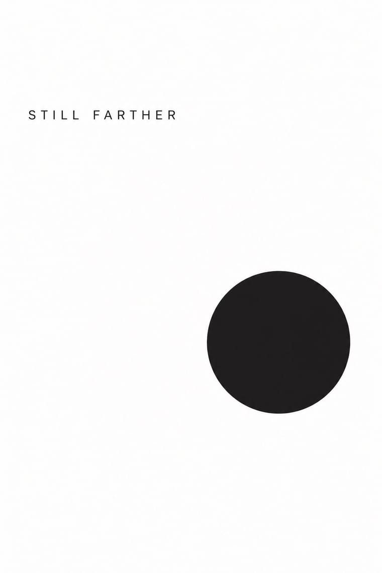
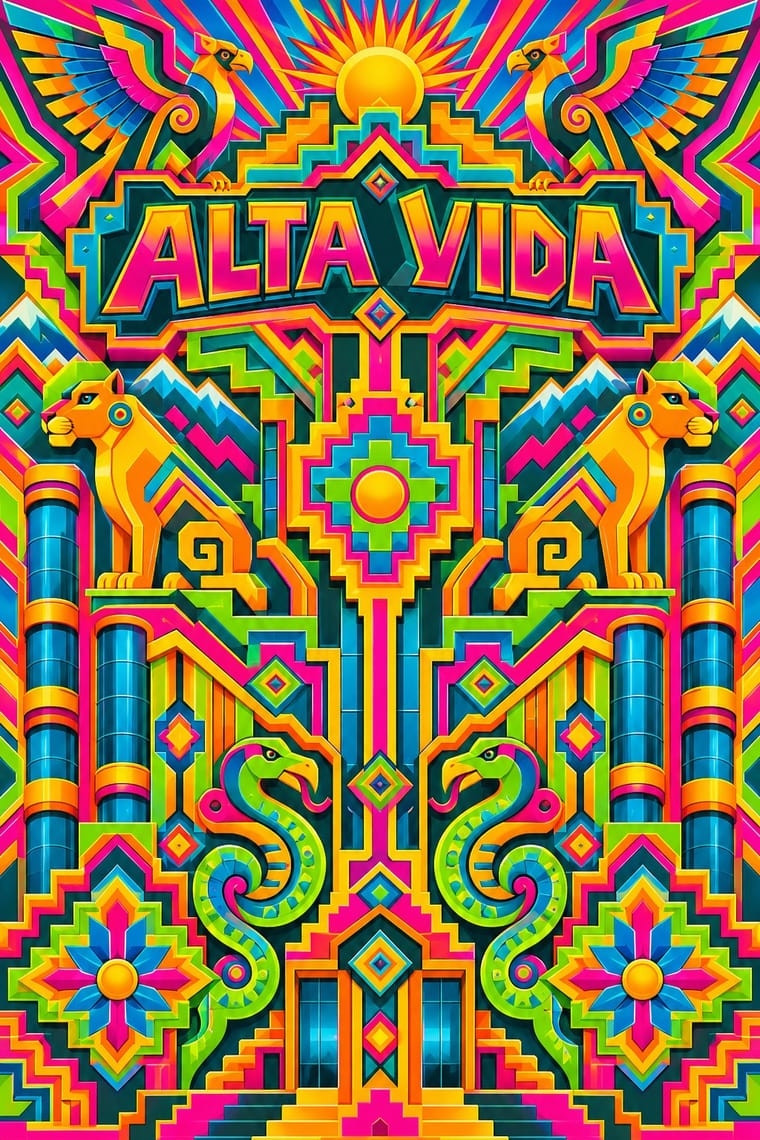
05
More combinations
With Minimalist Graphic Design
- ECM Sleeve Aesthetic (Munich) Pairs well · ECM's record sleeves carry the same reduction into music since 1970: one corresponding image, a few lines of small type and a great deal of silence; borrow their wintry photograph and tiny type when a minimal layout needs mood rather than system.
- Ma & Wabi-sabi Aesthetics Pairs well · Add one imperfect texture or natural material so the emptiness feels contemplative rather than sterile.
- Memphis Design Contrasts · Memphis's clashing patterns are the antidote to minimal reticence; a single Memphis accent makes a minimal layout playful.
- Dark Tech Minimalism Pairs well · Invert the palette to near-black and keep the same reduction for a contemporary technology register.
- Neoclassical Book Typography Pairs well · Set a single Didone headline in minimalism's empty, monochrome field for the classic luxury-fashion register.
- Renaissance Book Typography Pairs well · Keep classical page proportions and a humanist serif but strip the ornament to give minimal layouts warmth and authority.
- Afrobeat Sleeve Art Contrasts · Its exact opposite on density; a single minimal element on a Lemi-style sleeve stands out sharply, and vice versa.
- Scandinavian Functionalism Pairs well · Add natural colour and rounded forms to minimalist reduction for calm, approachable consumer branding.
With Neo-Andean Architecture
- Art Deco Pairs well · Deco's stepped chevrons and luxurious halls are close kin; combine them with chakana crosses for opulent, symmetrical interiors, but keep the fluorescent palette.
- Googie & Atomic Age Pairs well · Both turn commercial buildings into giant futurist signs; borrow Googie's upswept angles and neon to push a cholet front toward the Space Age.