Style combination · Pairs well
Minimalist Graphic Design × Neoclassical Book Typography
Set a single Didone headline in minimalism's empty, monochrome field for the classic luxury-fashion register.
Mix them and make something Minimalist Graphic Design Neoclassical Book Typography
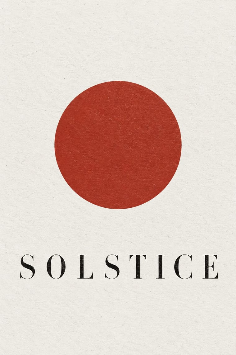
01
What each style brings
Each part of the design comes from the style with the stronger say in it, and each style gives at least two.
Minimalist Graphic Design Neoclassical Book Typography
- Type from Neoclassical Book Typography
- Colour from Minimalist Graphic Design
- Form from Minimalist Graphic Design
- Composition from Minimalist Graphic Design
- Surface from Neoclassical Book Typography
02
The type
Open fonts standing in for each style’s own type, which is often hand-drawn or commercial.
Display · Neoclassical Book Typography
Tide
Bodoni Moda, standing in for Bodoni (Giambattista Bodoni, Parma)
Text · Minimalist Graphic Design
Modernism reduced to its barest means, informed by 1960s Minimal art and Japanese emptiness: one image or line of type, vast white or neutral space, a monochrome or near-monochrome palette and meticulous typographic detail. From ECM record sleeves to Muji and Apple packaging, it signals quality, calm and confidence by withholding rather than adding.
Inter; Minimalist Graphic Design used Helvetica Neue and Akzidenz-Grotesk
03
The colours
The ground and leading colours come from Minimalist Graphic Design, with a counter-accent from Neoclassical Book Typography. The ink reads on the ground at 4.5:1 or more.
Minimalist Graphic Design Neoclassical Book Typography
-
#ffffffground · 36% -
#1a1a1aink · 14% -
#d9d6d0accent · 18% -
#a32d24accent · 14% -
#8c8a86accent · 10% -
#c9bfa8accent · 8%
As CSS
:root {
  --ground: #ffffff;
  --ink: #1a1a1a;
  --accent-1: #d9d6d0;
  --accent-2: #a32d24;
  --accent-3: #8c8a86;
  --accent-4: #c9bfa8;
  --font-display: "Bodoni Moda", serif;
  --font-text: "Inter", sans-serif;
}
04
The two styles
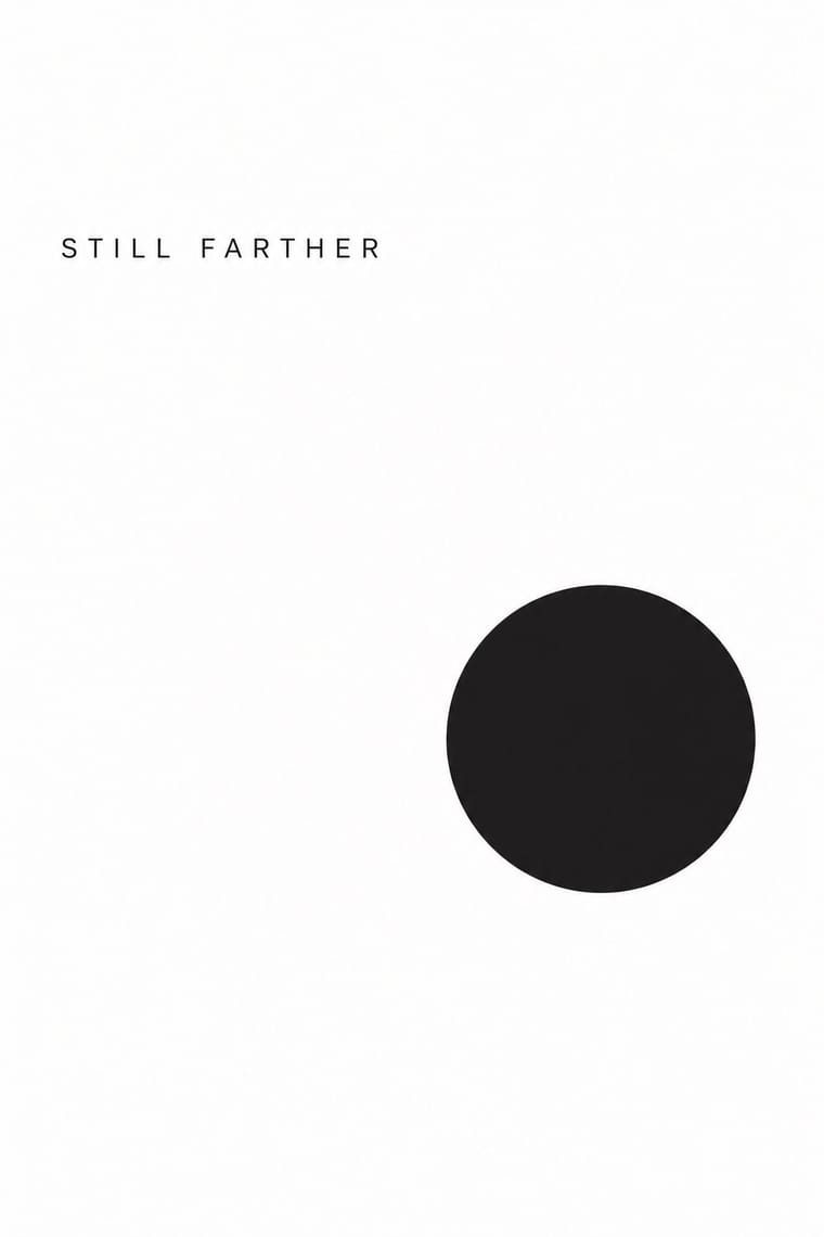
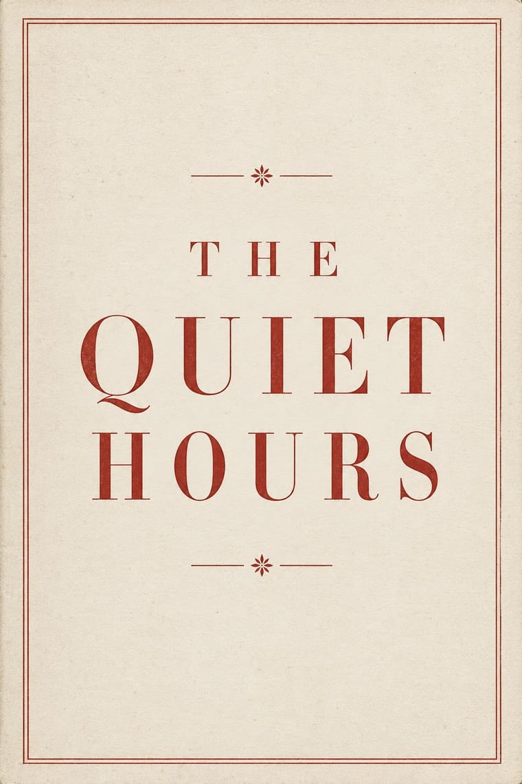
05
More combinations
With Minimalist Graphic Design
- ECM Sleeve Aesthetic (Munich) Pairs well · ECM's record sleeves carry the same reduction into music since 1970: one corresponding image, a few lines of small type and a great deal of silence; borrow their wintry photograph and tiny type when a minimal layout needs mood rather than system.
- Ma & Wabi-sabi Aesthetics Pairs well · Add one imperfect texture or natural material so the emptiness feels contemplative rather than sterile.
- Memphis Design Contrasts · Memphis's clashing patterns are the antidote to minimal reticence; a single Memphis accent makes a minimal layout playful.
- Dark Tech Minimalism Pairs well · Invert the palette to near-black and keep the same reduction for a contemporary technology register.
- Neo-Andean Architecture (Cholets) Contrasts · Its exact opposite on ornament and colour; one symmetrical fluorescent panel in a white, empty layout reads as a loud statement of identity.
- Renaissance Book Typography Pairs well · Keep classical page proportions and a humanist serif but strip the ornament to give minimal layouts warmth and authority.
- Afrobeat Sleeve Art Contrasts · Its exact opposite on density; a single minimal element on a Lemi-style sleeve stands out sharply, and vice versa.
- Scandinavian Functionalism Pairs well · Add natural colour and rounded forms to minimalist reduction for calm, approachable consumer branding.
With Neoclassical Book Typography
- Renaissance Book Typography Contrasts · Its direct ancestor and foil: swap calligraphic Garalde type, woodcut initials and borders for vertical stress, hairlines and bare white space to see how far reduction alone can carry a page.
- Victorian Letterpress & Wood Type Contrasts · Victorian fat faces blew the Didone up into display type and mixed many faces per sheet; set one face in graded sizes instead when you want calm rather than clamour.
- Die Neue Typographie Contrasts · Tschichold's asymmetric, sans-serif programme was written against exactly this centred classical page; use the clash to choose a stance deliberately.
- Bulaq (Amiriyya) Naskh Book Printing Pairs well · In an Arabic–Latin edition, face a justified, rule-framed Naskh page with a centred transitional or Didone page; both make type, rules and margins the only luxury.
- DTC 'Blanding' / Millennial Minimalism Contrasts · Luxury's other reduction: a single Didone wordmark signals heritage where the lowercase sans signals approachability.