Style combination · Contrasts
Memphis Design × Wordless Flat-Pack Assembly Instructions
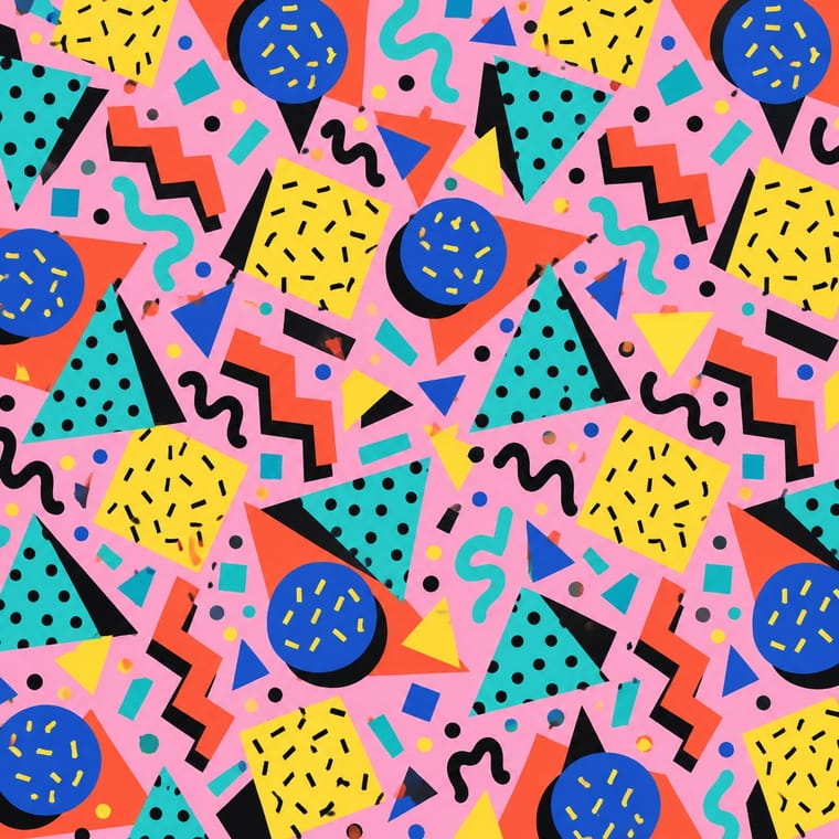
Memphis colour, pattern and squiggles are everything the booklet refuses; one patterned part on a grey outline page makes a pointed contrast.
Mix them and make something Memphis Design Wordless Flat-Pack Assembly Instructions
01
What each style brings
Each part of the design comes from the style with the stronger say in it, and each style gives at least two.
Memphis Design Wordless Flat-Pack Assembly Instructions
- Type from Memphis Design
- Colour from Memphis Design
-
Wordless Flat-Pack Assembly Instructions avoids full polychrome: this is where the two pull against each other, which is the point of the contrast.
- Form from Memphis Design
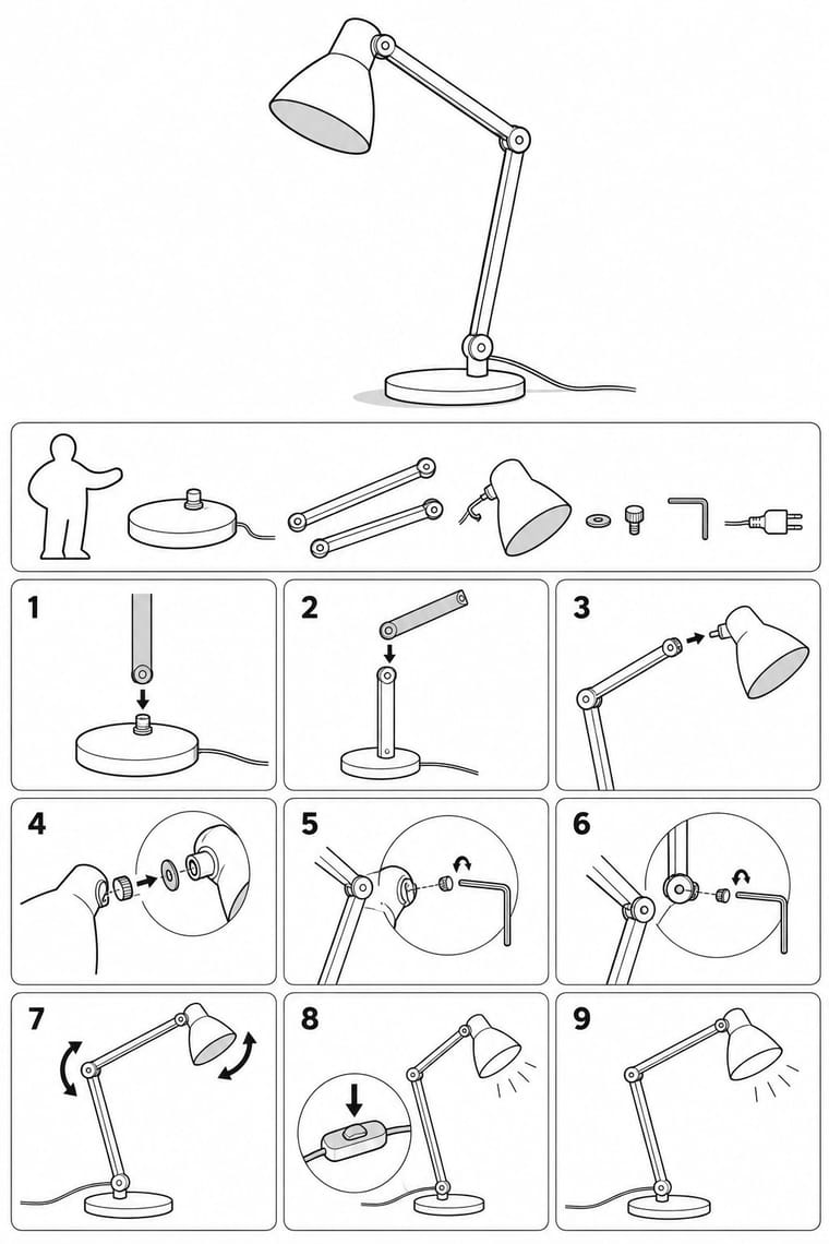
- Composition from Wordless Flat-Pack Assembly Instructions
- Surface from Wordless Flat-Pack Assembly Instructions
02
The type
Open fonts standing in for each style’s own type, which is often hand-drawn or commercial.
Text · Wordless Flat-Pack Assembly Instructions
The wordless flat-pack booklet as IKEA drew it up after 1999, which replaced the exploded view of older instruction manuals with step-by-step pictures: the product is drawn in black outline on white as it looks at each stage of building, with grey only to pick out the part being fitted. The work is broken into many simple steps with few points of focus each, hardware and tools carry their article numbers, and a cartoon 'assembly figure', now drawn without gender, gives tips. With no words, one booklet serves every market.
Space Mono; Wordless Flat-Pack Assembly Instructions used Almost no type and On covers and brand material only
03
The colours
The ground and leading colours come from Memphis Design, with a counter-accent from Wordless Flat-Pack Assembly Instructions. The ink reads on the ground at 4.5:1 or more.
Memphis Design Wordless Flat-Pack Assembly Instructions
-
#ffd23fground · 36% -
#111111ink · 14% -
#ff5a36accent · 18% -
#6e6e6eaccent · 14% -
#2ec4b6accent · 10% -
#a8a8a8accent · 8%
As CSS
:root {
  --ground: #ffd23f;
  --ink: #111111;
  --accent-1: #ff5a36;
  --accent-2: #6e6e6e;
  --accent-3: #2ec4b6;
  --accent-4: #a8a8a8;
  --font-display: "Jost", sans-serif;
  --font-text: "Space Mono", monospace;
}
Use it with care
Wordless Flat-Pack Assembly Instructions: IKEA’s name, logo and assembly figure belong to IKEA: work in the manner (black line on white, one simple step per picture, no words) without using them, without copying a real IKEA booklet or product, and without presenting the result as IKEA’s or implying a link with IKEA.
04
The two styles
05
More combinations
With Memphis Design
- International Typographic Style Contrasts · Scatter Memphis squiggles across a strict Swiss grid to stage modernism versus its postmodern critique.
- Kawaii Design Pairs well · Memphis pastel geometry and kawaii's rounded characters share a toy-like optimism; combine them for playful packaging.
- Corporate Memphis Contrasts · Corporate Memphis tamed the original's clash and irony; restore real colour conflict and wit to escape generic tech illustration.
- Neo-Brutalism Pairs well · Memphis black outlines and flat clashing fills translate directly into neo-brutalist cards, buttons and stickers.
- Swiss Punk / New Wave Typography Pairs well · Add Memphis squiggles and pastel triangles to New Wave's floating bars for the full 1980s postmodern palette.
- La Movida Madrileña Graphics Pairs well · Memphis showed its first collection in Milan in 1981, three years before Madrid Me Mata: add its clashing laminate colours, squiggles and geometric primitives to a Movida poster for a fuller 1980s postmodern look, keeping the hand-drawn figures and lettering.
- Dutch Expressive Postmodernism (Studio Dumbar & Hard Werken) Pairs well · A contemporary 1980s attack on good taste: set Memphis primitives, squiggles and patterned laminates inside a Dumbar-style photographed set for a poster with real shadows and clashing colour.
- Milanese Industrial Modernism (Olivetti, Pirelli, Studio Boggeri) Contrasts · Milan's own later rebellion against functional wit; set Memphis's ornamental irony against this clean industrial optimism for a deliberate generational clash.
With Wordless Flat-Pack Assembly Instructions
- Ligne Claire (Franco-Belgian Clear Line) Pairs well · The clear line of comics shares its even outline and sequence of panels; borrow its colour for a friendlier how-to.
- Isotype Pictorial Statistics Pairs well · Both explain without words; add Isotype's counted pictograms for a parts list and keep the outline drawing for the steps.
- Munich 1972 Olympic Design (Otl Aicher) Pairs well · Aicher's pictogram system gives the tool and warning signs a stricter grid while the drawings stay in outline.