Style combination · Contrasts
Lotería Card Imagery × Mexican Calendar Chromo
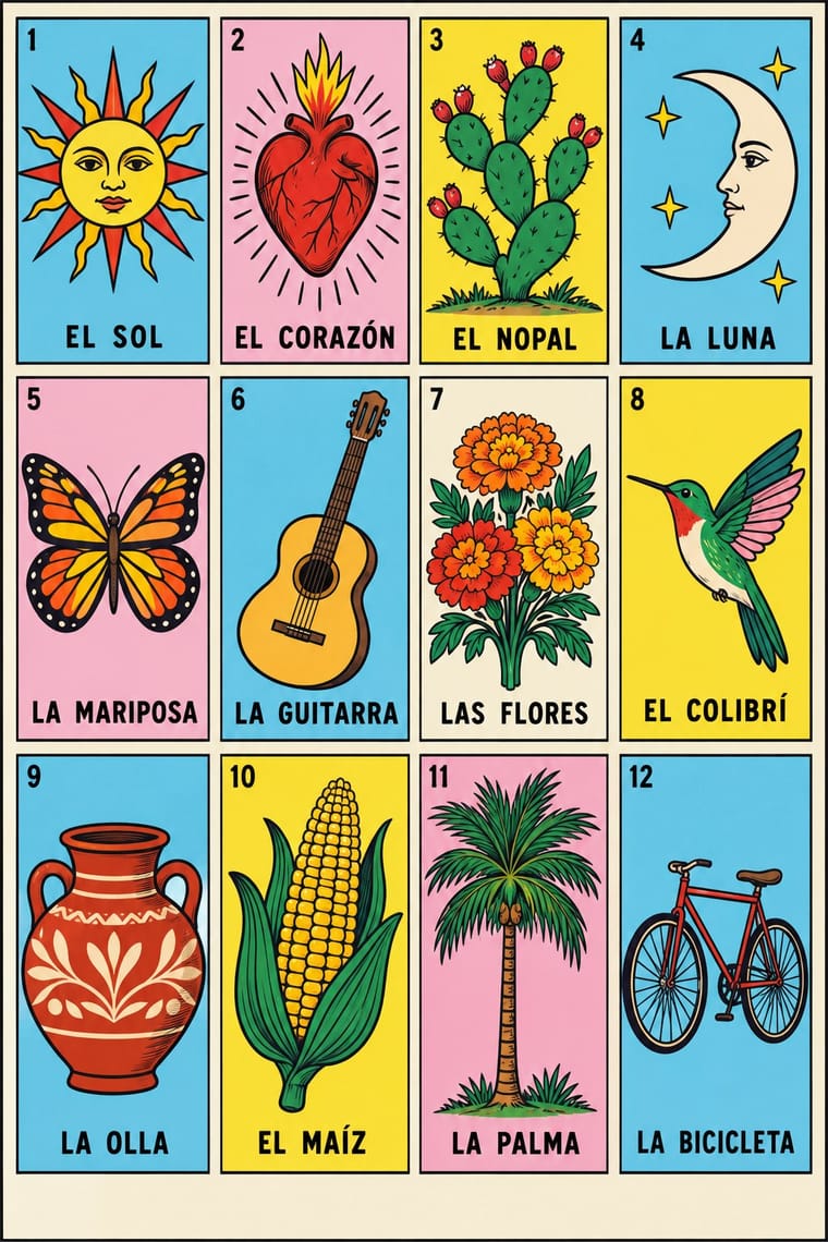
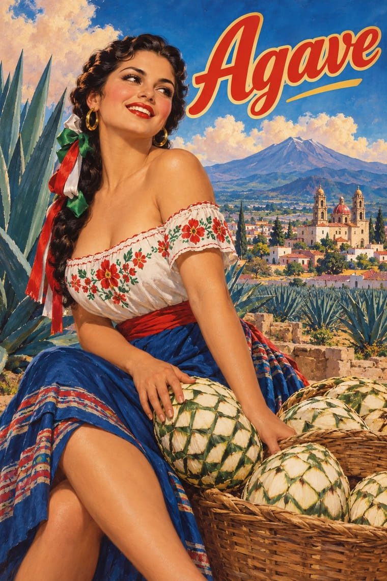
Both are popular Mexican colour prints for everyday use, but the lotería sets one flat, outlined emblem figure per numbered card in a ruled frame, named in capitals at the foot, for a game, while the chromo paints one modelled scene in deep landscape to hang for a year.
Mix them and make something Lotería Card Imagery Mexican Calendar Chromo
01
What each style brings
Each part of the design comes from the style with the stronger say in it, and each style gives at least two.
Lotería Card Imagery (Mexican Lotería) Mexican Calendar Chromo (Cromos calendáricos)
- Type from Lotería Card Imagery
- Colour from Mexican Calendar Chromo
- Form from Lotería Card Imagery
- Composition from Lotería Card Imagery
-
Mexican Calendar Chromo avoids modular grid: this is where the two pull against each other, which is the point of the contrast.
- Surface from Mexican Calendar Chromo
02
The type
Open fonts standing in for each style’s own type, which is often hand-drawn or commercial.
Display · Lotería Card Imagery
Fiesta
Londrina Solid, standing in for Hand-drawn capitals on homemade tablas and artists' redrawn decks
Text · Mexican Calendar Chromo
Mexico's give-away advertising calendars, at their height from the 1930s to the late 1960s. Printers led by Galas de México kept studios of painters, among them Jesús Helguera, Eduardo Cataño, Jorge González Camarena and Josep Renau, whose large oil paintings were printed by offset above a sponsor's name and a small calendar pad. In an idealising academic realism touched by Hollywood glamour they staged Aztec legends as melodrama, charros and chinas poblanas, saints, film stars and pin-ups, and hung all year in homes, shops and workshops.
Archivo; Mexican Calendar Chromo used The sponsor's name and address overprinted in the band left blank below the picture and Brand logotypes painted into the picture or carried on the product
03
The colours
The ground and leading colours come from Mexican Calendar Chromo, with a counter-accent from Lotería Card Imagery. The ink reads on the ground at 4.5:1 or more.
Lotería Card Imagery (Mexican Lotería) Mexican Calendar Chromo (Cromos calendáricos)
-
#f0c4a8ground · 39% -
#1f4e8cink · 15% -
#c8372daccent · 20% -
#a8693faccent · 15% -
#3d8b4faccent · 11%
As CSS
:root {
  --ground: #f0c4a8;
  --ink: #1f4e8c;
  --accent-1: #c8372d;
  --accent-2: #a8693f;
  --accent-3: #3d8b4f;
  --font-display: "Londrina Solid", cursive;
  --font-text: "Archivo", sans-serif;
}
Use it with care
Lotería Card Imagery (Mexican Lotería): Lotería is a living family game, played across Mexico and much of the United States and in parts of Central America, and a marker of Mexican and Mexican-American identity, so do not use it as generic 'Mexican' party decoration for products with no tie to those communities, and commission and credit Mexican, Central American and Chicanx artists when you redraw it. The standard deck's nine human figures are all stereotypes of Indigenous people, upper-class white people and Afro-Latinos (TIME, citing Gloria Arjona), most plainly El Negrito (No. 26) and El Apache (No. 38), stock figures of a Black man and a Native American, and other decks carry the same kind of figure (the feathered Indio with bow and arrow on Lomas Garza's 1972 tablas): do not reproduce them as period charm; replace them, as new decks freely do. The owners of Don Clemente Gallo (Pasatiempos Gallo) hold the registered trademark of the original images, so draw new emblems rather than tracing them, and write card names in correct Spanish instead of mock-Spanish.
Mexican Calendar Chromo (Cromos calendáricos): The Aztec scenes are a nationalist fantasy of the pre-Hispanic past painted by academically trained artists, several of them born or raised in Spain, not Indigenous art: do not present them as Nahua or Mexica tradition or copy their feathered costumes as if they were ethnography. The saints and the Virgin of Guadalupe are devotional images that many owners pray before, so do not parody them, and the pin-ups were painted, as a UNAM study of the Galas archive puts it, to satisfy male longing and promote the sponsors' brands, carrying old and new stereotypes of women. The paintings are still in copyright (Helguera died in 1971) and Grupo Carso holds the rights to the Galas archive, while Alta reported in 2023 that Calendarios Landin owns the rights to Helguera, so paint new pictures in the manner rather than retouching old chromos.
04
The two styles
05
More combinations
With Lotería Card Imagery
- Kanga (Swahili Message Cloth) Contrasts · Both centre one motif in a frame above a line of capitals, but a kanga is a cloth whose printed Swahili saying is its message, while a lotería card prints only the emblem's name and leaves the verse to the caller's voice.
- West African Barbershop & Hair Salon Signs Contrasts · Both lay out named, numbered pictures in rows and columns, but a barbershop sign is one hand-painted menu of heads that differ only in their hairstyle, under the shop's boast, while a lotería tabla is a printed board of unrelated emblems, one of a set of boards that each hold a different selection from the same deck.
- Chicano Screenprint Poster Pairs well · Chicano artists from Carmen Lomas Garza's 1972 tablas onward redraw the lotería card as a sign of Mexican-American home life; frame a screenprinted slogan or portrait as a numbered, named card to borrow that recognition.
- Isotype Pictorial Statistics Contrasts · Both set picture signs on a grid, but Isotype's pictograms are reduced, uniform and repeated to count quantities, while every lotería emblem is a different, fully drawn picture with its own name, matched by chance and read aloud.
- Imagerie d'Épinal & European Bilderbogen Contrasts · Both are cheap coloured popular prints of stock figures in ruled frames under capital captions, but an Épinal sheet tells a story or musters a row of soldiers across many cases, while a lotería card holds one emblem and the tabla's cells have no order: the caller draws them by chance.
- Mexican Popular Graphics (Posada) Pairs well · Posada himself printed a Juego de lotería; pair the lotería card's single framed emblem and name with his black relief calaveras and shouting broadside type for a Mexican popular-print voice that is both orderly and satirical.
- Tarot de Marseille Woodcut Cards Contrasts · Lotería also gives each card one figure with its name at the foot, but in letterspaced sans capitals and soft offset colour; borrow the tarot's carved roman title band, ruled frame and stencil drift to make a lotería-type card set look older and graver.
With Mexican Calendar Chromo
- Shanghai Modern & Yuefenpai Contrasts · Both are tobacco-sponsored calendar pictures of beauties, but yuefenpai set softly rubbed watercolour women inside decorative borders with the products alongside, while the Mexican chromo is an oil painting of a whole scene that fills the sheet, with the pad pasted at its foot.
- Egyptian Painted Film Poster Contrasts · Both paint the stars of a national cinema's golden age, but the Egyptian poster collages star heads under huge calligraphic titles, while the chromo paints one unified scene and keeps its lettering to a small band below.
- Socialist Realist Propaganda Poster Contrasts · Both idealise the nation in heroic academic realism, but the Socialist Realist poster adds slogans and marching crowds to mobilise, while the chromo sells beer and cigarettes with romance and nostalgia; borrow its heroic anatomy for a national-history scene and leave the slogan out.
- Mexican Popular Graphics (Posada) Contrasts · Posada's broadsheets are black relief cuts under shouting type, sold for news and satire; the chromo is a full-colour oil painting given away to be admired all year, with the type kept small and out of the picture.
- Hand-Painted Signage & Vernacular Lettering Pairs well · Grocery stores, poultry shops and workshops gave the calendars to their customers; pair a painted rótulo for the shop's name with a chromo-style painting for the look of a mid-century Mexican neighbourhood business.
- Taller de Gráfica Popular Contrasts · Both grew out of post-revolutionary Mexico and picture its history, but the TGP cut black-and-white linocuts and woodcuts with bold headlines for popular and anti-fascist struggles, while the calendar painters made saturated oils of an idealised Mexico to sell beer and cigarettes.
- Indian Calendar & Bazaar Art Contrasts · Both are give-away calendars that reproduce commissioned paintings above a sponsor's name, but Indian bazaar art centres a frontal deity in haloes, gold and ornamental frames for worship, while the Mexican chromo stages a secular scene in deep landscape (a legend, a charro, a film star, a pin-up) with no frame around it; its saints are one genre among many.
- Chicano Screenprint Poster Contrasts · Many Chicanos grew up with these give-away calendars hanging at home, and Chicano workshops took up the calendar as a fundraising print (Méchicano Art Center's 1977 Calendario), but, in Terezita Romo's words, revised its single image format, offset medium and commercial objective: screenprinted flat colour and political and cultural messages in place of a brand's modelled oil scene.