Style combination · Contrasts
Lucerne Poster Scene × Polish Poster School
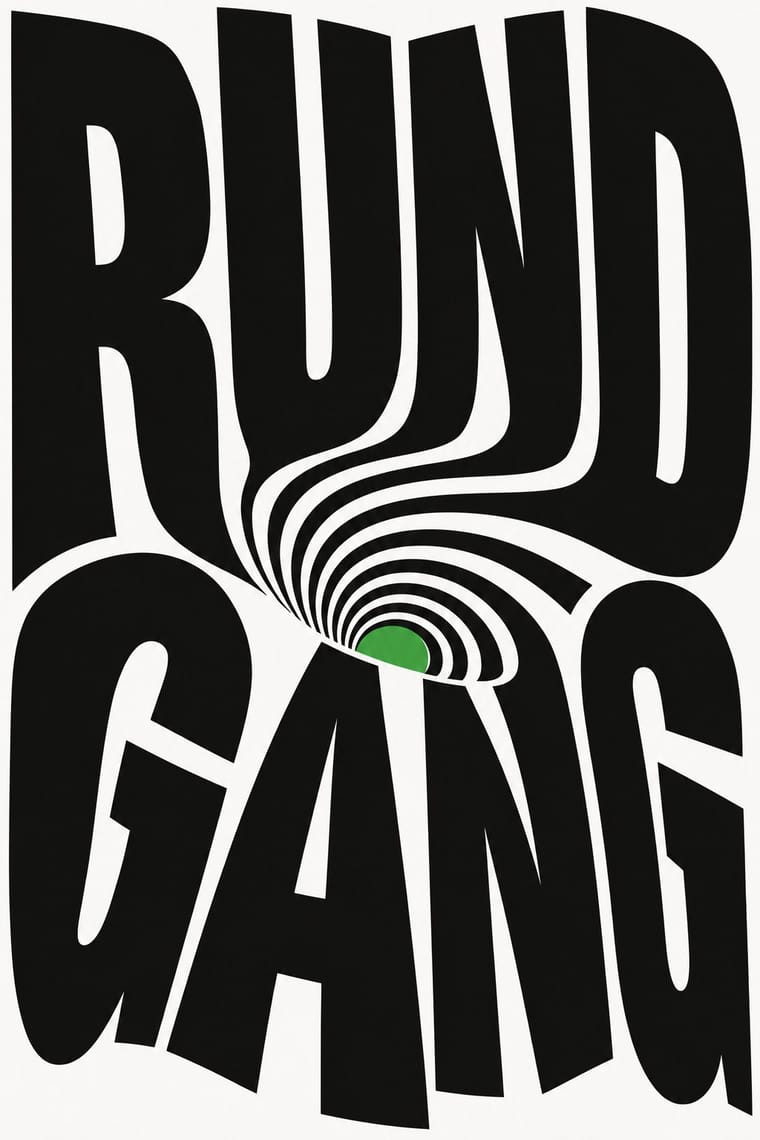
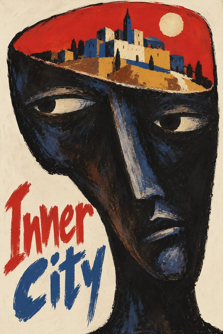
Another cultural-venue poster culture of one idea per sheet, but painted and hand-lettered as a metaphor; Lucerne builds the idea from the letters and optical effects on the computer. Borrow the Polish wit, not the brush.
Mix them and make something Lucerne Poster Scene Polish Poster School
01
What each style brings
Each part of the design comes from the style with the stronger say in it, and each style gives at least two.
Lucerne Poster Scene (Neubad & Südpol Posters) Polish Poster School
- Type from Lucerne Poster Scene
- Colour from Lucerne Poster Scene
- Form from Polish Poster School
- Composition from Lucerne Poster Scene
- Surface from Polish Poster School
02
The type
Open fonts standing in for each style’s own type, which is often hand-drawn or commercial.
Display · Lucerne Poster Scene
Pop
Anton, standing in for Letters constructed or distorted for each poster: Brechbühl's handwritten blend-tool letters for The Notwist (2019), the square-tiled cube letters of Neubad Start (2013), Pfäffli's bent, sliced and paper-folded titles for Südpol; elsewhere set type is warped rather than drawn, as in the condensed sans bent round a disc for Future Islands (2014) or the serif of When Saints Go Machine
Text · Polish Poster School
A painterly, metaphorical poster culture that flourished in communist Poland, chiefly for film, theatre, opera and circus. Working for state publishers, free of commercial pressure but under censorship, designers such as Henryk Tomaszewski, Jan Lenica and Roman Cieślewicz replaced star photographs with a single witty or unsettling visual idea, painted or collaged by hand and lettered in the artist's own handwriting.
Archivo; Polish Poster School used Henryk Tomaszewski's casual handwritten capitals and Brush- and crayon-drawn title lettering
03
The colours
The ground and leading colours come from Lucerne Poster Scene, with a counter-accent from Polish Poster School. The ink reads on the ground at 4.5:1 or more.
Lucerne Poster Scene (Neubad & Südpol Posters) Polish Poster School
-
#ffffffground · 36% -
#0a0a0aink · 14% -
#f0e111accent · 18% -
#d4352baccent · 14% -
#ff415baccent · 10% -
#d6a23aaccent · 8%
As CSS
:root {
  --ground: #ffffff;
  --ink: #0a0a0a;
  --accent-1: #f0e111;
  --accent-2: #d4352b;
  --accent-3: #ff415b;
  --accent-4: #d6a23a;
  --font-display: "Anton", sans-serif;
  --font-text: "Archivo", sans-serif;
}
04
The two styles
05
More combinations
With Lucerne Poster Scene
- Neo-Swiss Revival Contrasts · Neo-Swiss keeps the grotesque intact on a modular grid for identities and the web; Lucerne keeps the grotesque only for the small print and distorts the title itself, poster by poster. Choose neo-Swiss for a system, Lucerne for a one-off event.
- Op Art Graphics Pairs well · The Neubad's black-and-white rule led Brechbühl straight to Op Art for The Notwist; take Op's vibrating line fields and checks, but bend them into the letters of the title instead of filling the sheet with pattern alone.
- Di Tella Graphic Design (Instituto Torcuato Di Tella) Pairs well · Both make the event title an optical picture for a small cultural institution under tight means; add the Di Tella's one or two flat inks and blunt grotesque to a Lucerne letter construction for a sterner, more 1960s sheet.
- Kinetic Typography & Variable Type Pairs well · Lucerne's twisted and warped letters are already halfway to motion (The Notwist also ran as an animated poster); animate the construction for screens while keeping the printed F4 as the still.
- Screenprinted Gig & Alt-Movie Poster Contrasts · Gig posters are illustrated editions made for collectors; Lucerne's concert posters are mostly typographic, made for the city's walls and small venue runs. Use the contrast to decide between picture and title.
With Polish Poster School
- International Typographic Style Contrasts · Painterly ambiguity versus objective grid and photography; borrow one hand-painted image to warm a Swiss-style cultural series.
- Socialist Realist Propaganda Poster Contrasts · The school defined itself against official heroic realism; use the pairing to show metaphor outperforming literal propaganda.
- Iranian Modernist Graphic Design Pairs well · Iranian designers absorbed the Polish metaphor poster; combine one surreal image with calligraphic lettering for cultural posters.
- Push Pin Style Pairs well · Both prize the illustrator-designer's hand and wit; pair Polish metaphor with Push Pin lettering for theatrical, idea-led posters.
- Polish Cold War Neon (PRL Neonisation) Pairs well · Some of the same artists drew posters and neons; take the poster's single witty idea and hand-drawn title and translate it into one line of light for a night version of a campaign.
- Polish Information Picture Book (Dwie Siostry) Contrasts · The poster designer and teacher Henryk Tomaszewski is credited with a role in the revival, but the poster school puts one painted, metaphorical image on a poster, while the picture books refuse paint and fill a spread with a hundred small labelled facts. Choose between a single idea that provokes and a dense page that informs.
- Turkish Modernist Poster & Graphic Design Contrasts · The same conceptual-poster network: Turkish designers showed at the Warsaw Poster Biennale from 1966 and Ertel's posters entered the Wilanów archive in 1968. The Polish school paints, collages and distorts its single idea; the Turkish posters cut it into flat shapes in two or three clean inks. Choose Warsaw for unease, Istanbul for a crisp visual pun.
- West German Conceptual Film & Culture Poster (Hillmann and Rambow) Contrasts · Its contemporary in art-film posters: the Polish school paints the metaphor and letters the title by hand in loose brushwork; take the Kassel route when the same single idea should come from a cropped photograph or a hard silhouette with set grotesque type.