Style combination · Pairs well
Jeepney Art × Pop Art Graphics
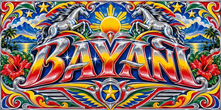
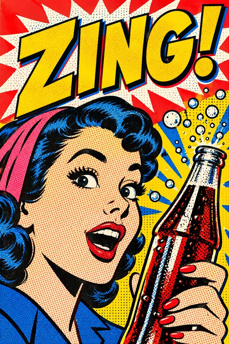
Jeepneys already mix comic heroes with devotional images; Pop's flat Ben-Day treatment can systematise that mash-up for print.
01
What each style brings
Each part of the design comes from the style with the stronger say in it, and each style gives at least two.
Jeepney Art Pop Art Graphics
- Type from Jeepney Art
- Colour from Pop Art Graphics
- Form from Jeepney Art
- Composition from Jeepney Art
- Surface from Pop Art Graphics
02
The type
Open fonts standing in for each style’s own type, which is often hand-drawn or commercial.
Text · Pop Art Graphics
Pop turned the commercial imagery of post-war consumer culture (comics, packaging, celebrity photographs and advertising) into both its subject and its method. Images are appropriated, enlarged, flattened and repeated; colour is bright and unmodulated; and the printing process itself, from Ben-Day dots to off-register silkscreen, is left visible as a sign of mass production.
Archivo; Pop Art Graphics used Comic-book hand lettering and Franklin Gothic
03
The colours
The ground and leading colours come from Pop Art Graphics, with a counter-accent from Jeepney Art. The ink reads on the ground at 4.5:1 or more.
Jeepney Art Pop Art Graphics
-
#fbf8f0ground · 36% -
#111111ink · 14% -
#ffd400accent · 18% -
#ce1126accent · 14% -
#0038a8accent · 10% -
#ff5fa2accent · 8%
As CSS
:root {
  --ground: #fbf8f0;
  --ink: #111111;
  --accent-1: #ffd400;
  --accent-2: #ce1126;
  --accent-3: #0038a8;
  --accent-4: #ff5fa2;
  --font-display: "Yellowtail", cursive;
  --font-text: "Archivo", sans-serif;
}
04
The two styles
05
More combinations
With Jeepney Art
- Total Design & Dutch Functionalism Contrasts · Systematic transit signage is the rational opposite of owner-by-owner jeepney lettering; contrast the two when designing public-transport identities.
- Googie & Atomic Age Pairs well · Share chrome, fins and roadside showmanship; pair Googie starbursts with jeepney lettering for retro transport or food-truck branding.
- Baybayin Revival Graphics Contrasts · Both speak for Filipino identity, but jeepney art crowds chrome, airbrush and polychrome lettering, while baybayin revival sets a single one-ink character in open space; use the contrast to decide between festive abundance and a quiet mark of origin.
- Filipino Komiks Pairs well · Both are Manila's popular street graphics from the same postwar decades. Put a komiks hero, drawn in black brush line, on a jeepney's polychrome panel, chrome trim and shaded sign-painter lettering for a piece that reads as Manila.
- Itasha (Anime Character Car Graphics) Contrasts · Both cover a vehicle in saturated colour, figures and emblems, but a jeepney is a passenger vehicle painted by hired sign painters with chrome, scripts and folk symbols, while an itasha is a private car wearing one fan's printed characters; borrow the jeepney's chrome and lettering only to show what itasha leaves out.
- Dhaka Rickshaw Painting Pairs well · Another street-vehicle painting tradition; rickshaw art is picture-panel and portrait-led rather than metal-trimmed and lettering-heavy.
- Matatu & Nganya Art Contrasts · The nearest vehicle tradition: both are privately owned shared taxis decorated to win passengers, but the jeepney leans on chrome horses, pinstripes, saints and family names, while the nganya is a canvas for near-photographic portraits of global pop, sports and political stars, hip-hop catchphrases, screens and LEDs.
With Pop Art Graphics
- International Typographic Style Contrasts · Set one loud appropriated Pop image inside a strict grid with a neutral grotesque so the irony reads as deliberate rather than chaotic.
- Ma & Wabi-sabi Aesthetics Contrasts · Where Pop multiplies glossy commodities, wabi-sabi values the single worn object; use one to puncture the mood of the other.
- Guna Mola Pairs well · Guna women redraw brand logos and cartoons (RCA Victor, Bullwinkle) in reverse appliqué; let that act of translation inspire Pop work, but buy or commission molas rather than imitating them.
- Neo-Brutalism Pairs well · Lift Pop's thick black outlines and flat primaries into UI cards and buttons for a confident, comic-strip interface.
- Risograph & Indie Print Culture Pairs well · Print Ben-Day dot screens in fluorescent pink and yellow riso inks to give Pop's mass-media imagery a small-run, handmade warmth.
- Screenprinted Gig & Alt-Movie Poster Pairs well · Shepard Fairey called Kozik 'the punk rock Warhol'; take Pop's appropriated cartoons and halftones and give them a gig poster's single idea and hand-lettered title.
- Finnish Bold Print (Marimekko Modernism) Pairs well · Contemporaries in saturated flat colour at a giant scale; borrow pop's isolated, enlarged object for a poster, but drop its halftone and irony to keep Marimekko's sincerity.
- Superflat Contrasts · Both turn commodities into art; take Pop's repetition and frontal commodity but swap its halftone and off-register silkscreen for Superflat's smooth vector fills and anime characters, so the print process disappears.