Style combination · Contrasts
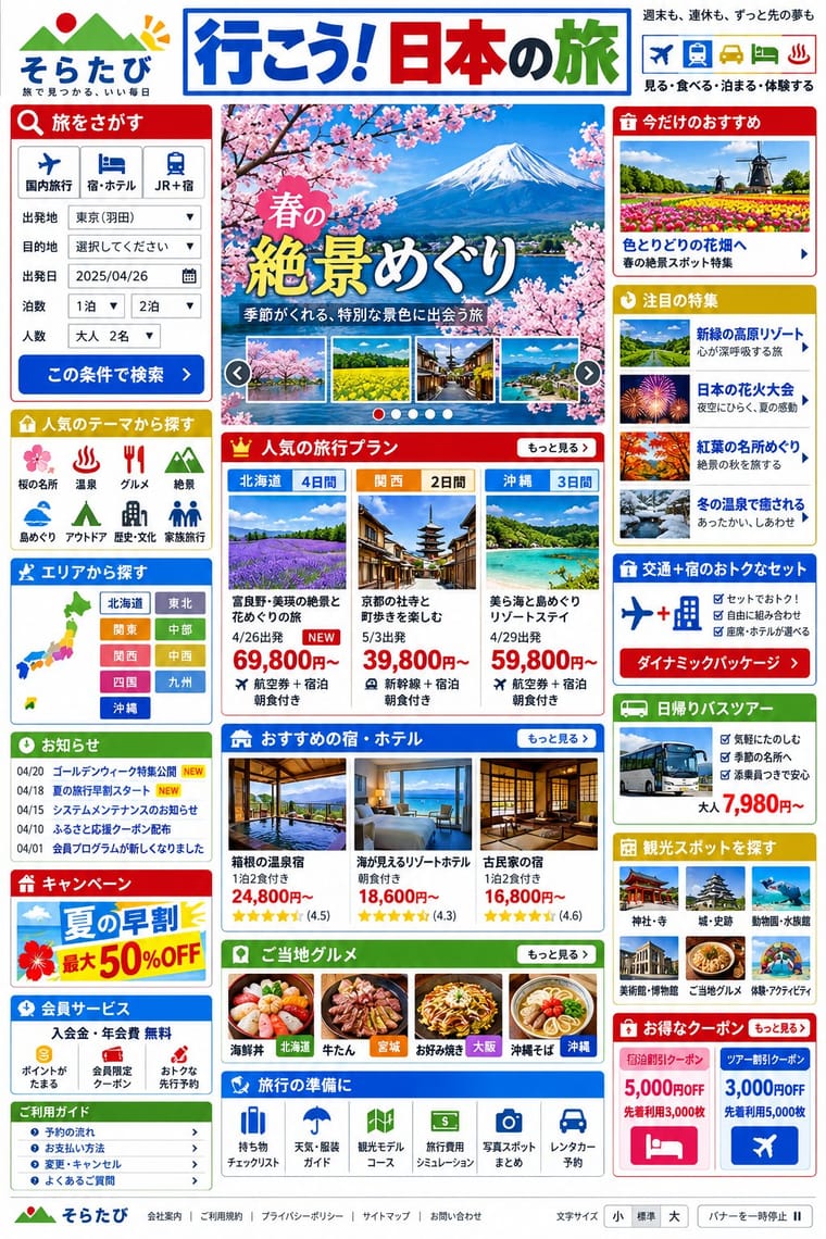
Japanese Dense Web Design × Ma
Japan's minimalism in the traditional arts and design is what writers on these sites (Zeldman, 2010; Hongkiat) set against them; leave one deliberately empty module in a dense page to make the tension a choice.
01
What each style brings
Each part of the design comes from the style with the stronger say in it, and each style gives at least two.
Japanese Dense Web Design Ma & Wabi-sabi Aesthetics
- Type from Japanese Dense Web Design
- Colour from Ma
- Form from Japanese Dense Web Design
- Composition from Japanese Dense Web Design
- Surface from Ma
02
The type
Open fonts standing in for each style’s own type, which is often hand-drawn or commercial.
Display · Japanese Dense Web Design
Calm
Zen Kaku Gothic New, standing in for Hiragino Kaku Gothic (Jiyukobo; the Hiragino family from 1993), the Apple system gothic, first in the stacks of mhlw.go.jp ('ヒラギノ角ゴ Pro W3') and Rakuten Travel (ProN)
Text · Ma
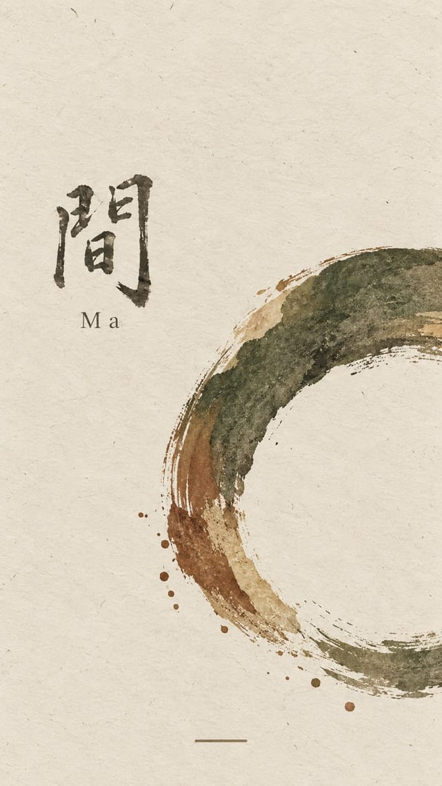
A Japanese aesthetic rooted in Zen and the wabi tea ceremony that prizes austerity, imperfection, impermanence and the charged interval (ma) between things. In graphic design it appears as vast empty grounds, a single off-centre element, muted natural colours, visible material texture and the unrepeatable brush mark, from ink painting to Muji's 'emptiness'.
Shippori Mincho; Ma used Bokuseki and Sōsho cursive kana and kanji
03
The colours
The ground and leading colours come from Ma, with a counter-accent from Japanese Dense Web Design. The ink reads on the ground at 4.5:1 or more.
Japanese Dense Web Design Ma & Wabi-sabi Aesthetics
-
#e9e4d8ground · 36% -
#2b2a28ink · 14% -
#7d4e3aaccent · 18% -
#0650cbaccent · 14% -
#b9a88aaccent · 10% -
#bf0000accent · 8%
As CSS
:root {
  --ground: #e9e4d8;
  --ink: #2b2a28;
  --accent-1: #7d4e3a;
  --accent-2: #0650cb;
  --accent-3: #b9a88a;
  --accent-4: #bf0000;
  --font-display: "Zen Kaku Gothic New", sans-serif;
  --font-text: "Shippori Mincho", serif;
}
Use it with care
Japanese Dense Web Design: Treat this as one Japanese web convention among several, not as a national essence or simply as bad design: commentators argue the density serves readers who want complete information before deciding (McGowan, 2018; Fujitsu Benelux, 2025), and many Japanese brands (MUJI, UNIQLO, POLA) choose minimal sites. Similar density appears on Korean portals such as Naver, which Fujitsu Benelux sets beside Yahoo! JAPAN, and Cruz found other regions that write in CJK characters close to Japan, so do not present it as uniquely Japanese. Dense pages still need accessibility work: offer a text-size control and a pause button for rotating banners, as mhlw.go.jp does, and give headlines lettered as images real text or alt text.
04
The two styles
05
More combinations
With Japanese Dense Web Design
- Emoji Pictographic Language Pairs well · Emoji came out of Japan's phone web (J-Phone in 1997, i-mode in 1999), which commentators also credit with keeping these pages text-heavy; small pictographs set inline with text links add colour and signal to a dense list without taking space.
- Danmaku Bullet-Comment Overlay Pairs well · Niconico's comment layer brings the same everything-at-once density to video; pair them for a crowded, participatory Japanese web voice.
- Early Web Vernacular Contrasts · This grew from the early web's link directories and table layouts, but the early web was amateur bricolage on dark tiled grounds, while this is a professional convention on white in system gothics; borrow its column discipline to tame a GeoCities pastiche.
- GOV.UK Design (GDS Style) Contrasts · GOV.UK's one thing per page answers the same public-information brief the opposite way; set mhlw.go.jp beside gov.uk to weigh completeness on one screen against step-by-step disclosure.
- Cyworld Minihompy & Minimi (Korean Mini-Homepage Culture) Contrasts · Both pack framed panels onto one screen, but the Japanese portal informs strangers while the minihompy decorates one person's page for friends.
With Ma
- Minimalist Graphic Design Pairs well · Add one rough material or brush mark to a minimalist layout so its emptiness feels lived-in rather than sterile.
- Japanese Postwar Modernism Pairs well · Use a modernist grid but leave whole modules empty, the way Tanaka and Hara let ma structure the page.
- Memphis Design Contrasts · Memphis is loud, synthetic and glossy; set one Memphis squiggle on a vast wabi ground only if you want deliberate friction.
- Scandinavian Functionalism Pairs well · Both prize natural materials and restraint; combine Nordic clarity with wabi irregularity for warm, quiet identities.
- Uli & Nsibidi Line and Sign Tradition Pairs well · Both make the empty interval carry meaning and place a few elements off-centre in earth colours; uli supplies a living line and named signs where wabi-sabi supplies texture and a single mark.
- Slow-Living Editorial (the Kinfolk Look) Pairs well · Leonard Koren, author of the 1994 book on wabi-sabi for designers, joined Kinfolk's editorial board in 2016; add a cracked bowl, raw linen or an off-centre object on a bare ground to make the calm less styled and more lived-in.
- Korean Commercial Calligraphy (Kaelligeurapi) Pairs well · Give one brushed word a wide, quiet field of paper-toned space so its dry streaks and pooled ink read as the whole design.
- Rinpa & Saga-bon Contrasts · Both come from Kyoto's tea culture (Kōetsu also made Raku tea bowls), but wabi-sabi wants rough clay and empty paper where Rinpa wants gold leaf and malachite; one bare field can serve either, so choose the material that fills it.