Style combination · Pairs well
Uli × Ma
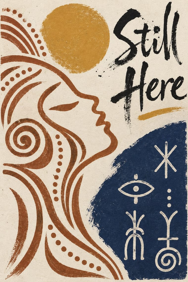
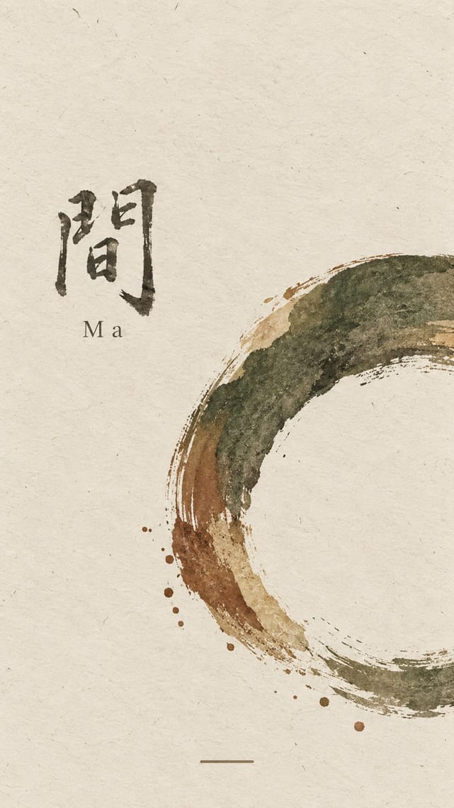
Both make the empty interval carry meaning and place a few elements off-centre in earth colours; uli supplies a living line and named signs where wabi-sabi supplies texture and a single mark.
01
What each style brings
Each part of the design comes from the style with the stronger say in it, and each style gives at least two.
Uli & Nsibidi Line and Sign Tradition Ma & Wabi-sabi Aesthetics
- Type from Ma
- Colour from Uli
- Form from Uli
- Composition from Uli
- Surface from Ma
02
The type
Open fonts standing in for each style’s own type, which is often hand-drawn or commercial.
Text · Uli
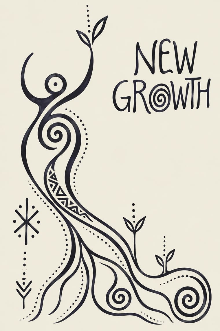
Two linked graphic languages of southeastern Nigeria. Uli is Igbo women's body and wall painting: freehand lines that swell and taper, spirals and small named motifs set asymmetrically on open ground, so gaps count as much as marks. Nsibidi comprises hundreds of pictographic and abstract signs from the Cross River region, kept chiefly by the Ekpe and Mgbe leopard societies and reserved white on indigo ukara cloth. In 1962 Uche Okeke took uli into modern ink drawing; at Nsukka from the 1970s younger artists, Obiora Udechukwu above all, carried uli and later nsibidi into drawing and painting.
Instrument Sans; Uli used Nsibidi signs as an ideographic set, drawn by hand and Uli line and motif repertoire drawn freehand
03
The colours
The ground and leading colours come from Uli, with a counter-accent from Ma. The ink reads on the ground at 4.5:1 or more.
Uli & Nsibidi Line and Sign Tradition Ma & Wabi-sabi Aesthetics
-
#f0ebdfground · 36% -
#1b1a1cink · 14% -
#c4952faccent · 18% -
#7d4e3aaccent · 14% -
#b9a88aaccent · 10% -
#23305aaccent · 8%
As CSS
:root {
  --ground: #f0ebdf;
  --ink: #1b1a1c;
  --accent-1: #c4952f;
  --accent-2: #7d4e3a;
  --accent-3: #b9a88a;
  --accent-4: #23305a;
  --font-display: "Shippori Mincho", serif;
  --font-text: "Instrument Sans", sans-serif;
}
Use it with care
Uli & Nsibidi Line and Sign Tradition: These are living traditions with restricted parts. Nsibidi has a sacred side kept by the Ekpe and Mgbe leopard societies, and ukara cloth is used exclusively by Ekpe members, so never copy society signs or ukara layouts for decoration, merchandise or invented 'secret' meanings; use only signs whose public meaning has been checked with knowledgeable members of the community. Uli is Igbo women's art, which declined after Christian missionaries discouraged it, and the mostly male Nsukka artists were criticised for drawing on it; credit and commission Igbo and Cross River artists, including women painters such as those of the Upa Women Artists Collective, and do not present invented pseudo-nsibidi or generated 'uli' as historical work. Keep the two traditions apart in credit: uli is Igbo women's painting, nsibidi a sign system of Ejagham origin kept by Ekpe and Mgbe men's societies; never label one as the other.
04
The two styles
05
More combinations
With Uli
- Kōwhaiwhai & Toi Māori Design Contrasts · Both build from curving line and balance positive against negative space, but kōwhaiwhai mirrors koru in continuous bands along a rafter, while uli scatters single motifs asymmetrically over open skin, wall or paper.
- Adinkra & Kente Symbol Systems Contrasts · Both put named signs on West African cloth, but adinkra stamps solid silhouettes into a filled grid in one dark dye, while uli draws open line on empty ground and ukara reserves nsibidi signs white in indigo; keep the two sign systems, their meanings and their makers apart.
- Afrofuturist Design Pairs well · Afrofuturism already borrows nsibidi, as in Black Panther's Ancient Wakandan script; keep uli's sparse dark line and real, public signs rather than glowing pseudo-glyphs on deep-space grounds.
- Bògòlanfini Mud Cloth Pairs well · Both leave pale signs in a dark-dyed ground, bògòlan by painting mud around them and ukara by stitching raffia to resist indigo; ukara itself is restricted to Ekpe, so borrow the light-on-dark idea with public signs placed freely, credit each source and keep each motif's meaning.
- Warli Painting Contrasts · Both are women's wall painting built on line; uli usually draws one dark tone on a light ground, skin or paper and leaves wide empty ground around single motifs, the reverse of Warli's white on earth with rows of figures filling the field, so borrow uli's restraint to calm a crowded Warli-derived layout.
- Mithila (Madhubani) Painting Contrasts · Both are women's wall-painting traditions led by line, but uli sets a few swelling lines and named motifs asymmetrically on open ground, so the gaps count, while Mithila closes a symmetrical, bordered field and fills every gap. Set them side by side to show restraint against abundance.
With Ma
- Minimalist Graphic Design Pairs well · Add one rough material or brush mark to a minimalist layout so its emptiness feels lived-in rather than sterile.
- Japanese Postwar Modernism Pairs well · Use a modernist grid but leave whole modules empty, the way Tanaka and Hara let ma structure the page.
- Memphis Design Contrasts · Memphis is loud, synthetic and glossy; set one Memphis squiggle on a vast wabi ground only if you want deliberate friction.
- Scandinavian Functionalism Pairs well · Both prize natural materials and restraint; combine Nordic clarity with wabi irregularity for warm, quiet identities.
- Slow-Living Editorial (the Kinfolk Look) Pairs well · Leonard Koren, author of the 1994 book on wabi-sabi for designers, joined Kinfolk's editorial board in 2016; add a cracked bowl, raw linen or an off-centre object on a bare ground to make the calm less styled and more lived-in.
- Korean Commercial Calligraphy (Kaelligeurapi) Pairs well · Give one brushed word a wide, quiet field of paper-toned space so its dry streaks and pooled ink read as the whole design.
- Rinpa & Saga-bon Contrasts · Both come from Kyoto's tea culture (Kōetsu also made Raku tea bowls), but wabi-sabi wants rough clay and empty paper where Rinpa wants gold leaf and malachite; one bare field can serve either, so choose the material that fills it.
- Supergraphics Contrasts · Quiet, unfinished interiors against loud, total colour make a deliberate counterweight in a mixed scheme.