Style combination · Pairs well
Danmaku Bullet-Comment Overlay × Japanese Dense Web Design
Niconico's comment layer brings the same everything-at-once density to video; pair them for a crowded, participatory Japanese web voice.
Mix them and make something Danmaku Bullet-Comment Overlay Japanese Dense Web Design
01
What each style brings
Each part of the design comes from the style with the stronger say in it, and each style gives at least two.
Danmaku Bullet-Comment Overlay Japanese Dense Web Design
- Type from Japanese Dense Web Design
- Colour from Japanese Dense Web Design
- Form from Japanese Dense Web Design
-
Danmaku Bullet-Comment Overlay avoids borders & frames: this is where the two pull against each other.
- Composition from Danmaku Bullet-Comment Overlay
- Surface from Danmaku Bullet-Comment Overlay
02
The type
Open fonts standing in for each style’s own type, which is often hand-drawn or commercial.
Display · Japanese Dense Web Design
Square
Zen Kaku Gothic New, standing in for Hiragino Kaku Gothic (Jiyukobo; the Hiragino family from 1993), the Apple system gothic, first in the stacks of mhlw.go.jp ('ヒラギノ角ゴ Pro W3') and Rakuten Travel (ProN)
Text · Japanese Dense Web Design
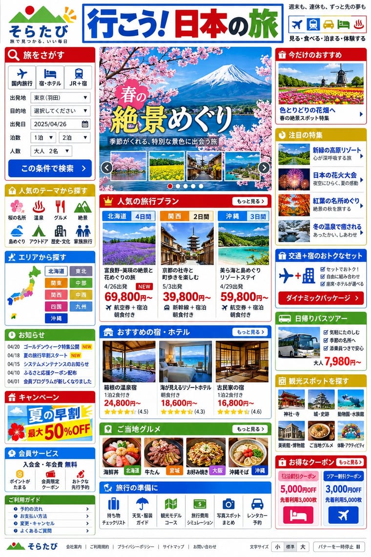
The information-packed look of Japan's big portals, shops, airlines and ministries: three or more narrow columns of boxed modules, crowded with small Japanese text, blue links, tiny thumbnails, dated news lists and rotating ad banners, in bright colours on a white page. Grown from the link directories of the late-1990s portals, often tied to the text-heavy phone web of i-mode, and kept by Yahoo! JAPAN, Rakuten and Kakaku.com into the 2020s, it puts completeness before calm and builds hierarchy with colour and boxes instead of type size.
Zen Kaku Gothic New; Japanese Dense Web Design used MS PGothic (MS Pゴシック), distributed with Windows from Windows 95, the Windows fallback in the font stacks of mhlw.go.jp, kakaku.com and Rakuten Travel and Meiryo (C&G Inc., Eiichi Kōno and Takeharu Suzuki, with Latin letters by Matthew Carter after Verdana), the default Japanese system font from Windows Vista, first in kakaku.com's stack
03
The colours
The ground and leading colours come from Japanese Dense Web Design, with a counter-accent from Danmaku Bullet-Comment Overlay. The ink reads on the ground at 4.5:1 or more.
Danmaku Bullet-Comment Overlay Japanese Dense Web Design
-
#ffffffground · 36% -
#333333ink · 14% -
#0650cbaccent · 18% -
#ff0000accent · 14% -
#bf0000accent · 10% -
#00ffffaccent · 8%
As CSS
:root {
  --ground: #ffffff;
  --ink: #333333;
  --accent-1: #0650cb;
  --accent-2: #ff0000;
  --accent-3: #bf0000;
  --accent-4: #00ffff;
  --font-display: "Zen Kaku Gothic New", sans-serif;
  --font-text: "Zen Kaku Gothic New", sans-serif;
}
Use it with care
Danmaku Bullet-Comment Overlay: Danmaku is moving text that starts on its own, runs longer than five seconds and sits on top of other content, so any design that uses it needs a way to pause, hide or thin it (WCAG 2.2.2, which is why platforms build an off switch) and must keep it clear of faces and captions. Real comments are other people's words over footage someone else owns: write your own lines rather than lifting screenshots, and do not fake an audience's enthusiasm in advertising. A live comment layer can also be used to pile abuse on people, and in mainland China the China Netcasting Services Association's rules for short-video platforms of 9 January 2019 require danmaku to be reviewed before it is shown, so moderate any live use.
Japanese Dense Web Design: Treat this as one Japanese web convention among several, not as a national essence or simply as bad design: commentators argue the density serves readers who want complete information before deciding (McGowan, 2018; Fujitsu Benelux, 2025), and many Japanese brands (MUJI, UNIQLO, POLA) choose minimal sites. Similar density appears on Korean portals such as Naver, which Fujitsu Benelux sets beside Yahoo! JAPAN, and Cruz found other regions that write in CJK characters close to Japan, so do not present it as uniquely Japanese. Dense pages still need accessibility work: offer a text-size control and a pause button for rotating banners, as mhlw.go.jp does, and give headlines lettered as images real text or alt text.
04
The two styles
05
More combinations
With Danmaku Bullet-Comment Overlay
- Kinetic Typography & Variable Type Contrasts · Kinetic type is one designer's choreographed letters; danmaku is hundreds of identical-default lines from strangers. Decide whether motion type should feel authored or crowd-made before borrowing either.
- International Typographic Style Contrasts · Swiss hierarchy gives one message priority; danmaku gives every voice the same size and lets the crowd bury the image. Pin one strict Swiss title in the top lane to stage order against the swarm.
- Internet Ugly & Meme Vernacular Pairs well · Both are crowd vernaculars made to be copied; run numeric memes and outlined white lines over a found clip, but keep danmaku's lanes and timing instead of the image macro's top-and-bottom caption.
- Emoji Pictographic Language Pairs well · Kaomoji and emoji already ride inside danmaku lines; use them as small pictographs in the stream rather than as large isolated icons.
- Demoscene Graphics (Cracktros, Demos & Text-Mode Art) Pairs well · Niconico comment art and text-mode art both draw pictures with characters; borrow text-mode techniques for a title card made of comments.
- VTuber Avatar and Stream Graphics Pairs well · On Bilibili and Niconico, viewers' bullet comments fly across the stream over the avatar. Leave the top lanes clear of the character's face and title, so the crowd's comments and the avatar share the screen without hiding it.
- Korean Variety-Show Captions (Yeneung Jamak) Contrasts · Choose editorial hierarchy, changing faces and illustrated containers for a producer's comic voice; choose equal-weight, separately rendered lanes and repetition for a viewer chorus. Outlined text over video alone does not make the two interchangeable.
With Japanese Dense Web Design
- Emoji Pictographic Language Pairs well · Emoji came out of Japan's phone web (J-Phone in 1997, i-mode in 1999), which commentators also credit with keeping these pages text-heavy; small pictographs set inline with text links add colour and signal to a dense list without taking space.
- Ma & Wabi-sabi Aesthetics Contrasts · Japan's minimalism in the traditional arts and design is what writers on these sites (Zeldman, 2010; Hongkiat) set against them; leave one deliberately empty module in a dense page to make the tension a choice.
- Early Web Vernacular Contrasts · This grew from the early web's link directories and table layouts, but the early web was amateur bricolage on dark tiled grounds, while this is a professional convention on white in system gothics; borrow its column discipline to tame a GeoCities pastiche.
- GOV.UK Design (GDS Style) Contrasts · GOV.UK's one thing per page answers the same public-information brief the opposite way; set mhlw.go.jp beside gov.uk to weigh completeness on one screen against step-by-step disclosure.
- Cyworld Minihompy & Minimi (Korean Mini-Homepage Culture) Contrasts · Both pack framed panels onto one screen, but the Japanese portal informs strangers while the minihompy decorates one person's page for friends.