Style combination · Contrasts
Graffiti × Pixação
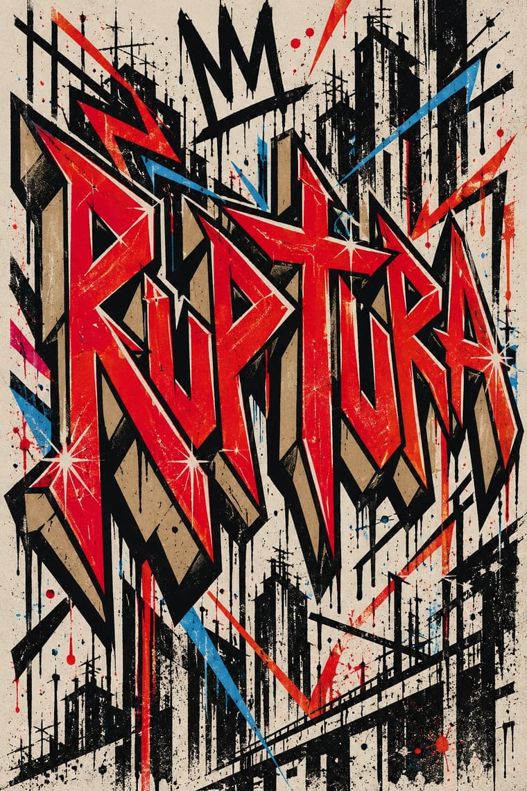
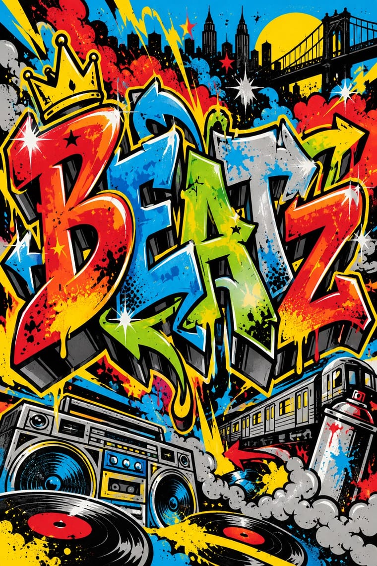
Both write names on walls, and Pesquisa FAPESP lists hip-hop among the 1980s influences on pixação, but graffiti builds the letter into a coloured, outlined, three-dimensional piece with characters, while pixação keeps a flat black straight letter in level rows and goes for height. Brazilian law since 2011 tolerates graffiti made with the owner's consent and keeps pichação a crime, so decide which one the brief needs.
01
What each style brings
Each part of the design comes from the style with the stronger say in it, and each style gives at least two.
Graffiti & Hip-Hop Graphics Pixação (São Paulo Tag Reto)
- Type from Graffiti
- Colour from Pixação
- Form from Pixação
- Composition from Graffiti
-
Pixação avoids illusion of depth and diagonal axis: this is where the two pull against each other, which is the point of the contrast.
- Surface from Graffiti
-
Pixação avoids hard offset shadow: this is where the two pull against each other, which is the point of the contrast.
02
The type
Open fonts standing in for each style’s own type, which is often hand-drawn or commercial.
Text · Pixação
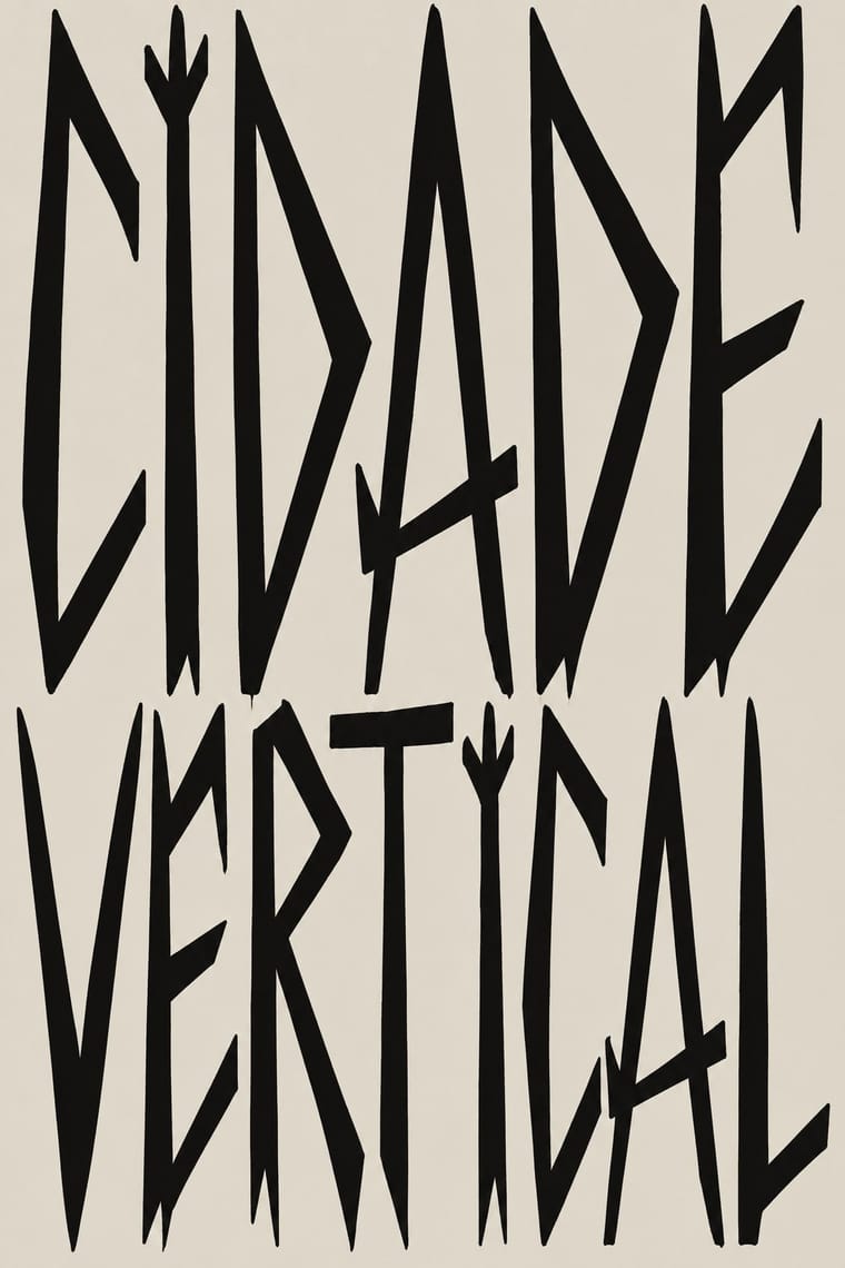
The name-writing of São Paulo's pixadores, which since the 1980s has covered walls and façades and, from the 1990s, the upper floors of tower blocks. Group names and personal tags go up in black latex paint, by roller or spray, in tag reto: a straight, elongated, pointed alphabet taken from the rune-like logos on heavy-metal and punk record sleeves. The letters run in level rows scaled to the building's windows and floors, with no fill, outline or colour. The script is written for other pixadores, and height, risk and reach across the city rank the work.
Oswald; Pixação used Tag reto ('straight tag'), the São Paulo pixo alphabet and Rune-like band logos on 1980s heavy-metal and hard-rock record sleeves (Iron Maiden, AC/DC, Judas Priest, Metallica), within a punk and metal scene: the alphabet's source
03
The colours
The ground and leading colours come from Pixação, with a counter-accent from Graffiti. The ink reads on the ground at 4.5:1 or more.
Graffiti & Hip-Hop Graphics Pixação (São Paulo Tag Reto)
-
#dcd7ccground · 36% -
#121212ink · 14% -
#b39f7faccent · 18% -
#e4002baccent · 14% -
#00a3e0accent · 10% -
#5e5b56accent · 8%
As CSS
:root {
  --ground: #dcd7cc;
  --ink: #121212;
  --accent-1: #b39f7f;
  --accent-2: #e4002b;
  --accent-3: #00a3e0;
  --accent-4: #5e5b56;
  --font-display: "Sedgwick Ave Display", cursive;
  --font-text: "Oswald", sans-serif;
}
Use it with care
Pixação (São Paulo Tag Reto): Pixação is a living, illegal practice of real groups: under Brazil's Law 12.408 of 2011 pichação remains a crime punishable by three months to a year in detention, while consented graffiti is not, and pixadores risk their lives climbing buildings. Do not copy a real group's letreiro, tag or grife emblem (inside the movement someone who signs a group's name without its owner's permission is a 'clone' and loses respect), and do not invent fake crew names in the style for a brand. If a project wants the look, commission and credit pixadores such as Cripta Djan, and do not use it as edgy decoration while people who write it are still prosecuted and jailed.
04
The two styles
05
More combinations
With Graffiti
- International Typographic Style Contrasts · Put a single tag or throw-up over a strict Swiss grid to stage the clash between institutional order and a street voice.
- Corporate Identity Modernism Contrasts · Use graffiti as the foil to corporate identity: a painted name over a logo makes the ownership of public space visible.
- Pop Art Graphics Pairs well · Pair letter-pieces with Ben-Day comic panels and bold outlines, as 1980s gallery graffiti often did, for a street-meets-gallery look.
- Hype Streetwear Graphics (Box Logo to Quotation Marks) Pairs well · Streetwear grew out of New York hip-hop dress; pair a set geometric wordmark with a hand-drawn graffiti piece for a back print, but keep the logo flat and centred so the tag reads as the decoration and the box as the brand.
- Stencil Street Art Contrasts · Both use spray paint in the street, but graffiti makes the writer's name a freehand, many-coloured letter-sculpture with 3D blocks and fades; stencil art sprays a reproducible photographic picture in black. Decide which one the brief needs before mixing them.
- Guochao (China-Chic National Trend) Pairs well · Guochao's streetwear wing already borrows hip-hop lockups; treat a brush character as the tag and keep the heritage palette.
- Black Lives Matter Street Murals Contrasts · Graffiti writers paint their own names on walls and trains, uninvited and in letters few outsiders can read; these murals lay one shared, legible slogan on the road, usually with the city's permission. Let a writer fill one letter, as Sam Sneke did in Seattle, without turning the slogan into a piece.
- Matatu & Nganya Art Pairs well · The source of its names, catchphrases and heroes: take graffiti's wildstyle and bubble lettering for the vehicle name and keep the matatu's photoreal portrait as the focal point.
With Pixação
- Gothic Blackletter & Fraktur Tradition Pairs well · Tag reto descends from gothic and runic forms by way of metal logos; set a textura line above a row of straight, pointed tag-reto letters, both in black, to show the lineage from the book page to the façade.
- Brazilian Concrete Design Contrasts · São Paulo's two letter cultures met at the Bienal: concrete design grew out of the first Bienal in 1951, and pixadores wrote across the 28th in 2008. A rational sans on a grid against a wall of tag reto stages the city's divide between institutional modernism and the periphery.
- Punk & DIY Zine Pairs well · The first pixadores took their letters from metal and punk sleeves; a black-and-white xerox gig flyer with a tag-reto band name keeps the same underground loyalty without going onto a wall.
- Lambe-Lambe Posters (Brazilian Paste-Up Street Posters) Contrasts · Both are Brazilian urban wall practices, but lambes are pasted paper with illustration, collage and photography in series, while pixação is painted lettering; compare the medium, not the politics.