Style combination · Contrasts
Brazilian Concrete Design × Pixação
São Paulo's two letter cultures met at the Bienal: concrete design grew out of the first Bienal in 1951, and pixadores wrote across the 28th in 2008. A rational sans on a grid against a wall of tag reto stages the city's divide between institutional modernism and the periphery.
Mix them and make something Brazilian Concrete Design Pixação
01
What each style brings
Each part of the design comes from the style with the stronger say in it, and each style gives at least two.
Brazilian Concrete Design Pixação (São Paulo Tag Reto)
- Type from Pixação
- Colour from Brazilian Concrete Design
- Form from Brazilian Concrete Design
- Composition from Brazilian Concrete Design
- Surface from Pixação
02
The type
Open fonts standing in for each style’s own type, which is often hand-drawn or commercial.
Display · Pixação
Order
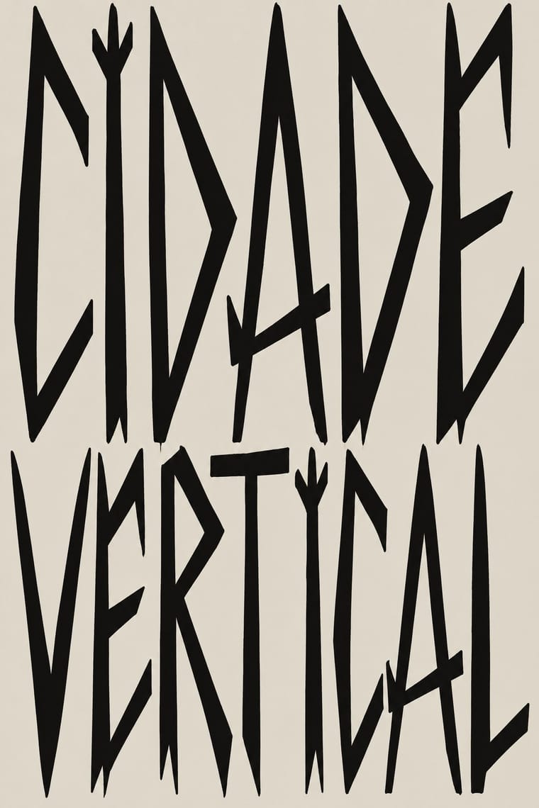
Sedgwick Ave Display, standing in for Tag reto ('straight tag'), the São Paulo pixo alphabet: straight, long, pointed strokes; each group's letreiro is fixed by its owner, who gives new members a sketch to practise
Text · Brazilian Concrete Design
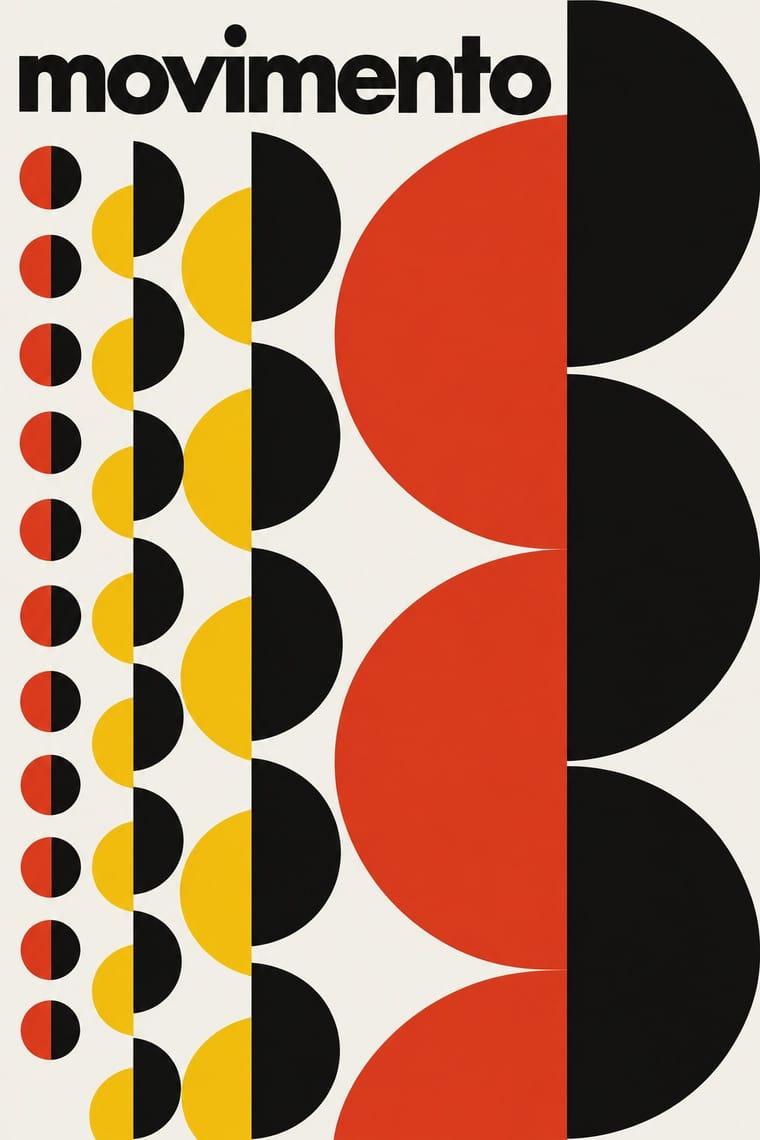
A São Paulo and Rio movement in which concrete art, concrete poetry and Brazil's first design offices shared one vocabulary: Max Bill's mathematically generated geometry, serial repetition and sans-serif type. Sparked by Bill's 1951 retrospective at MASP and the first São Paulo Bienal, it passed through Ulm via Alexandre Wollner into Forminform (1957) and ESDI (1963), producing rigorous trademarks, posters and a celebrated newspaper redesign.
Jost; Brazilian Concrete Design used Futura and Akzidenz-Grotesk
03
The colours
The ground and leading colours come from Brazilian Concrete Design, with a counter-accent from Pixação. The ink reads on the ground at 4.5:1 or more.
Brazilian Concrete Design Pixação (São Paulo Tag Reto)
-
#f4f2ecground · 36% -
#121212ink · 14% -
#f3c316accent · 18% -
#b39f7faccent · 14% -
#e2361faccent · 10% -
#1f4e9eaccent · 8%
As CSS
:root {
  --ground: #f4f2ec;
  --ink: #121212;
  --accent-1: #f3c316;
  --accent-2: #b39f7f;
  --accent-3: #e2361f;
  --accent-4: #1f4e9e;
  --font-display: "Sedgwick Ave Display", cursive;
  --font-text: "Jost", sans-serif;
}
Use it with care
Pixação (São Paulo Tag Reto): Pixação is a living, illegal practice of real groups: under Brazil's Law 12.408 of 2011 pichação remains a crime punishable by three months to a year in detention, while consented graffiti is not, and pixadores risk their lives climbing buildings. Do not copy a real group's letreiro, tag or grife emblem (inside the movement someone who signs a group's name without its owner's permission is a 'clone' and loses respect), and do not invent fake crew names in the style for a brand. If a project wants the look, commission and credit pixadores such as Cripta Djan, and do not use it as edgy decoration while people who write it are still prosecuted and jailed.
04
The two styles
05
More combinations
With Brazilian Concrete Design
- Op Art Graphics Pairs well · Maluf's repeated rectangles already vibrate; push the serial module towards op moiré for a kinetic poster that stays constructed.
- Taller de Gráfica Popular Contrasts · Mexico's figurative, militant linocuts are Latin America's other modernism; contrast them to choose between abstraction and narrative.
- International Typographic Style Pairs well · Bring concrete poetry's spatial word-play into a Swiss grid to make typographic layouts that read as images.
- Andean Woven Graphic Systems Pairs well · Both vary a single module serially; apply the Wari rule of rotating and compressing one unit across a field to a systematic poster or identity.
- Tropicália Graphic Design Contrasts · The Brazilian rational design Duarte trained beside and then swallowed: the 1964 Deus e o Diabo poster keeps concrete's lowercase Helvetica and aligned text blocks, then splits them with one cut-out figure in a sun; the 1968 covers drop the grid altogether.
- Literatura de Cordel Woodcut Contrasts · Brazil's concrete designers worked in the same decades with grids and sans-serifs; set a cordel woodcut against concrete typography for a sharp sertão-versus-São Paulo tension.
- Brazilian Modernismo Graphics (Klaxon and the Semana de 22) Pairs well · Almeida's tumbled LACTA advertisement gained new meaning once concrete poetry arrived in the 1950s. Set a Klaxon-style word image on a concrete grid to keep the play of letters but discipline its spacing.
- Zagreb Modernist Graphics (EXAT 51 to Teatar &TD) Contrasts · The nearest genome: São Paulo and Zagreb both turned constructive geometry and serial units into posters from 1951. Brazilian concrete design prints offset for industry and the press, sets a few geometric elements in tension with a white ground and stays strictly non-figurative; Zagreb screenprints for a gallery and a student theatre, runs one multiplied unit across the sheet, sometimes on metallic paper, against a small band of lowercase grotesque, and with Arsovski breaks the system with photo collage, pop quotation and rebus titles.
With Pixação
- Graffiti & Hip-Hop Graphics Contrasts · Both write names on walls, and Pesquisa FAPESP lists hip-hop among the 1980s influences on pixação, but graffiti builds the letter into a coloured, outlined, three-dimensional piece with characters, while pixação keeps a flat black straight letter in level rows and goes for height. Brazilian law since 2011 tolerates graffiti made with the owner's consent and keeps pichação a crime, so decide which one the brief needs.
- Gothic Blackletter & Fraktur Tradition Pairs well · Tag reto descends from gothic and runic forms by way of metal logos; set a textura line above a row of straight, pointed tag-reto letters, both in black, to show the lineage from the book page to the façade.
- Punk & DIY Zine Pairs well · The first pixadores took their letters from metal and punk sleeves; a black-and-white xerox gig flyer with a tag-reto band name keeps the same underground loyalty without going onto a wall.
- Lambe-Lambe Posters (Brazilian Paste-Up Street Posters) Contrasts · Both are Brazilian urban wall practices, but lambes are pasted paper with illustration, collage and photography in series, while pixação is painted lettering; compare the medium, not the politics.