Style combination · Pairs well
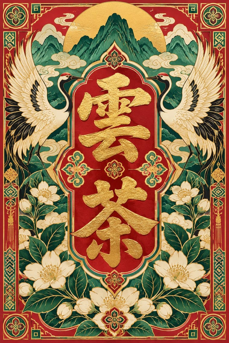
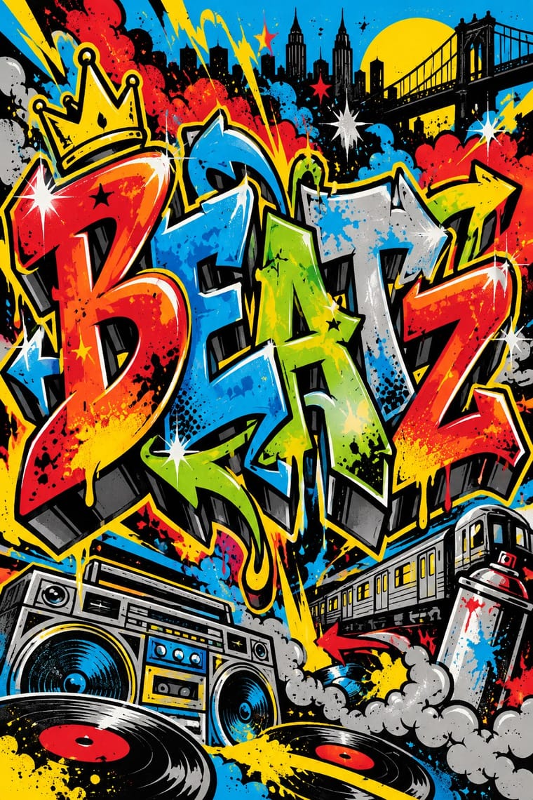
Guochao × Graffiti
Guochao's streetwear wing already borrows hip-hop lockups; treat a brush character as the tag and keep the heritage palette.
01
What each style brings
Each part of the design comes from the style with the stronger say in it, and each style gives at least two.
Guochao (China-Chic National Trend) Graffiti & Hip-Hop Graphics
- Type from Guochao
- Colour from Guochao
- Form from Guochao
- Composition from Graffiti
- Surface from Graffiti
02
The type
Open fonts standing in for each style’s own type, which is often hand-drawn or commercial.
Display · Guochao
Daydream
Kaushan Script, standing in for Bold brush calligraphy (kaishu and xingshu) for hero characters
Text · Graffiti
Born on New York's subway cars and Bronx party flyers, graffiti writing turns the writer's name into a monumental letter-sculpture: bubble, block and wildstyle letters with arrows, 3D drop shadows, fades and highlights, painted freehand in aerosol. Hip-hop's flyers, sleeves and logos carried the same lettering, cartoon characters and street swagger into print and then around the world.
Special Elite; Graffiti used Wildstyle lettering and Bubble letters
03
The colours
The ground and leading colours come from Guochao, with a counter-accent from Graffiti. The ink reads on the ground at 4.5:1 or more.
Guochao (China-Chic National Trend) Graffiti & Hip-Hop Graphics
-
#161616ground · 36% -
#f3ead8ink · 14% -
#e3b33baccent · 18% -
#e4002baccent · 14% -
#b8232faccent · 10% -
#00a3e0accent · 8%
As CSS
:root {
  --ground: #161616;
  --ink: #f3ead8;
  --accent-1: #e3b33b;
  --accent-2: #e4002b;
  --accent-3: #b8232f;
  --accent-4: #00a3e0;
  --font-display: "Kaushan Script", cursive;
  --font-text: "Special Elite", monospace;
}
Use it with care
Guochao (China-Chic National Trend): Guochao often lifts ethnic-minority crafts (Miao silverwork and embroidery, Dai and Mongolian motifs) and intangible-heritage techniques as packaging finishes. Credit and pay the communities and craftspeople whose patterns are used, commission or collaborate with practitioners rather than copying motifs, and remember that dragons, imperial yellow and national symbols carry political as well as decorative meaning.
04
The two styles
05
More combinations
With Guochao
- Nianhua & Chinese Folk Print Pairs well · Redraw door gods, carp and auspicious babies as clean vector characters for limited-edition packaging, keeping each rebus's meaning intact.
- DTC 'Blanding' / Millennial Minimalism Contrasts · Western direct-to-consumer brands strip identity to pastel sans-serif minimalism; guochao sells ornament and heritage instead, so use one to test the other.
- Shanghai Modern & Yuefenpai Pairs well · Republican-era meishuzi lettering and calendar-poster borders give guochao packaging period depth beyond imperial red and gold.
- Dazibao (Big-Character Posters) Contrasts · Both make huge characters the whole message; compare the handwritten political urgency of the big-character poster with guochao's polished commercial heritage.
- Contemporary Chinese Book Design ('Most Beautiful Books of China') Contrasts · Guochao shouts Chinese heritage with saturated jewel colours, gloss and folk motifs on packaging; these books whisper it with bare paper, thread, one red and at most a matte gilt edge, so choose between the loud and the quiet national voice.
- Chinese Calligraphy & Seal Carving (Shufa & Zhuanke) Pairs well · Guochao branding borrows brush characters and red seals; commission real calligraphy and a properly cut seal instead of a generic brush-texture font and a fake stamp.
- Chinese National-Style Animation (Shanghai Animation Film Studio) Pairs well · For China-chic packaging and campaigns, borrow the method (an opera-mask face, scrolling clouds, an ink wash on empty paper) rather than quoting the studio's licensed characters.
- Chinese Paper-Cut (Jianzhi) Pairs well · Guochao packaging borrows red cut-paper silhouettes; keep the real cut logic (joined lines, folded symmetry, correct auspicious characters) instead of a generic filigree texture.
With Graffiti
- International Typographic Style Contrasts · Put a single tag or throw-up over a strict Swiss grid to stage the clash between institutional order and a street voice.
- Corporate Identity Modernism Contrasts · Use graffiti as the foil to corporate identity: a painted name over a logo makes the ownership of public space visible.
- Pop Art Graphics Pairs well · Pair letter-pieces with Ben-Day comic panels and bold outlines, as 1980s gallery graffiti often did, for a street-meets-gallery look.
- Hype Streetwear Graphics (Box Logo to Quotation Marks) Pairs well · Streetwear grew out of New York hip-hop dress; pair a set geometric wordmark with a hand-drawn graffiti piece for a back print, but keep the logo flat and centred so the tag reads as the decoration and the box as the brand.
- Pixação (São Paulo Tag Reto) Contrasts · Both write names on walls, and Pesquisa FAPESP lists hip-hop among the 1980s influences on pixação, but graffiti builds the letter into a coloured, outlined, three-dimensional piece with characters, while pixação keeps a flat black straight letter in level rows and goes for height. Brazilian law since 2011 tolerates graffiti made with the owner's consent and keeps pichação a crime, so decide which one the brief needs.
- Stencil Street Art Contrasts · Both use spray paint in the street, but graffiti makes the writer's name a freehand, many-coloured letter-sculpture with 3D blocks and fades; stencil art sprays a reproducible photographic picture in black. Decide which one the brief needs before mixing them.
- Black Lives Matter Street Murals Contrasts · Graffiti writers paint their own names on walls and trains, uninvited and in letters few outsiders can read; these murals lay one shared, legible slogan on the road, usually with the city's permission. Let a writer fill one letter, as Sam Sneke did in Seattle, without turning the slogan into a piece.
- Matatu & Nganya Art Pairs well · The source of its names, catchphrases and heroes: take graffiti's wildstyle and bubble lettering for the vehicle name and keep the matatu's photoreal portrait as the focal point.