Style combination · Pairs well
Pixação × Punk
The first pixadores took their letters from metal and punk sleeves; a black-and-white xerox gig flyer with a tag-reto band name keeps the same underground loyalty without going onto a wall.
01
What each style brings
Each part of the design comes from the style with the stronger say in it, and each style gives at least two.
Pixação (São Paulo Tag Reto) Punk & DIY Zine
- Type from Pixação
- Colour from Punk
- Form from Pixação
- Composition from Pixação
-
Punk avoids modular grid: this is where the two pull against each other.
- Surface from Punk
02
The type
Open fonts standing in for each style’s own type, which is often hand-drawn or commercial.
Display · Pixação
Riot
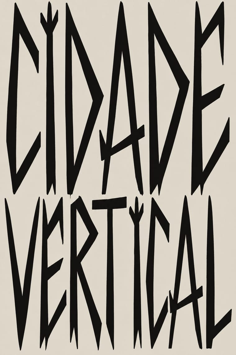
Sedgwick Ave Display, standing in for Tag reto ('straight tag'), the São Paulo pixo alphabet: straight, long, pointed strokes; each group's letreiro is fixed by its owner, who gives new members a sketch to practise
Text · Punk
The graphic voice of punk rock in fanzines, record sleeves and gig flyers: images and words cut from newspapers, typed or scrawled, pasted down and run off on a photocopier. Deliberate crudeness, ransom-note lettering and hijacked mass-media imagery turned cheap reproduction into an anti-professional statement of autonomy and dissent.
Courier Prime; Punk used Ransom-note cut-out lettering and Typewriter faces
03
The colours
The ground and leading colours come from Punk, with a counter-accent from Pixação. The ink reads on the ground at 4.5:1 or more.
Pixação (São Paulo Tag Reto) Punk & DIY Zine
-
#f2efe6ground · 36% -
#0d0d0dink · 14% -
#ff2fa0accent · 18% -
#b39f7faccent · 14% -
#d7191caccent · 10% -
#5e5b56accent · 8%
As CSS
:root {
  --ground: #f2efe6;
  --ink: #0d0d0d;
  --accent-1: #ff2fa0;
  --accent-2: #b39f7f;
  --accent-3: #d7191c;
  --accent-4: #5e5b56;
  --font-display: "Sedgwick Ave Display", cursive;
  --font-text: "Courier Prime", monospace;
}
Use it with care
Pixação (São Paulo Tag Reto): Pixação is a living, illegal practice of real groups: under Brazil's Law 12.408 of 2011 pichação remains a crime punishable by three months to a year in detention, while consented graffiti is not, and pixadores risk their lives climbing buildings. Do not copy a real group's letreiro, tag or grife emblem (inside the movement someone who signs a group's name without its owner's permission is a 'clone' and loses respect), and do not invent fake crew names in the style for a brand. If a project wants the look, commission and credit pixadores such as Cripta Djan, and do not use it as edgy decoration while people who write it are still prosecuted and jailed.
04
The two styles
05
More combinations
With Pixação
- Graffiti & Hip-Hop Graphics Contrasts · Both write names on walls, and Pesquisa FAPESP lists hip-hop among the 1980s influences on pixação, but graffiti builds the letter into a coloured, outlined, three-dimensional piece with characters, while pixação keeps a flat black straight letter in level rows and goes for height. Brazilian law since 2011 tolerates graffiti made with the owner's consent and keeps pichação a crime, so decide which one the brief needs.
- Gothic Blackletter & Fraktur Tradition Pairs well · Tag reto descends from gothic and runic forms by way of metal logos; set a textura line above a row of straight, pointed tag-reto letters, both in black, to show the lineage from the book page to the façade.
- Brazilian Concrete Design Contrasts · São Paulo's two letter cultures met at the Bienal: concrete design grew out of the first Bienal in 1951, and pixadores wrote across the 28th in 2008. A rational sans on a grid against a wall of tag reto stages the city's divide between institutional modernism and the periphery.
- Lambe-Lambe Posters (Brazilian Paste-Up Street Posters) Contrasts · Both are Brazilian urban wall practices, but lambes are pasted paper with illustration, collage and photography in series, while pixação is painted lettering; compare the medium, not the politics.
With Punk
- Russian Constructivism Pairs well · Borrow Constructivist diagonals and red-and-black bars to give punk collage the agitprop structure post-punk sleeves later adopted.
- Risograph & Indie Print Culture Pairs well · Run punk collages through a riso in fluoro pink and black to keep the DIY ethic while gaining richer, layered colour.
- Corporate Identity Modernism Contrasts · Deface a clean corporate identity with xerox collage to make the critique of polish and authority explicit.
- Frutiger Aero Contrasts · Glossy optimism is everything punk rejects; one torn xerox fragment on an aero gradient reads as instant sabotage.
- Fluxus Graphics (Maciunas) Contrasts · Both mix found type with appropriated pictures, but punk tears and photocopies while Fluxus keeps a clean offset black, justified blocks and a tight edge-to-edge grid; use the Fluxus version when cheap materials should still look ordered.
- Natural Wine Label Art Pairs well · Alice Feiring calls the earlier natural-wine scene punk rock: of Gut Oggau she says 'This is where things grow up and stop being so punk rock' (Punch, 2021). Take punk's refusal of professional polish but drop the collage and the anger: one felt-pen picture on a white label carries the same do-it-yourself stance in a friendlier voice.
- Grapus (French Militant Graphic Collective) Contrasts · Both scribble over photographs, but punk's photocopied blacks and ransom-note type are cheap and nihilist, while Grapus prints bright offset colour, mostly on white, in an optimistic, party-backed voice.
- Situationist Détournement Graphics Contrasts · Punk reprised the situationist prank in the late 1970s, but it packs torn photocopies and mixed type into crowded pages; détournement keeps a few recognisable fragments and lets each one say the opposite of what it said. Borrow the rewritten balloon when a punk layout needs a sharper argument.