Style combination · Contrasts
Corporate Identity Modernism × Graffiti
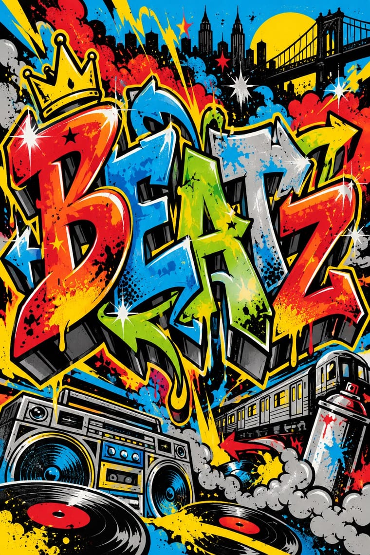
Use graffiti as the foil to corporate identity: a painted name over a logo makes the ownership of public space visible.
Mix them and make something Corporate Identity Modernism Graffiti
01
What each style brings
Each part of the design comes from the style with the stronger say in it, and each style gives at least two.
Corporate Identity Modernism Graffiti & Hip-Hop Graphics
- Type from Graffiti
- Colour from Corporate Identity Modernism
- Form from Corporate Identity Modernism
- Composition from Corporate Identity Modernism
- Surface from Graffiti
02
The type
Open fonts standing in for each style’s own type, which is often hand-drawn or commercial.
Text · Corporate Identity Modernism
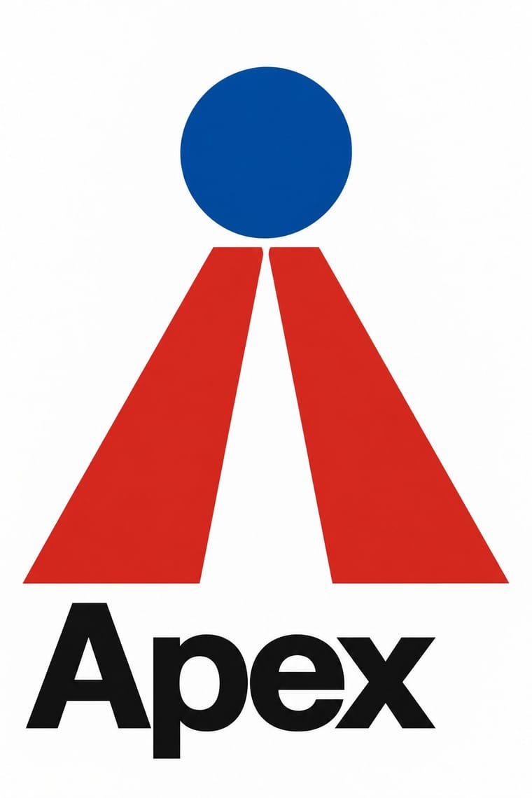
Modernist reduction applied to corporate communication. A company's whole public face (trademark, logotype, stationery, packaging, vehicles and signage) was unified by an abstract symbol, a single typeface and one colour, all policed by a graphic standards manual. Pioneered by Paul Rand, Chermayeff & Geismar, Unimark and Lippincott & Margulies, it made the reductive mark and the grid the visual language of multinational business and government.
Inter; Corporate Identity Modernism used Helvetica and Univers
03
The colours
The ground and leading colours come from Corporate Identity Modernism, with a counter-accent from Graffiti. The ink reads on the ground at 4.5:1 or more.
Corporate Identity Modernism Graffiti & Hip-Hop Graphics
-
#ffffffground · 36% -
#111111ink · 14% -
#d7261eaccent · 18% -
#0a4fa0accent · 14% -
#00a3e0accent · 10% -
#a4a9adaccent · 8%
As CSS
:root {
  --ground: #ffffff;
  --ink: #111111;
  --accent-1: #d7261e;
  --accent-2: #0a4fa0;
  --accent-3: #00a3e0;
  --accent-4: #a4a9ad;
  --font-display: "Sedgwick Ave Display", cursive;
  --font-text: "Inter", sans-serif;
}
04
The two styles
05
More combinations
With Corporate Identity Modernism
- Corporate Memphis Contrasts · Its successor trades abstract authority for rubbery friendliness; compare the two to decide how institutional or human a brand should feel.
- Generative & Dynamic Identities Pairs well · Keep the manual's mark, colour and grid as constants and let generative rules vary one parameter, so the system still reads as one company.
- Flat Design Pairs well · Flat UI inherits these reductive marks; reuse their clear-space and colour-code discipline when scaling icons across screens.
- Punk & DIY Zine Contrasts · Punk's ransom-note lettering is the anti-manual; one torn, xeroxed element against a corporate grid reads instantly as critique.
- Plakatstil / Sachplakat Pairs well · Its brand-name-plus-object formula prefigures logo-led identity; pair it with a modernist grid for confident product campaigns.
- Risograph & Indie Print Culture Contrasts · Exact Pantone-matched corporate colour is the opposite of riso's drifting inks; use the contrast to signal independence.
- Contemporary Arabic & Dual-Script Type Design Pairs well · Roll a matched Arabic–Latin family through a standards manual so both scripts carry the identity with equal authority.
- Milanese Industrial Modernism (Olivetti, Pirelli, Studio Boggeri) Contrasts · American corporate identity policed one mark through a manual, while Milan let artists vary the language; compare the two when deciding how strict a brand system should be.
With Graffiti
- International Typographic Style Contrasts · Put a single tag or throw-up over a strict Swiss grid to stage the clash between institutional order and a street voice.
- Pop Art Graphics Pairs well · Pair letter-pieces with Ben-Day comic panels and bold outlines, as 1980s gallery graffiti often did, for a street-meets-gallery look.
- Hype Streetwear Graphics (Box Logo to Quotation Marks) Pairs well · Streetwear grew out of New York hip-hop dress; pair a set geometric wordmark with a hand-drawn graffiti piece for a back print, but keep the logo flat and centred so the tag reads as the decoration and the box as the brand.
- Pixação (São Paulo Tag Reto) Contrasts · Both write names on walls, and Pesquisa FAPESP lists hip-hop among the 1980s influences on pixação, but graffiti builds the letter into a coloured, outlined, three-dimensional piece with characters, while pixação keeps a flat black straight letter in level rows and goes for height. Brazilian law since 2011 tolerates graffiti made with the owner's consent and keeps pichação a crime, so decide which one the brief needs.
- Stencil Street Art Contrasts · Both use spray paint in the street, but graffiti makes the writer's name a freehand, many-coloured letter-sculpture with 3D blocks and fades; stencil art sprays a reproducible photographic picture in black. Decide which one the brief needs before mixing them.
- Guochao (China-Chic National Trend) Pairs well · Guochao's streetwear wing already borrows hip-hop lockups; treat a brush character as the tag and keep the heritage palette.
- Black Lives Matter Street Murals Contrasts · Graffiti writers paint their own names on walls and trains, uninvited and in letters few outsiders can read; these murals lay one shared, legible slogan on the road, usually with the city's permission. Let a writer fill one letter, as Sam Sneke did in Seattle, without turning the slogan into a piece.
- Matatu & Nganya Art Pairs well · The source of its names, catchphrases and heroes: take graffiti's wildstyle and bubble lettering for the vehicle name and keep the matatu's photoreal portrait as the focal point.