Style combination · Contrasts
Lambe-Lambe Posters × Pixação
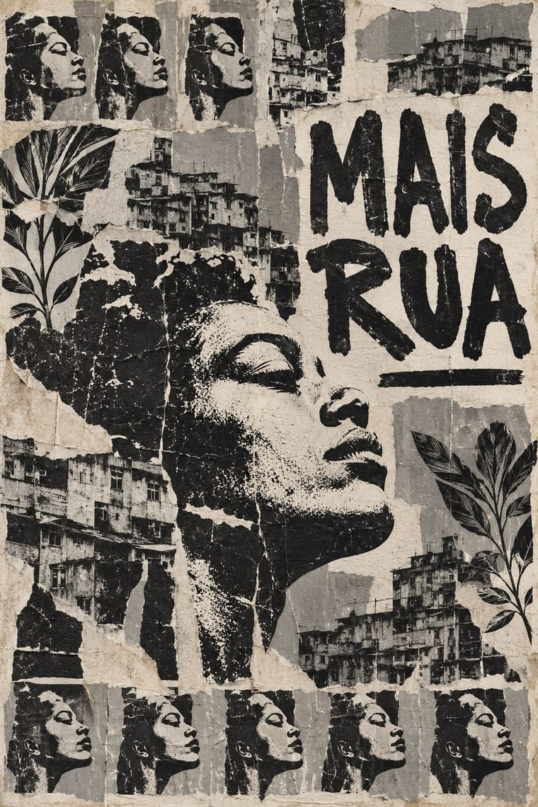
Both are Brazilian urban wall practices, but lambes are pasted paper with illustration, collage and photography in series, while pixação is painted lettering; compare the medium, not the politics.
01
What each style brings
Each part of the design comes from the style with the stronger say in it, and each style gives at least two.
Lambe-Lambe Posters (Brazilian Paste-Up Street Posters) Pixação (São Paulo Tag Reto)
- Type from Pixação
- Colour from Pixação
- Form from Pixação
- Composition from Lambe-Lambe Posters
- Surface from Lambe-Lambe Posters
02
The type
Open fonts standing in for each style’s own type, which is often hand-drawn or commercial.
Display · Pixação
Loud
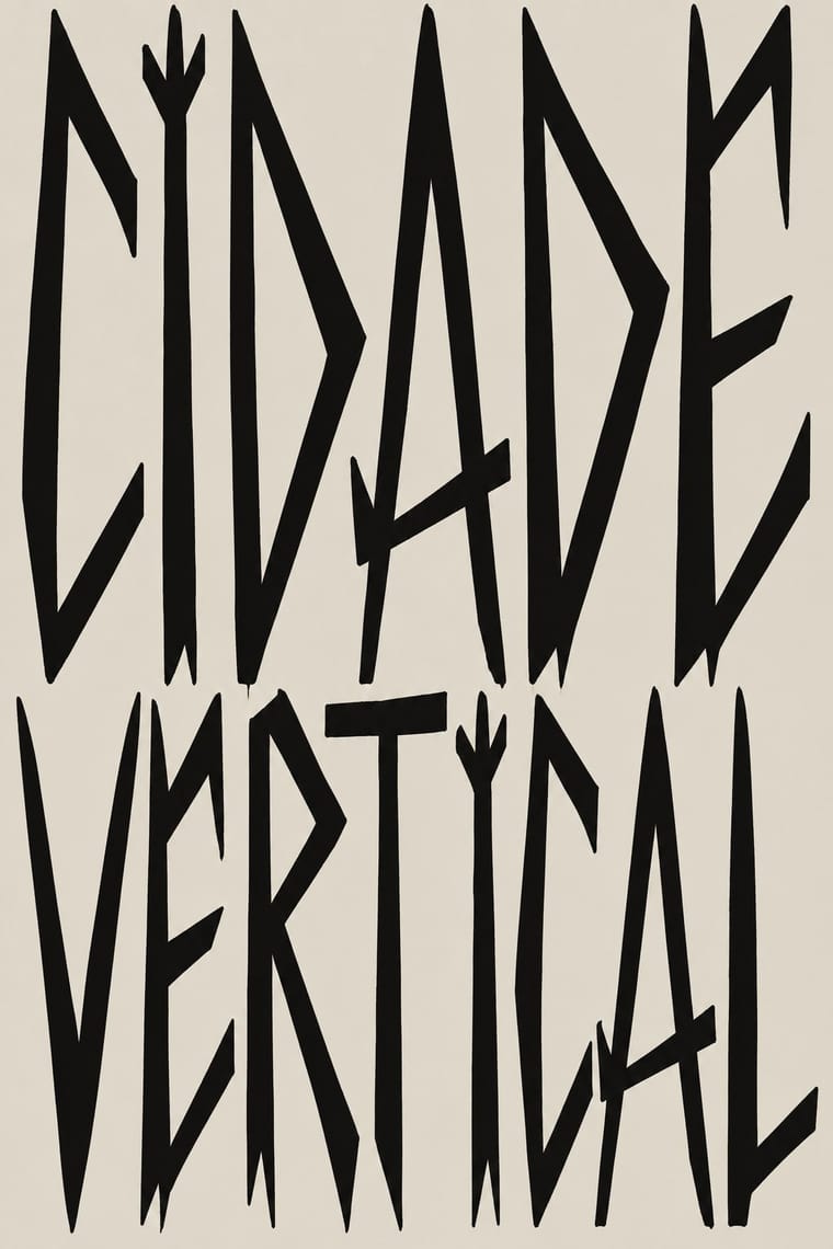
Sedgwick Ave Display, standing in for Tag reto ('straight tag'), the São Paulo pixo alphabet: straight, long, pointed strokes; each group's letreiro is fixed by its owner, who gives new members a sketch to practise
Text · Lambe-Lambe Posters
Paper posters and stickers in sheets of varying sizes, pasted with hand-made glue onto walls, poles and bins in densely urbanised Brazilian cities. Derived from the language of graffiti, lambes combine illustration, collage and photography, and repeat mass-reproduced images in series. Unlike a commercial cartaz they carry a critical, questioning message about social issues.
Oswald; Lambe-Lambe Posters used Hand-drawn lettering, where present and Whatever display lettering the artist supplies; no typeface is established for the form
03
The colours
The ground and leading colours come from Pixação, with a counter-accent from Lambe-Lambe Posters. The ink reads on the ground at 4.5:1 or more.
Lambe-Lambe Posters (Brazilian Paste-Up Street Posters) Pixação (São Paulo Tag Reto)
-
#dcd7ccground · 44% -
#121212ink · 17% -
#b39f7faccent · 22% -
#5e5b56accent · 17%
As CSS
:root {
  --ground: #dcd7cc;
  --ink: #121212;
  --accent-1: #b39f7f;
  --accent-2: #5e5b56;
  --font-display: "Sedgwick Ave Display", cursive;
  --font-text: "Oswald", sans-serif;
}
Use it with care
Lambe-Lambe Posters (Brazilian Paste-Up Street Posters): Lambe-lambe here means the critical street-poster practice, not the commercial cartaz (advertising) or circus posters, which are a separate lineage. Wikipedia also links Latin American posters of the 1960s to late 1980s to protest against military regimes, including in Rio de Janeiro and São Paulo; this entry covers the contemporary urban scene documented by 2015-2016 studies, and its start date of 2010 is an approximation, not a sourced origin. Lambes are political and critical speech, often about social inequality; do not borrow the look as a decorative or commercial 'edgy' skin. Visual traits beyond illustration, collage, photography, serial repetition and wall pasting (lettering, photocopy, stencil, ink count) are not established by the sources read, so they are held at low weight; the palette is a neutral paper-and-ink approximation, not sampled from posters. The Fortaleza 2016 and ANPAP 2017 papers could not be verified and are not relied on. Pixação is a separate Brazilian practice with its own entry. The Luis Alvaz sticker is the only named maker found; the exemplars are otherwise scholarship, not posters.
Pixação (São Paulo Tag Reto): Pixação is a living, illegal practice of real groups: under Brazil's Law 12.408 of 2011 pichação remains a crime punishable by three months to a year in detention, while consented graffiti is not, and pixadores risk their lives climbing buildings. Do not copy a real group's letreiro, tag or grife emblem (inside the movement someone who signs a group's name without its owner's permission is a 'clone' and loses respect), and do not invent fake crew names in the style for a brand. If a project wants the look, commission and credit pixadores such as Cripta Djan, and do not use it as edgy decoration while people who write it are still prosecuted and jailed.
04
The two styles
05
More combinations
With Lambe-Lambe Posters
- Stencil Street Art Pairs well · Both descend from or sit beside graffiti culture in the street; pair a pasted series with a painted element only where a project needs both.
- International Typographic Style Contrasts · Order from a rigorous grid and neutral type set against order built by repeating pasted sheets by hand.
- Latin American Feminist Protest Graphics (Ni Una Menos and the Green Wave) Contrasts · A later Argentine protest-graphics movement; compare how a campaign gets a unified look by shared symbol versus by serial pasting of varied images.
With Pixação
- Graffiti & Hip-Hop Graphics Contrasts · Both write names on walls, and Pesquisa FAPESP lists hip-hop among the 1980s influences on pixação, but graffiti builds the letter into a coloured, outlined, three-dimensional piece with characters, while pixação keeps a flat black straight letter in level rows and goes for height. Brazilian law since 2011 tolerates graffiti made with the owner's consent and keeps pichação a crime, so decide which one the brief needs.
- Gothic Blackletter & Fraktur Tradition Pairs well · Tag reto descends from gothic and runic forms by way of metal logos; set a textura line above a row of straight, pointed tag-reto letters, both in black, to show the lineage from the book page to the façade.
- Brazilian Concrete Design Contrasts · São Paulo's two letter cultures met at the Bienal: concrete design grew out of the first Bienal in 1951, and pixadores wrote across the 28th in 2008. A rational sans on a grid against a wall of tag reto stages the city's divide between institutional modernism and the periphery.
- Punk & DIY Zine Pairs well · The first pixadores took their letters from metal and punk sleeves; a black-and-white xerox gig flyer with a tag-reto band name keeps the same underground loyalty without going onto a wall.