Style combination · Pairs well
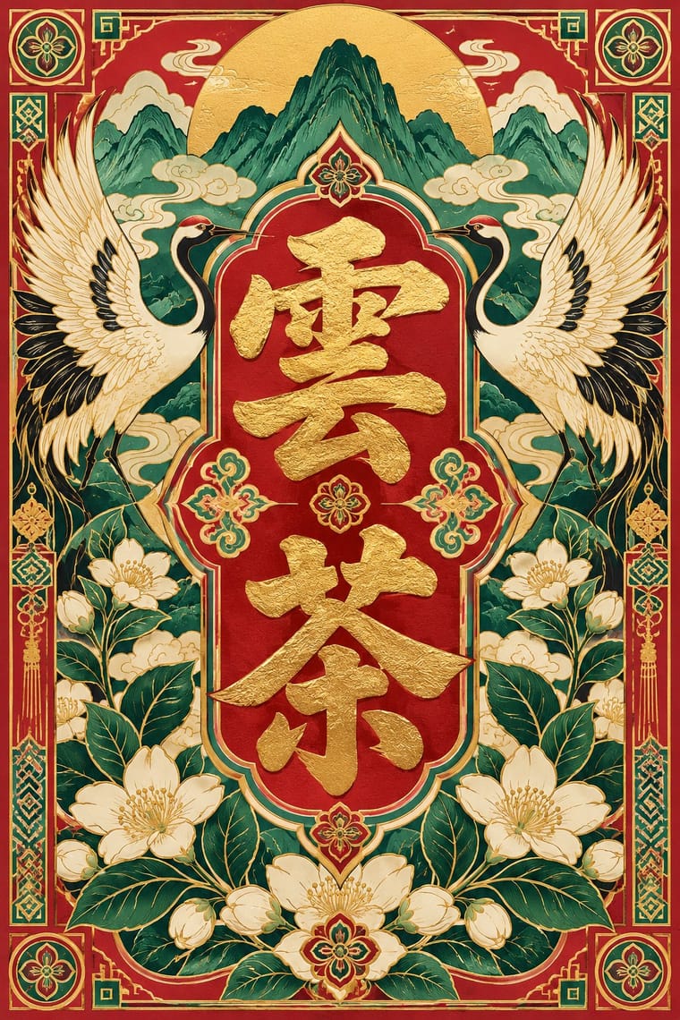
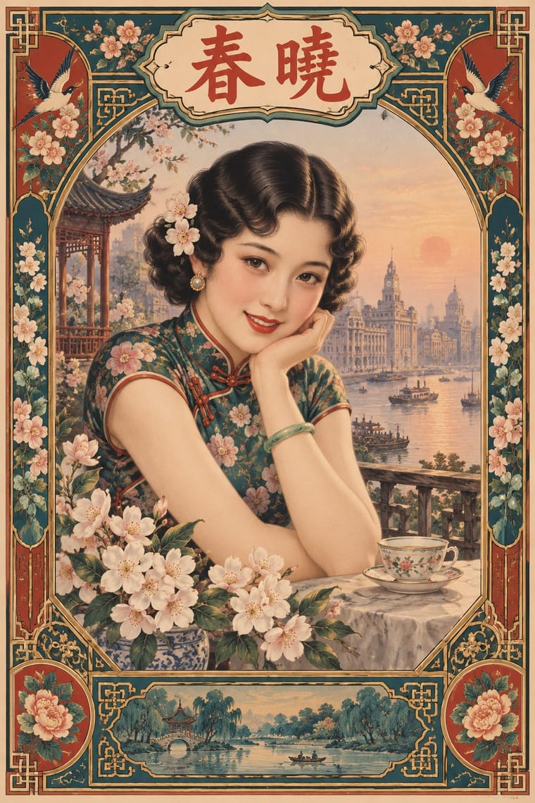
Guochao × Shanghai Modern
Republican-era meishuzi lettering and calendar-poster borders give guochao packaging period depth beyond imperial red and gold.
01
What each style brings
Each part of the design comes from the style with the stronger say in it, and each style gives at least two.
Guochao (China-Chic National Trend) Shanghai Modern & Yuefenpai
- Type from Guochao
- Colour from Guochao
- Form from Shanghai Modern
- Composition from Shanghai Modern
- Surface from Guochao
02
The type
Open fonts standing in for each style’s own type, which is often hand-drawn or commercial.
Display · Guochao
Velvet
Kaushan Script, standing in for Bold brush calligraphy (kaishu and xingshu) for hero characters
Text · Shanghai Modern
The commercial art of treaty-port Shanghai. Calendar posters (yuefenpai) given away by tobacco, pharmaceutical and cosmetics firms took over the New Year print's place on the wall, pairing glamorous women in qipao, softly modelled in Zheng Mantuo's rubbed-brush watercolour technique, with ornamental borders, calendars and products. In the 1920s–30s pictorials, cartoons and 'art lettering' (meishuzi) absorbed Art Deco geometry into a cosmopolitan Chinese modernism.
Shippori Mincho; Shanghai Modern used Meishuzi and Songti
03
The colours
The ground and leading colours come from Guochao, with a counter-accent from Shanghai Modern. The ink reads on the ground at 4.5:1 or more.
Guochao (China-Chic National Trend) Shanghai Modern & Yuefenpai
-
#161616ground · 36% -
#f3ead8ink · 14% -
#e3b33baccent · 18% -
#b8322faccent · 14% -
#3c8d72accent · 10% -
#1f5f5baccent · 8%
As CSS
:root {
  --ground: #161616;
  --ink: #f3ead8;
  --accent-1: #e3b33b;
  --accent-2: #b8322f;
  --accent-3: #3c8d72;
  --accent-4: #1f5f5b;
  --font-display: "Kaushan Script", cursive;
  --font-text: "Shippori Mincho", serif;
}
Use it with care
Guochao (China-Chic National Trend): Guochao often lifts ethnic-minority crafts (Miao silverwork and embroidery, Dai and Mongolian motifs) and intangible-heritage techniques as packaging finishes. Credit and pay the communities and craftspeople whose patterns are used, commission or collaborate with practitioners rather than copying motifs, and remember that dragons, imperial yellow and national symbols carry political as well as decorative meaning.
04
The two styles
05
More combinations
With Guochao
- Nianhua & Chinese Folk Print Pairs well · Redraw door gods, carp and auspicious babies as clean vector characters for limited-edition packaging, keeping each rebus's meaning intact.
- Graffiti & Hip-Hop Graphics Pairs well · Guochao's streetwear wing already borrows hip-hop lockups; treat a brush character as the tag and keep the heritage palette.
- DTC 'Blanding' / Millennial Minimalism Contrasts · Western direct-to-consumer brands strip identity to pastel sans-serif minimalism; guochao sells ornament and heritage instead, so use one to test the other.
- Dazibao (Big-Character Posters) Contrasts · Both make huge characters the whole message; compare the handwritten political urgency of the big-character poster with guochao's polished commercial heritage.
- Contemporary Chinese Book Design ('Most Beautiful Books of China') Contrasts · Guochao shouts Chinese heritage with saturated jewel colours, gloss and folk motifs on packaging; these books whisper it with bare paper, thread, one red and at most a matte gilt edge, so choose between the loud and the quiet national voice.
- Chinese Calligraphy & Seal Carving (Shufa & Zhuanke) Pairs well · Guochao branding borrows brush characters and red seals; commission real calligraphy and a properly cut seal instead of a generic brush-texture font and a fake stamp.
- Chinese National-Style Animation (Shanghai Animation Film Studio) Pairs well · For China-chic packaging and campaigns, borrow the method (an opera-mask face, scrolling clouds, an ink wash on empty paper) rather than quoting the studio's licensed characters.
- Chinese Paper-Cut (Jianzhi) Pairs well · Guochao packaging borrows red cut-paper silhouettes; keep the real cut logic (joined lines, folded symmetry, correct auspicious characters) instead of a generic filigree texture.
With Shanghai Modern
- Socialist Realist Propaganda Poster Contrasts · After 1949 the same painters and rubbed-watercolour technique served propaganda; compare how one rendering style sells glamour versus ideology.
- Nianhua & Chinese Folk Print Pairs well · Fold nianhua's auspicious symbols and bright folk colour into a calendar-poster layout for festive packaging.
- International Typographic Style Contrasts · Its framed, ornamented, figurative poster is the opposite of Swiss reduction; strip elements one by one to find what carries the mood.
- Art Deco Pairs well · Wrap a softly painted yuefenpai figure in Deco borders and geometric lettering for East–West period glamour.
- Republican Chinese Book Cover Design (Lu Xun & Tao Yuanqing) Contrasts · Same city and decades, opposite intent: calendar posters model glamorous women in soft polychrome with ornamental borders, while New Literature covers leave a plain field to one flat, symbolic motif and a drawn title.
- Mexican Calendar Chromo (Cromos calendáricos) Contrasts · Both are tobacco-sponsored calendar pictures of beauties, but yuefenpai set softly rubbed watercolour women inside decorative borders with the products alongside, while the Mexican chromo is an oil painting of a whole scene that fills the sheet, with the pad pasted at its foot.
- Cuban Tobacco Lithography (Habilitaciones & Marquillas) Pairs well · Shanghai's calendar posters were also given away by tobacco firms; pair their softly modelled women and ornamental borders with the Havana label's medals and arms for a cross-continental tobacco or spirits heritage line.
- Showa Modern Commercial Art and Zuan-moji Pairs well · Both put a modern-girl figure in East Asian commercial posters; combine the Japanese geometric lettering with Shanghai's painterly figure for a pan-Asian Deco look.