Style combination · Contrasts
Global Village Coffeehouse × Memphis Design
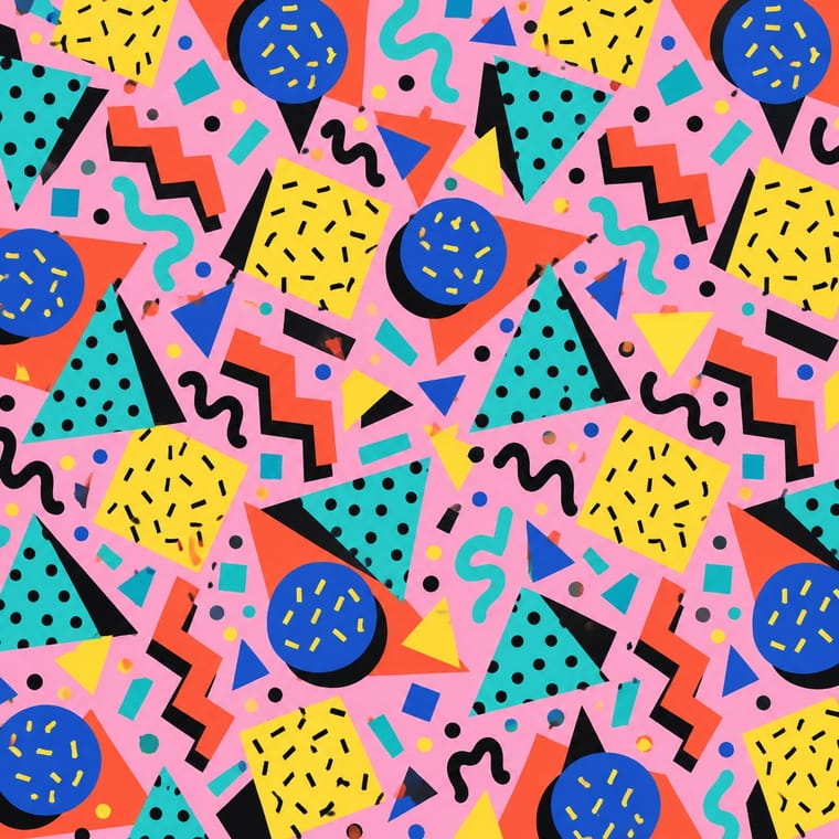
Its predecessor and foil: Collins describes designers leaving clean Memphis forms and bright colours for earth tones, woodcut line and rough paper, so set the two side by side to show the turn from 1980s excess to 1990s earnestness.
Mix them and make something Global Village Coffeehouse Memphis Design
01
What each style brings
Each part of the design comes from the style with the stronger say in it, and each style gives at least two.
Global Village Coffeehouse Memphis Design
- Type from Global Village Coffeehouse
- Colour from Memphis Design
-
Global Village Coffeehouse avoids complementary clash: this is where the two pull against each other, which is the point of the contrast.
- Form from Memphis Design
- Composition from Global Village Coffeehouse
- Surface from Global Village Coffeehouse
02
The type
Open fonts standing in for each style’s own type, which is often hand-drawn or commercial.
Display · Global Village Coffeehouse
Yay!
Jost, standing in for Neo-hieroglyphic and pictograph dingbat and display fonts from 1990s font packs, which Collins reads as a bid for a more 'universal language' (Are.na, 2018)
Text · Global Village Coffeehouse
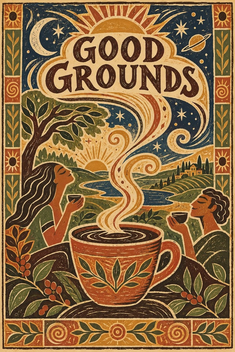
The faux-naive, earth-toned illustration style that late-1980s American designers set against Memphis, and that chain cafés, bookstores, packaging and clip art spread through the 1990s. Rough woodcut- and scratchboard-like line shows suns and moons, spirals, hands, eyes, globes, ships, flowing figures and coffee cups with 'aroma swirls' over mottled earth-toned grounds. Trading Memphis brights and metallic foil for textured paper and twine, it sold handmade warmth and 'global village' unity. The name arose in CARI's online group in 2017; Evan Collins set the style out in a 2018 Are.na essay.
Jost; Global Village Coffeehouse used Mondõ Kaizen (Don Synstelien, SynFonts; on MyFonts since 2001), the font Evan Collins links from his phrase 'countless 1990s font packs' in the passage on neo-hieroglyphics (Are.na, 2018) and Neo-hieroglyphic and pictograph dingbat and display fonts from 1990s font packs, which Collins reads as a bid for a more 'universal language' (Are.na, 2018)
03
The colours
The ground and leading colours come from Memphis Design, with a counter-accent from Global Village Coffeehouse. The ink reads on the ground at 4.5:1 or more.
Global Village Coffeehouse Memphis Design
-
#ffd23fground · 36% -
#111111ink · 14% -
#ff5a36accent · 18% -
#d19a35accent · 14% -
#2ec4b6accent · 10% -
#b4532aaccent · 8%
As CSS
:root {
  --ground: #ffd23f;
  --ink: #111111;
  --accent-1: #ff5a36;
  --accent-2: #d19a35;
  --accent-3: #2ec4b6;
  --accent-4: #b4532a;
  --font-display: "Jost", sans-serif;
  --font-text: "Jost", sans-serif;
}
Use it with care
Global Village Coffeehouse: The style borrowed ancient and Indigenous imagery as generic primitivism: Collins records kokopelli figures and 'tribal' and hieroglyph-like icons, at times showing 'tribal' figures carrying executives or serving coffee, and Dwell notes vaguely African masks on café walls; kokopelli is a fertility deity of the Hopi, Zuni and other Southwestern peoples. Draw suns, spirals, cups, plants and invented figures instead, leave out kokopelli, masks and other specific peoples' sacred figures, and never show non-Western people as servants or as an exotic backdrop for a product.
04
The two styles
05
More combinations
With Global Village Coffeehouse
- Risograph & Indie Print Culture Pairs well · Print the sun, spiral and aroma-swirl motifs in two or three earthy riso inks on uncoated stock to get real ink grain instead of an airbrushed texture filter.
- Minimalist Graphic Design Contrasts · Dwell records independent cafés rejecting burlap coffee sacks and aroma swirls and moving 'toward minimalism'; set GVC's terracotta and woodcut against that bare restraint to show how café design turned away from it.
- Y2K Futurism Contrasts · CARI notes the pendulum swung from GVC back to minimalist, tech and clean looks such as Y2K; set chrome and translucent blue against terracotta and scratchboard marks to show that turn in one spread.
- Hipster Artisanal Revival Contrasts · Both sell handmade warmth on textured paper; hipster-artisanal draws on Victorian trade badges and kraft-paper heritage, GVC on globalist suns, spirals and world imagery, so compare the two to place a café between 'world' warmth and local heritage.
- Corporate Memphis Contrasts · Both sell big-company friendliness with simplified figures; corporate memphis does it in clean flat vectors on white, GVC in rough woodcut line on earthy, textured grounds, so choose between them by how handmade the warmth should feel.
With Memphis Design
- International Typographic Style Contrasts · Scatter Memphis squiggles across a strict Swiss grid to stage modernism versus its postmodern critique.
- Kawaii Design Pairs well · Memphis pastel geometry and kawaii's rounded characters share a toy-like optimism; combine them for playful packaging.
- Corporate Memphis Contrasts · Corporate Memphis tamed the original's clash and irony; restore real colour conflict and wit to escape generic tech illustration.
- Neo-Brutalism Pairs well · Memphis black outlines and flat clashing fills translate directly into neo-brutalist cards, buttons and stickers.
- Swiss Punk / New Wave Typography Pairs well · Add Memphis squiggles and pastel triangles to New Wave's floating bars for the full 1980s postmodern palette.
- La Movida Madrileña Graphics Pairs well · Memphis showed its first collection in Milan in 1981, three years before Madrid Me Mata: add its clashing laminate colours, squiggles and geometric primitives to a Movida poster for a fuller 1980s postmodern look, keeping the hand-drawn figures and lettering.
- Dutch Expressive Postmodernism (Studio Dumbar & Hard Werken) Pairs well · A contemporary 1980s attack on good taste: set Memphis primitives, squiggles and patterned laminates inside a Dumbar-style photographed set for a poster with real shadows and clashing colour.
- Milanese Industrial Modernism (Olivetti, Pirelli, Studio Boggeri) Contrasts · Milan's own later rebellion against functional wit; set Memphis's ornamental irony against this clean industrial optimism for a deliberate generational clash.