Style combination · Contrasts
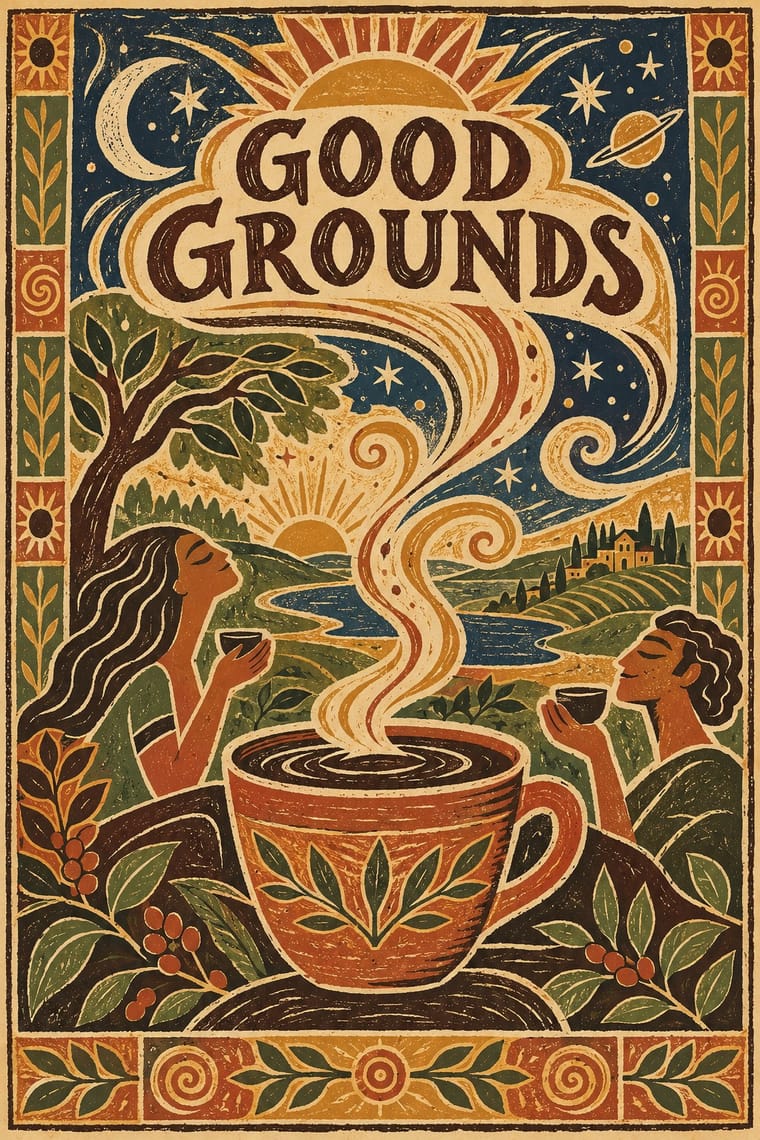
Global Village Coffeehouse × Hipster Artisanal Revival
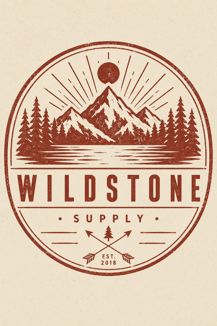
Both sell handmade warmth on textured paper; hipster-artisanal draws on Victorian trade badges and kraft-paper heritage, GVC on globalist suns, spirals and world imagery, so compare the two to place a café between 'world' warmth and local heritage.
Mix them and make something Global Village Coffeehouse Hipster Artisanal Revival
01
What each style brings
Each part of the design comes from the style with the stronger say in it, and each style gives at least two.
Global Village Coffeehouse Hipster Artisanal Revival
- Type from Hipster Artisanal Revival
- Colour from Global Village Coffeehouse
- Form from Global Village Coffeehouse
- Composition from Hipster Artisanal Revival
- Surface from Global Village Coffeehouse
02
The type
Open fonts standing in for each style’s own type, which is often hand-drawn or commercial.
Display · Hipster Artisanal Revival
Home
Jost, standing in for Futura (Paul Renner, Bauer, 1927), as on the Field Notes cover
Text · Hipster Artisanal Revival
The trade-mark look of the 2007–2018 craft boom, which dressed new coffee roasters, breweries and stationers as nineteenth- and early-twentieth-century firms. A centred one-ink badge holds a line-drawn icon, crossed arrows or an X with words in its quadrants, a triangle and an 'Est.' date for a firm a year old, in tracked sans capitals and a flowing script on kraft, cream or chalkboard. Stock 'Hipster Badges' made it a template; by 2012–13 trend reports and parodies called it overdone, and by 2018 it had matured into colourless, detailed monoline badges that left the arrows and scripts behind.
Jost; Hipster Artisanal Revival used Wisdom Script (James T. Edmondson, Lost Type, 2011), originally drawn for the 'Woods of Wisdom' poster series and Brothers (John Downer, Emigre, 1999), after a turn-of-the-century chromolithographed Cole Brothers circus letterhead
03
The colours
The ground and leading colours come from Global Village Coffeehouse, with a counter-accent from Hipster Artisanal Revival. The ink reads on the ground at 4.5:1 or more.
Global Village Coffeehouse Hipster Artisanal Revival
-
#efe2c6ground · 36% -
#3b2a20ink · 14% -
#d19a35accent · 18% -
#8e2f25accent · 14% -
#b4532aaccent · 10% -
#c4a27aaccent · 8%
As CSS
:root {
  --ground: #efe2c6;
  --ink: #3b2a20;
  --accent-1: #d19a35;
  --accent-2: #8e2f25;
  --accent-3: #b4532a;
  --accent-4: #c4a27a;
  --font-display: "Jost", sans-serif;
  --font-text: "Jost", sans-serif;
}
Use it with care
Global Village Coffeehouse: The style borrowed ancient and Indigenous imagery as generic primitivism: Collins records kokopelli figures and 'tribal' and hieroglyph-like icons, at times showing 'tribal' figures carrying executives or serving coffee, and Dwell notes vaguely African masks on café walls; kokopelli is a fertility deity of the Hopi, Zuni and other Southwestern peoples. Draw suns, spirals, cups, plants and invented figures instead, leave out kokopelli, masks and other specific peoples' sacred figures, and never show non-Western people as servants or as an exotic backdrop for a product.
Hipster Artisanal Revival: The hipster fashion and branding of the same years also borrowed pseudo-Native 'tribal' dress: Adrienne Keene's Native Appropriations (2010) answered the fashion for 'hipster headdresses' by noting that eagle feathers 'have to be earned', and in 2012 the Navajo Nation sued Urban Outfitters over goods sold under the 'Navajo' name. Keep to arrows, triangles and trade-mark devices; do not add feathered headdresses, war bonnets or 'tribal' and 'Navajo' patterns as a heritage shorthand.
04
The two styles
05
More combinations
With Global Village Coffeehouse
- Risograph & Indie Print Culture Pairs well · Print the sun, spiral and aroma-swirl motifs in two or three earthy riso inks on uncoated stock to get real ink grain instead of an airbrushed texture filter.
- Minimalist Graphic Design Contrasts · Dwell records independent cafés rejecting burlap coffee sacks and aroma swirls and moving 'toward minimalism'; set GVC's terracotta and woodcut against that bare restraint to show how café design turned away from it.
- Y2K Futurism Contrasts · CARI notes the pendulum swung from GVC back to minimalist, tech and clean looks such as Y2K; set chrome and translucent blue against terracotta and scratchboard marks to show that turn in one spread.
- Memphis Design Contrasts · Its predecessor and foil: Collins describes designers leaving clean Memphis forms and bright colours for earth tones, woodcut line and rough paper, so set the two side by side to show the turn from 1980s excess to 1990s earnestness.
- Corporate Memphis Contrasts · Both sell big-company friendliness with simplified figures; corporate memphis does it in clean flat vectors on white, GVC in rough woodcut line on earthy, textured grounds, so choose between them by how handmade the warmth should feel.
With Hipster Artisanal Revival
- DTC 'Blanding' / Millennial Minimalism Contrasts · Where this dressed new firms as old ones, blanding dressed them as frictionless and new, with lowercase geometric sans, pastels and white space; set the two side by side to place a brand between heritage and novelty.
- Victorian Letterpress & Wood Type Pairs well · Go back to the source: swap the stock badge parts for real jobbing type, printers' rules and stock borders to turn pastiche into the trade print it quotes.
- Risograph & Indie Print Culture Pairs well · The same small-batch maker economy; print the badge in one riso ink on uncoated stock to get real ink grain instead of a distress overlay.
- Flat Design Contrasts · Its contemporary on screen was textureless and many-coloured where this was single-ink and worn; one stamped badge inside a flat interface marks a product as hand-made.
- Hand-Painted Signage & Vernacular Lettering Pairs well · Sign painting revived alongside it; paint the badge on the shop window or chalkboard so the lettering is made by hand instead of aged with a texture filter.
- Phototype Expressive Typography (Lubalin & U&lc) Contrasts · Both pair a script with a geometric sans, but the craft badge tracks its capitals wide in a centred one-ink frame, while Lubalin kerns the same pairing until the letters touch and join. Set one against the other to decide whether the letters should breathe or fuse.
- Cottagecore Contrasts · Shares handmade, small-batch values, but swap its black-and-white urban badges for soft colour and florals to get cottagecore.
- European Heraldry Contrasts · The craft badge borrows heraldry's air of lineage with an 'Est.' date and crossed arrows on kraft paper, while a real coat of arms is a granted or inherited, blazoned identity in strong tinctures; set the two side by side to show the difference between quoting heritage and holding it.