Style combination · Contrasts
Arts × Italian Futurism
Arts & Crafts handwork is everything Futurism wanted to burn; juxtapose them to stage machine against hand.
01
What each style brings
Each part of the design comes from the style with the stronger say in it, and each style gives at least two.
Arts & Crafts Movement Italian Futurism
- Type from Italian Futurism
-
Arts avoids eclectic mixing: this is where the two pull against each other, which is the point of the contrast.
- Colour from Arts
- Form from Arts
-
Italian Futurism avoids floral & vegetal: this is where the two pull against each other, which is the point of the contrast.
- Composition from Italian Futurism
- Surface from Arts
02
The type
Open fonts standing in for each style’s own type, which is often hand-drawn or commercial.
Display · Italian Futurism
Future
Alfa Slab One, standing in for Mixed jobbing grotesques, Egyptians and Didones from the printer's case
Text · Arts
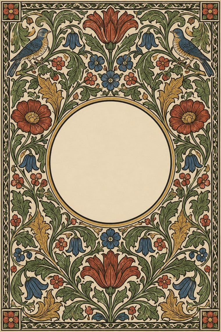
A British-led reform movement that answered industrial shoddiness with honest handcraft, medieval models and the ideal of joy in labour. In graphic design it is embodied by William Morris's Kelmscott Press: dark Jenson-derived and gothic types, handmade paper, and wood-engraved borders and initials dense with stylised foliage, treating the book as one integrated, hand-made object.
EB Garamond; Arts used Golden Type and Troy and Chaucer
03
The colours
The ground and leading colours come from Arts, with a counter-accent from Italian Futurism. The ink reads on the ground at 4.5:1 or more.
Arts & Crafts Movement Italian Futurism
-
#efe6d2ground · 36% -
#1c1a17ink · 14% -
#a33224accent · 18% -
#f2b705accent · 14% -
#c39a4aaccent · 10% -
#2e4a6aaccent · 8%
As CSS
:root {
  --ground: #efe6d2;
  --ink: #1c1a17;
  --accent-1: #a33224;
  --accent-2: #f2b705;
  --accent-3: #c39a4a;
  --accent-4: #2e4a6a;
  --font-display: "Alfa Slab One", serif;
  --font-text: "EB Garamond", serif;
}
04
The two styles
05
More combinations
With Arts
- Flat Design Contrasts · Borrow one engraved border or initial to give a flat interface a crafted, editorial moment against its vector minimalism.
- Scandinavian Functionalism Pairs well · Keep the craft ethic and natural palette but reduce Morris's foliage to a single repeating motif for warmth without clutter.
- Risograph & Indie Print Culture Pairs well · Frame a two-ink riso print with a Morris-style vine border to give indie publishing an heirloom, hand-made gravity.
- Die Neue Typographie Contrasts · Tschichold's asymmetric, unornamented page was built against this centred, bordered book; set them side by side to argue tradition versus machine age.
- Gothic Blackletter & Fraktur Tradition Pairs well · Morris's Kelmscott Press revived gothic type (Troy and Chaucer) inside dense woodcut borders; join the broken letter to foliate frames and handmade paper for a medieval, hand-made book.
- Renaissance Book Typography Pairs well · Morris's Kelmscott Press revived Jenson's roman; pair a Renaissance text block with dense Arts & Crafts borders for a private-press feel.
- Josef Frank and Svenskt Tenn Botanical Prints Pairs well · The parent tradition: both fill a repeat with plants on linen, but Morris is symmetrical, earthy and dense with dark grounds, Frank is looser, brighter and mostly light. Pair a Morris-style framed book page with Frank-style endpapers.
- Vorticism & BLAST Typography Contrasts · BLAST refused 'a revival of lost folk art' and blasted the 'years 1837 to 1900'; set its hard black shards against a hand-printed floral page to stage machine against handicraft.
With Italian Futurism
- International Typographic Style Contrasts · Drop one explosive words-in-freedom burst into a calm Swiss grid; the surrounding order makes the noise legible.
- Russian Constructivism Pairs well · Discipline Futurist dynamism with Constructivist bars and photomontage so a diagonal layout still delivers one clear message.
- Streamline Moderne Pairs well · Combine Futurist lines of force with Streamline speed lines to give transport or tech brands a kinetic retro-futurist voice.
- Italian Liberty Poster (Ricordi and the Stile Liberty Affiche) Pairs well · A later movement that Liberty poster simplification only anticipates: harder geometry and dynamic silhouettes, kept here within lithographic colour.
- Vorticism & BLAST Typography Contrasts · Its parent scatters words in freedom along curves and diagonals; Vorticism keeps the same shouting sizes on level, stacked lines, so decide whether the page should explode or stand like a wall.