Style combination · Contrasts
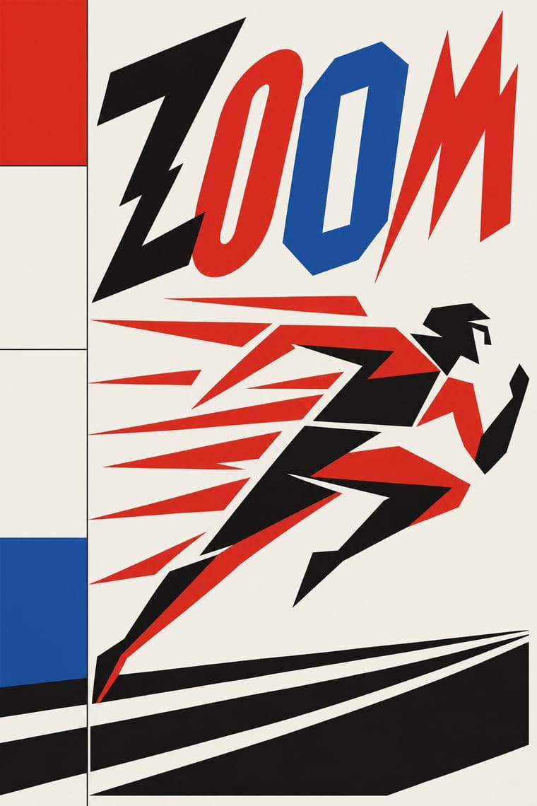
Italian Futurism × International Typographic Style
Drop one explosive words-in-freedom burst into a calm Swiss grid; the surrounding order makes the noise legible.
Mix them and make something Italian Futurism International Typographic Style
01
What each style brings
Each part of the design comes from the style with the stronger say in it, and each style gives at least two.
Italian Futurism International Typographic Style
- Type from Italian Futurism
-
International Typographic Style avoids eclectic mixing: this is where the two pull against each other, which is the point of the contrast.
- Colour from International Typographic Style
- Form from Italian Futurism
- Composition from International Typographic Style
- Surface from Italian Futurism
02
The type
Open fonts standing in for each style’s own type, which is often hand-drawn or commercial.
Display · Italian Futurism
Index
Alfa Slab One, standing in for Mixed jobbing grotesques, Egyptians and Didones from the printer's case
Text · International Typographic Style
A post-war refinement of the New Typography in which the mathematical grid, objective photography and neo-grotesque sans-serifs were used to communicate with clarity and neutrality. Taught at the Basel and Zurich schools, it became the default language of international corporate and institutional communication.
Inter; International Typographic Style used Akzidenz-Grotesk and Helvetica
03
The colours
The ground and leading colours come from International Typographic Style, with a counter-accent from Italian Futurism. The ink reads on the ground at 4.5:1 or more.
Italian Futurism International Typographic Style
-
#f2f0e9ground · 36% -
#111111ink · 14% -
#e1251baccent · 18% -
#f2b705accent · 14% -
#1f4e9caccent · 10% -
#7a7a7aaccent · 8%
As CSS
:root {
  --ground: #f2f0e9;
  --ink: #111111;
  --accent-1: #e1251b;
  --accent-2: #f2b705;
  --accent-3: #1f4e9c;
  --accent-4: #7a7a7a;
  --font-display: "Alfa Slab One", serif;
  --font-text: "Inter", sans-serif;
}
04
The two styles

05
More combinations
With Italian Futurism
- Arts & Crafts Movement Contrasts · Arts & Crafts handwork is everything Futurism wanted to burn; juxtapose them to stage machine against hand.
- Russian Constructivism Pairs well · Discipline Futurist dynamism with Constructivist bars and photomontage so a diagonal layout still delivers one clear message.
- Streamline Moderne Pairs well · Combine Futurist lines of force with Streamline speed lines to give transport or tech brands a kinetic retro-futurist voice.
- Italian Liberty Poster (Ricordi and the Stile Liberty Affiche) Pairs well · A later movement that Liberty poster simplification only anticipates: harder geometry and dynamic silhouettes, kept here within lithographic colour.
- Vorticism & BLAST Typography Contrasts · Its parent scatters words in freedom along curves and diagonals; Vorticism keeps the same shouting sizes on level, stacked lines, so decide whether the page should explode or stand like a wall.
With International Typographic Style
- Art Nouveau Contrasts · Ornamental curves against an orthogonal grid make a strong deliberate tension.
- Brutalist Web Design Pairs well · Strip the grid to raw HTML defaults to get a rawer, contemporary take on Swiss honesty.
- Psychedelic Poster Contrasts · Its exact opposite on legibility; borrow one swirling element to break a too-cold Swiss layout.
- Japanese Postwar Modernism Pairs well · Add Japanese restraint and emblematic colour fields to the grid for warmth without losing order.
- American Traditional Tattoo Flash Contrasts · Rational grid and sans-serif against sentimental, hand-lettered emblems: one flash motif on a Swiss layout makes a sharp contrast.
- Graffiti & Hip-Hop Graphics Contrasts · Put a single tag or throw-up over a strict Swiss grid to stage the clash between institutional order and a street voice.
- Pop Art Graphics Contrasts · Set one loud appropriated Pop image inside a strict grid with a neutral grotesque so the irony reads as deliberate rather than chaotic.
- Italian Painted Film Poster (Rome Studios) Contrasts · Grid, restraint and photographic objectivity are the opposite of a crowded painted montage.