Style combination · Pairs well
Material Design × Nutri-Score
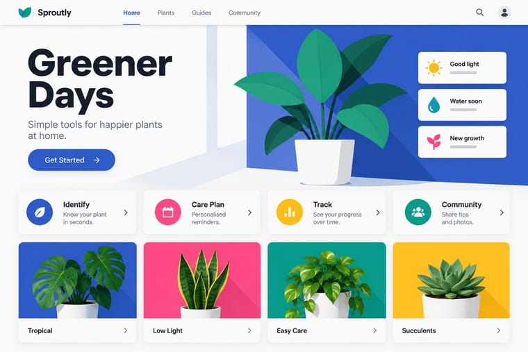
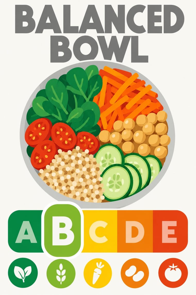
Rounded tiles, a fixed colour ramp and one raised selected state behave like a UI rating chip; Material's elevation and state rules suit screen versions of the grade in shopping apps.
01
What each style brings
Each part of the design comes from the style with the stronger say in it, and each style gives at least two.
Material Design Nutri-Score (Front-of-Pack Colour-Grade Label)
- Type from Nutri-Score
- Colour from Material Design
- Form from Nutri-Score
- Composition from Material Design
- Surface from Material Design
02
The type
Open fonts standing in for each style’s own type, which is often hand-drawn or commercial.
Display · Nutri-Score
Form
Jost, standing in for The logo's own lettering: a heavy geometric sans in capitals for the grey 'NUTRI-SCORE' heading and the white and tinted A–E grades, supplied only as vector outlines in the charter's Illustrator files; the charter's rule is 'Don't change fonts'
Text · Material Design
Google's design system, launched in 2014, which reintroduced controlled depth to flat design through the metaphor of 'material': sheets of digital paper and ink that sit at defined elevations, cast consistent shadows and move with meaningful motion. Built on an 8dp grid, Roboto and a bold primary-and-accent colour scheme, it later evolved into the personalised, tonal Material You (2021).
Inter; Material Design used Roboto and Google Sans
03
The colours
The ground and leading colours come from Material Design, with a counter-accent from Nutri-Score. The ink reads on the ground at 4.5:1 or more.
Material Design Nutri-Score (Front-of-Pack Colour-Grade Label)
-
#fafafaground · 36% -
#212121ink · 14% -
#ffc107accent · 18% -
#ee8100accent · 14% -
#ff4081accent · 10% -
#e63e11accent · 8%
As CSS
:root {
  --ground: #fafafa;
  --ink: #212121;
  --accent-1: #ffc107;
  --accent-2: #ee8100;
  --accent-3: #ff4081;
  --accent-4: #e63e11;
  --font-display: "Jost", sans-serif;
  --font-text: "Inter", sans-serif;
}
Use it with care
Nutri-Score (Front-of-Pack Colour-Grade Label): Nutri-Score is an EU trade mark of Santé publique France, licensed to food firms only under its conditions of use, and a grade printed on a pack is a nutrition claim. Do not put the real logo or a convincing imitation on products, mock-ups or generated images in a way that could pass for a genuine score; for fictional or teaching work, change the name or say clearly that the grade is illustrative, and check the current algorithm before showing any real product's letter.
04
The two styles
05
More combinations
With Material Design
- Neumorphism Contrasts · Material's crisp, directional elevation shadows are the accessible answer to neumorphism's ambiguous soft relief; compare both when tuning shadow contrast.
- International Typographic Style Pairs well · Lean on Swiss grid discipline and flush-left grotesque setting to keep card-heavy Material layouts calm and editorial.
- Brutalist Web Design Contrasts · Where Material hides structure behind polished components, brutalism exposes it; one raw, default-styled element signals 'under the hood' in a polished product.
- Glassmorphism Pairs well · Replace opaque sheets with frosted panes at the highest elevations (dialogs, navigation) so the stack stays legible over imagery.
- Early Web Vernacular Contrasts · Material's systematic spacing and elevation are everything the amateur web lacked; use it as the ‘after’ to this ‘before’.
- Metro (Microsoft Design Language) Contrasts · Layered paper and shadow against Metro's single flat plane; mix elevation into tiles only to signal interaction.
With Nutri-Score
- Plain Tobacco Packaging Contrasts · Plain packaging strips the brand and hands the face to the state; Nutri-Score leaves the brand intact and adds a small standardised inset in the lower third. Decide whether the public message should replace the design or sit inside it.
- Isotype Pictorial Statistics Pairs well · Both turn data into a sign anyone can read at a glance; borrow Isotype's repeated pictograms to explain the five grades on shelf talkers, leaflets or school material.
- British Road Signage (Kinneir & Calvert) Pairs well · Both are public signs built from a manual of fixed sizes, colours and clear zones; take the road-sign discipline when a colour-scale rating has to be applied by thousands of firms without drifting.
- Front-of-Pack Warning Octagons (Latin American Food Warning Seals) Contrasts · The Latin American seals warn in black, one nutrient at a time, by law; Nutri-Score grades the whole food on a coloured five-step scale and is voluntary in most countries. Choose the octagon to stop a purchase and the colour scale to steer a comparison.