Style combination · Contrasts
Material Design × Neumorphism
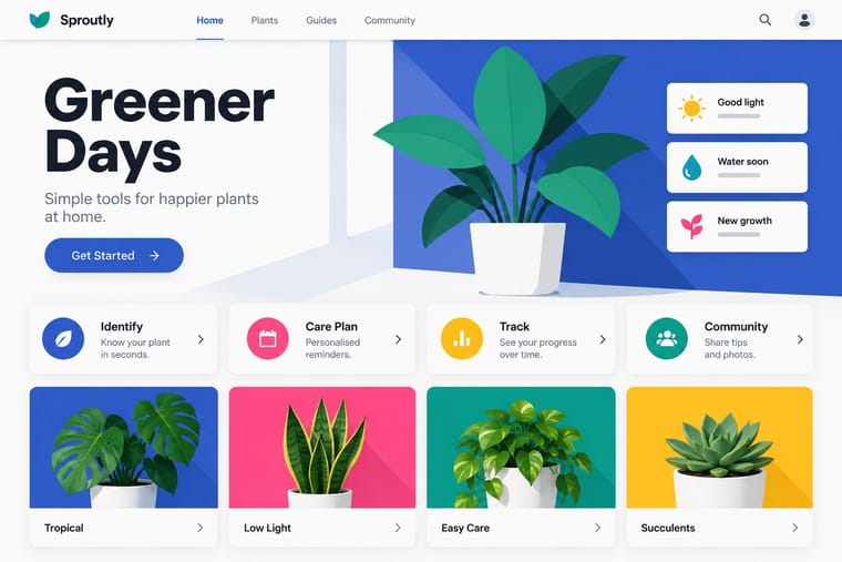
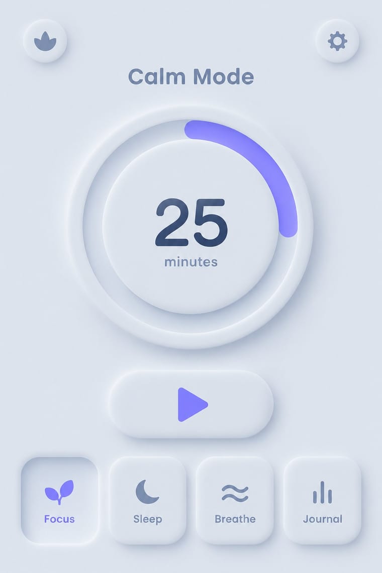
Material's crisp, directional elevation shadows are the accessible answer to neumorphism's ambiguous soft relief; compare both when tuning shadow contrast.
01
What each style brings
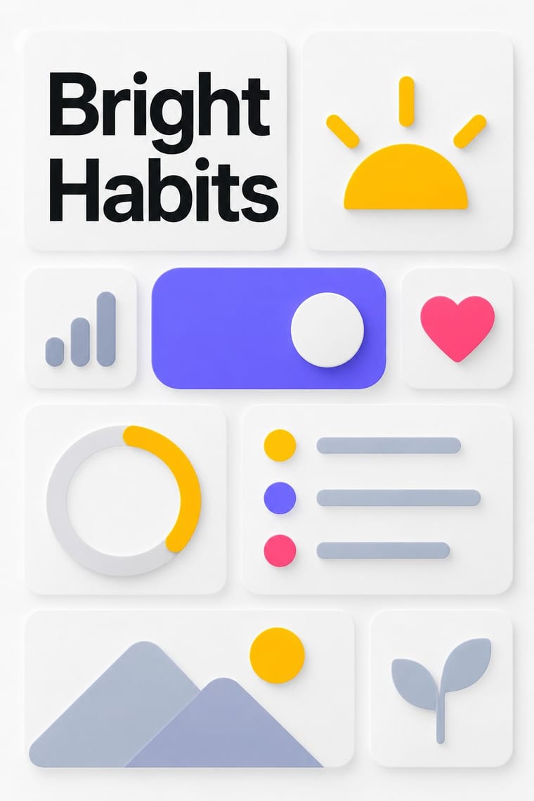
Each part of the design comes from the style with the stronger say in it, and each style gives at least two.
Material Design Neumorphism
- Type from Material Design
- Colour from Material Design
- Form from Neumorphism
- Composition from Material Design
- Surface from Neumorphism
02
The type
Open fonts standing in for each style’s own type, which is often hand-drawn or commercial.
Text · Neumorphism
A short-lived interface trend in which controls are extruded from, or pressed into, a background of the same colour and modelled only by paired soft shadows. Sparked by Alexander Plyuto's 2019 Dribbble banking-app concept and named on UX Collective, it revived skeuomorphic tactility in a monochrome, minimal form, then faded quickly over its weak contrast and poor accessibility.
Jost; Neumorphism used Poppins and Nunito
03
The colours
The ground and leading colours come from Material Design, with a counter-accent from Neumorphism. The ink reads on the ground at 4.5:1 or more.
Material Design Neumorphism
-
#fafafaground · 36% -
#212121ink · 14% -
#ffc107accent · 18% -
#6c63ffaccent · 14% -
#ff4081accent · 10% -
#a3b1c6accent · 8%
As CSS
:root {
  --ground: #fafafa;
  --ink: #212121;
  --accent-1: #ffc107;
  --accent-2: #6c63ff;
  --accent-3: #ff4081;
  --accent-4: #a3b1c6;
  --font-display: "Inter", sans-serif;
  --font-text: "Jost", sans-serif;
}
04
The two styles
05
More combinations
With Material Design
- International Typographic Style Pairs well · Lean on Swiss grid discipline and flush-left grotesque setting to keep card-heavy Material layouts calm and editorial.
- Brutalist Web Design Contrasts · Where Material hides structure behind polished components, brutalism exposes it; one raw, default-styled element signals 'under the hood' in a polished product.
- Glassmorphism Pairs well · Replace opaque sheets with frosted panes at the highest elevations (dialogs, navigation) so the stack stays legible over imagery.
- Nutri-Score (Front-of-Pack Colour-Grade Label) Pairs well · Rounded tiles, a fixed colour ramp and one raised selected state behave like a UI rating chip; Material's elevation and state rules suit screen versions of the grade in shopping apps.
- Early Web Vernacular Contrasts · Material's systematic spacing and elevation are everything the amateur web lacked; use it as the ‘after’ to this ‘before’.
- Metro (Microsoft Design Language) Contrasts · Layered paper and shadow against Metro's single flat plane; mix elevation into tiles only to signal interaction.
With Neumorphism
- Neo-Brutalism Contrasts · Neo-brutalism's black outlines and hard offset shadows solve neumorphism's contrast problem; borrow a crisp border for focus states.
- Minimalist Graphic Design Pairs well · Neumorphic relief only reads in near-empty layouts; apply minimalist restraint so a few controls carry the whole surface.
- HfG Ulm Systematic Design Pairs well · Model controls on Braun-style product design from the Ulm tradition: knobs, sliders and grilles that look moulded from one material.
- Claymorphism & Soft 3D Contrasts · Neumorphism presses monochrome controls out of a same-coloured surface with paired outer shadows; claymorphism inflates them into separately coloured objects that cast one drop shadow, so switch to it when soft relief loses contrast and every control starts to look like a button.
- Skeuomorphic UI Pairs well · Neumorphism keeps the light source and extrusion but drops the textures; borrow one material cue to give soft UI more character.