Style combination · Pairs well
Material Design × International Typographic Style
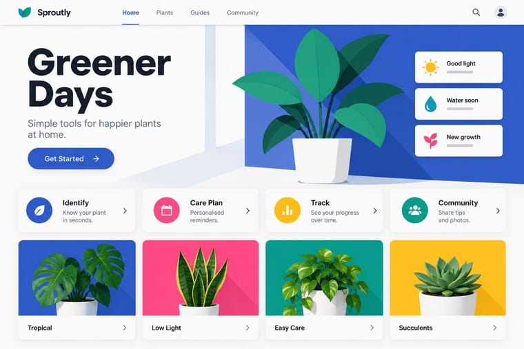
Lean on Swiss grid discipline and flush-left grotesque setting to keep card-heavy Material layouts calm and editorial.
Mix them and make something Material Design International Typographic Style
01
What each style brings
Each part of the design comes from the style with the stronger say in it, and each style gives at least two.
Material Design International Typographic Style
- Type from International Typographic Style
- Colour from International Typographic Style
- Form from Material Design
- Composition from Material Design
- Surface from Material Design
02
The type
Open fonts standing in for each style’s own type, which is often hand-drawn or commercial.
Text · Material Design
Google's design system, launched in 2014, which reintroduced controlled depth to flat design through the metaphor of 'material': sheets of digital paper and ink that sit at defined elevations, cast consistent shadows and move with meaningful motion. Built on an 8dp grid, Roboto and a bold primary-and-accent colour scheme, it later evolved into the personalised, tonal Material You (2021).
Inter; Material Design used Roboto and Google Sans
03
The colours
The ground and leading colours come from International Typographic Style, with a counter-accent from Material Design. The ink reads on the ground at 4.5:1 or more.
Material Design International Typographic Style
-
#f2f0e9ground · 36% -
#111111ink · 14% -
#e1251baccent · 18% -
#ffc107accent · 14% -
#1f4e9caccent · 10% -
#ff4081accent · 8%
As CSS
:root {
  --ground: #f2f0e9;
  --ink: #111111;
  --accent-1: #e1251b;
  --accent-2: #ffc107;
  --accent-3: #1f4e9c;
  --accent-4: #ff4081;
  --font-display: "Inter Tight", sans-serif;
  --font-text: "Inter", sans-serif;
}
04
The two styles

05
More combinations
With Material Design
- Neumorphism Contrasts · Material's crisp, directional elevation shadows are the accessible answer to neumorphism's ambiguous soft relief; compare both when tuning shadow contrast.
- Brutalist Web Design Contrasts · Where Material hides structure behind polished components, brutalism exposes it; one raw, default-styled element signals 'under the hood' in a polished product.
- Glassmorphism Pairs well · Replace opaque sheets with frosted panes at the highest elevations (dialogs, navigation) so the stack stays legible over imagery.
- Nutri-Score (Front-of-Pack Colour-Grade Label) Pairs well · Rounded tiles, a fixed colour ramp and one raised selected state behave like a UI rating chip; Material's elevation and state rules suit screen versions of the grade in shopping apps.
- Early Web Vernacular Contrasts · Material's systematic spacing and elevation are everything the amateur web lacked; use it as the ‘after’ to this ‘before’.
- Metro (Microsoft Design Language) Contrasts · Layered paper and shadow against Metro's single flat plane; mix elevation into tiles only to signal interaction.
With International Typographic Style
- Art Nouveau Contrasts · Ornamental curves against an orthogonal grid make a strong deliberate tension.
- Brutalist Web Design Pairs well · Strip the grid to raw HTML defaults to get a rawer, contemporary take on Swiss honesty.
- Psychedelic Poster Contrasts · Its exact opposite on legibility; borrow one swirling element to break a too-cold Swiss layout.
- Japanese Postwar Modernism Pairs well · Add Japanese restraint and emblematic colour fields to the grid for warmth without losing order.
- American Traditional Tattoo Flash Contrasts · Rational grid and sans-serif against sentimental, hand-lettered emblems: one flash motif on a Swiss layout makes a sharp contrast.
- Graffiti & Hip-Hop Graphics Contrasts · Put a single tag or throw-up over a strict Swiss grid to stage the clash between institutional order and a street voice.
- Pop Art Graphics Contrasts · Set one loud appropriated Pop image inside a strict grid with a neutral grotesque so the irony reads as deliberate rather than chaotic.
- Italian Painted Film Poster (Rome Studios) Contrasts · Grid, restraint and photographic objectivity are the opposite of a crowded painted montage.