Style combination · Pairs well
Chinese Calligraphy × Ma
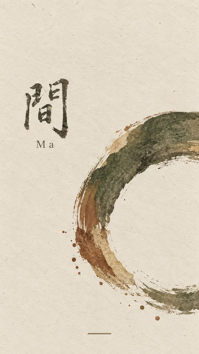
Both treat empty ground as active; let one brushed character and a small seal sit off-centre in a wide, quiet field of paper-toned space.
01
What each style brings
Each part of the design comes from the style with the stronger say in it, and each style gives at least two.
Chinese Calligraphy & Seal Carving (Shufa & Zhuanke) Ma & Wabi-sabi Aesthetics
- Type from Chinese Calligraphy
- Colour from Ma
- Form from Chinese Calligraphy
- Composition from Ma
- Surface from Chinese Calligraphy
02
The type
Open fonts standing in for each style’s own type, which is often hand-drawn or commercial.
Display · Chinese Calligraphy
Tide
Shippori Mincho, standing in for Regular script (kaishu) after Ouyang Xun and Yan Zhenqing (the 'Yan style', Yanti)
Text · Chinese Calligraphy
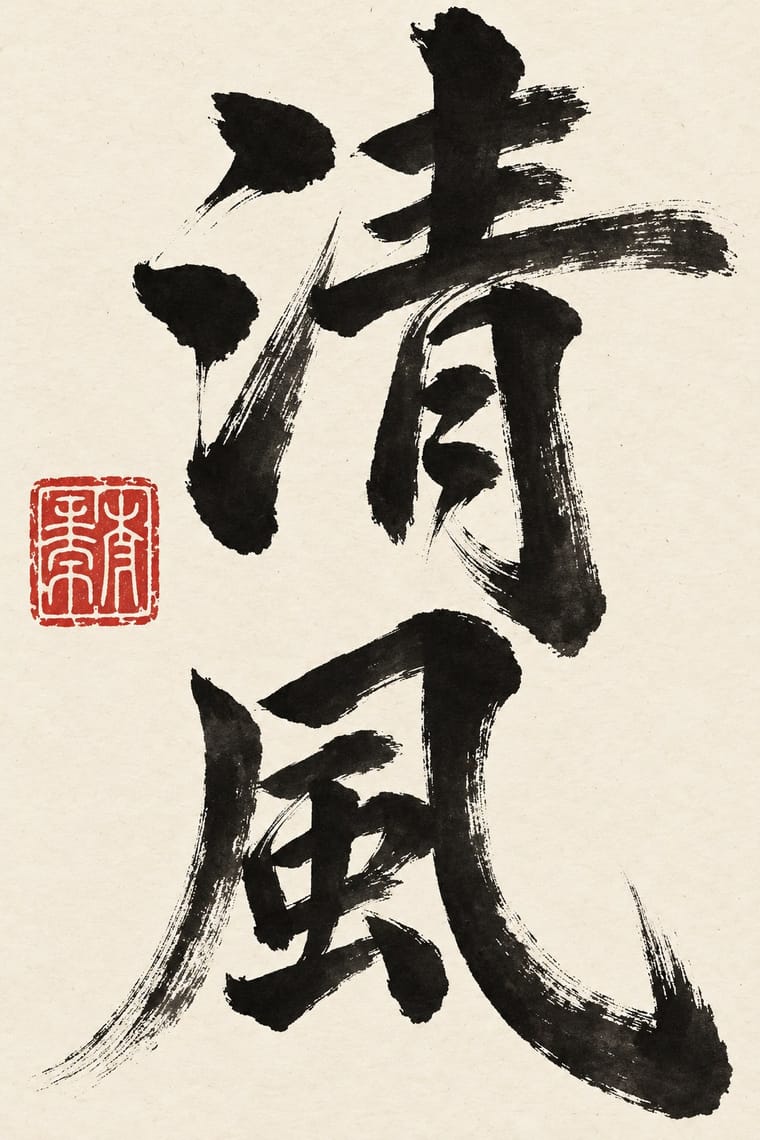
The written art of China and the root of East Asian lettering. A soft, pointed brush writes ink characters in vertical columns read right to left; pressure swells and thins each stroke, and a drying brush breaks into 'flying white'. Five script families run from even seal script to cursive so fast it becomes gesture. In literati work the only colour is the red seal, cut in stone, on pale paper or silk; at the New Year the brush writes couplets and 福 in black or gold on red paper. Carved in steles and plaques, the writing returns as white-on-black rubbings and signboards over doors and shops.
Shippori Mincho; Chinese Calligraphy used Seal script (zhuanshu) and Clerical script (lishu), which grew out of Qin clerks' writing and became the main script of the Han dynasty
03
The colours
The ground and leading colours come from Ma, with a counter-accent from Chinese Calligraphy. The ink reads on the ground at 4.5:1 or more.
Chinese Calligraphy & Seal Carving (Shufa & Zhuanke) Ma & Wabi-sabi Aesthetics
-
#e9e4d8ground · 36% -
#2b2a28ink · 14% -
#7d4e3aaccent · 18% -
#b8282eaccent · 14% -
#b9a88aaccent · 10% -
#d8c7a0accent · 8%
As CSS
:root {
  --ground: #e9e4d8;
  --ink: #2b2a28;
  --accent-1: #7d4e3a;
  --accent-2: #b8282e;
  --accent-3: #b9a88a;
  --accent-4: #d8c7a0;
  --font-display: "Shippori Mincho", serif;
  --font-text: "Shippori Mincho", serif;
}
Use it with care
Chinese Calligraphy & Seal Carving (Shufa & Zhuanke): Chinese calligraphy and seal engraving are living arts, inscribed on UNESCO's Representative List in 2009 and passed on from master to apprentice, so commission or credit calligraphers and seal carvers rather than tracing their hands, and never present generated writing as the work of a named master. Japanese shodō and Korean seoye grew from this root but are distinct living traditions with their own masters; do not label them Chinese or use this entry as a stand-in for them. Have every character written or checked by a fluent reader: image models produce pseudo-characters, and mirrored, reversed or wrongly ordered characters read as nonsense (the upside-down 福 posted at the New Year is a deliberate exception). A seal is a personal signature and is still used on official documents, so never make a seal bearing a real person's or institution's name without their consent, never copy a historical collector's or emperor's seal onto new work, and remember the seal face is cut in reverse so that the impression reads correctly. Never write a living person's name in red ink, a traditional taboo that marks the condemned and the dead. Buddhist sutras and other devotional texts written as calligraphy should not be cropped into texture or put on floors and throwaway items.
04
The two styles
05
More combinations
With Chinese Calligraphy
- International Typographic Style Contrasts · Set a single large brushed character against a flush-left grotesque grid to stage the gesture of the hand against impersonal order.
- Ottoman Tughra & Dîvânî Chancery Calligraphy Contrasts · The tughra makes a ruler's written name the giant emblem of a document; the Chinese seal keeps the name small, square and red beside the writing, so decide whether the signature is the picture or the counterweight.
- Guochao (China-Chic National Trend) Pairs well · Guochao branding borrows brush characters and red seals; commission real calligraphy and a properly cut seal instead of a generic brush-texture font and a fake stamp.
- Edo-moji Commercial Lettering (Kanteiryū, Yose-moji, Sumō-ji) Contrasts · Edo-moji fattens brush strokes until they fill every gap, for crowds and luck; calligraphy keeps the stroke's pressure and leaves the paper open, so choose between packed commercial display and spare personal writing.
- Song–Ming Woodblock Book Typography (Songti / Mincho) Pairs well · The printed letter was cut from the regular script of Tang calligraphers and straightened for the knife; put a brushed title or preface and a red seal above a Song-style text column so the written and the cut letter speak together.
- Chinese National-Style Animation (Shanghai Animation Film Studio) Pairs well · A brush-written title and a red seal sit naturally on a frame of graded ink and empty paper, as on the paintings the ink-wash films animate.
With Ma
- Minimalist Graphic Design Pairs well · Add one rough material or brush mark to a minimalist layout so its emptiness feels lived-in rather than sterile.
- Japanese Postwar Modernism Pairs well · Use a modernist grid but leave whole modules empty, the way Tanaka and Hara let ma structure the page.
- Memphis Design Contrasts · Memphis is loud, synthetic and glossy; set one Memphis squiggle on a vast wabi ground only if you want deliberate friction.
- Scandinavian Functionalism Pairs well · Both prize natural materials and restraint; combine Nordic clarity with wabi irregularity for warm, quiet identities.
- Uli & Nsibidi Line and Sign Tradition Pairs well · Both make the empty interval carry meaning and place a few elements off-centre in earth colours; uli supplies a living line and named signs where wabi-sabi supplies texture and a single mark.
- Slow-Living Editorial (the Kinfolk Look) Pairs well · Leonard Koren, author of the 1994 book on wabi-sabi for designers, joined Kinfolk's editorial board in 2016; add a cracked bowl, raw linen or an off-centre object on a bare ground to make the calm less styled and more lived-in.
- Korean Commercial Calligraphy (Kaelligeurapi) Pairs well · Give one brushed word a wide, quiet field of paper-toned space so its dry streaks and pooled ink read as the whole design.
- Rinpa & Saga-bon Contrasts · Both come from Kyoto's tea culture (Kōetsu also made Raku tea bowls), but wabi-sabi wants rough clay and empty paper where Rinpa wants gold leaf and malachite; one bare field can serve either, so choose the material that fills it.