Style combination · Contrasts
Chinese Calligraphy × Edo-moji Commercial Lettering
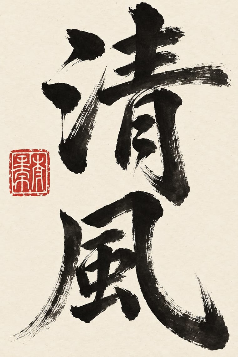
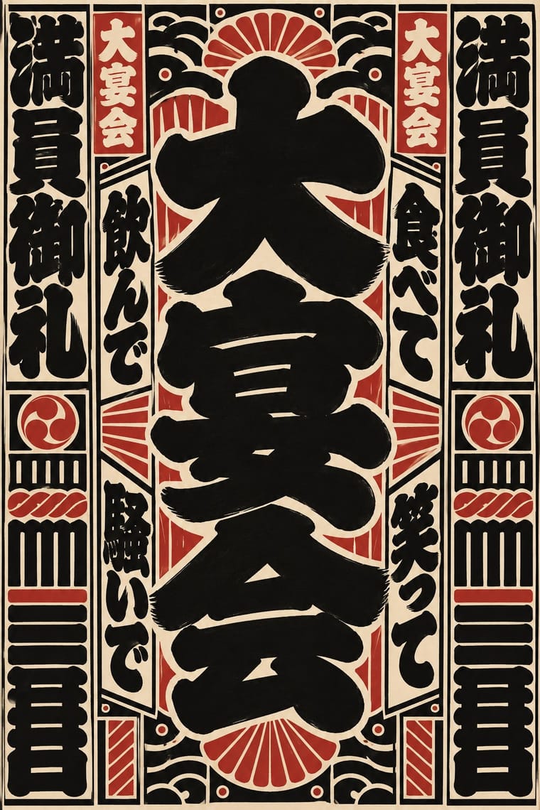
Edo-moji fattens brush strokes until they fill every gap, for crowds and luck; calligraphy keeps the stroke's pressure and leaves the paper open, so choose between packed commercial display and spare personal writing.
Mix them and make something Chinese Calligraphy Edo-moji Commercial Lettering
01
What each style brings
Each part of the design comes from the style with the stronger say in it, and each style gives at least two.
Chinese Calligraphy & Seal Carving (Shufa & Zhuanke) Edo-moji Commercial Lettering (Kanteiryū, Yose-moji, Sumō-ji)
- Type from Edo-moji Commercial Lettering
- Colour from Chinese Calligraphy
- Form from Chinese Calligraphy
- Composition from Edo-moji Commercial Lettering
- Surface from Chinese Calligraphy
02
The type
Open fonts standing in for each style’s own type, which is often hand-drawn or commercial.
Display · Edo-moji Commercial Lettering
Square
Yatra One; Edo-moji Commercial Lettering used Kanteiryū (勘亭流, shibai-moji) and Yose-moji (寄席文字)
Text · Chinese Calligraphy
The written art of China and the root of East Asian lettering. A soft, pointed brush writes ink characters in vertical columns read right to left; pressure swells and thins each stroke, and a drying brush breaks into 'flying white'. Five script families run from even seal script to cursive so fast it becomes gesture. In literati work the only colour is the red seal, cut in stone, on pale paper or silk; at the New Year the brush writes couplets and 福 in black or gold on red paper. Carved in steles and plaques, the writing returns as white-on-black rubbings and signboards over doors and shops.
Shippori Mincho; Chinese Calligraphy used Seal script (zhuanshu) and Clerical script (lishu), which grew out of Qin clerks' writing and became the main script of the Han dynasty
03
The colours
The ground and leading colours come from Chinese Calligraphy, with a counter-accent from Edo-moji Commercial Lettering. The ink reads on the ground at 4.5:1 or more.
Chinese Calligraphy & Seal Carving (Shufa & Zhuanke) Edo-moji Commercial Lettering (Kanteiryū, Yose-moji, Sumō-ji)
-
#f2ebdcground · 36% -
#151311ink · 14% -
#b8282eaccent · 18% -
#d8c7a0accent · 14% -
#5e5a55accent · 10% -
#22324faccent · 8%
As CSS
:root {
  --ground: #f2ebdc;
  --ink: #151311;
  --accent-1: #b8282e;
  --accent-2: #d8c7a0;
  --accent-3: #5e5a55;
  --accent-4: #22324f;
  --font-display: "Yatra One", cursive;
  --font-text: "Shippori Mincho", serif;
}
Use it with care
Chinese Calligraphy & Seal Carving (Shufa & Zhuanke): Chinese calligraphy and seal engraving are living arts, inscribed on UNESCO's Representative List in 2009 and passed on from master to apprentice, so commission or credit calligraphers and seal carvers rather than tracing their hands, and never present generated writing as the work of a named master. Japanese shodō and Korean seoye grew from this root but are distinct living traditions with their own masters; do not label them Chinese or use this entry as a stand-in for them. Have every character written or checked by a fluent reader: image models produce pseudo-characters, and mirrored, reversed or wrongly ordered characters read as nonsense (the upside-down 福 posted at the New Year is a deliberate exception). A seal is a personal signature and is still used on official documents, so never make a seal bearing a real person's or institution's name without their consent, never copy a historical collector's or emperor's seal onto new work, and remember the seal face is cut in reverse so that the impression reads correctly. Never write a living person's name in red ink, a traditional taboo that marks the condemned and the dead. Buddhist sutras and other devotional texts written as calligraphy should not be cropped into texture or put on floors and throwaway items.
Edo-moji Commercial Lettering (Kanteiryū, Yose-moji, Sumō-ji): These are living professional hands: Kanteiryū is written by kabuki calligraphers, yose-moji is taught by the Tachibana school, and sumō-ji is the trained duty of the Japan Sumo Association's gyōji, so commission or credit those writers instead of passing off a font as their work. Senjafuda are votive slips left at shrines and temples and the banzuke's 蒙御免 is a formula of sumo tradition; do not print real shrine names, performers' names or rankings as decoration, and draw characters with their real meanings rather than as pseudo-Japanese texture.
04
The two styles
05
More combinations
With Chinese Calligraphy
- International Typographic Style Contrasts · Set a single large brushed character against a flush-left grotesque grid to stage the gesture of the hand against impersonal order.
- Ottoman Tughra & Dîvânî Chancery Calligraphy Contrasts · The tughra makes a ruler's written name the giant emblem of a document; the Chinese seal keeps the name small, square and red beside the writing, so decide whether the signature is the picture or the counterweight.
- Ma & Wabi-sabi Aesthetics Pairs well · Both treat empty ground as active; let one brushed character and a small seal sit off-centre in a wide, quiet field of paper-toned space.
- Guochao (China-Chic National Trend) Pairs well · Guochao branding borrows brush characters and red seals; commission real calligraphy and a properly cut seal instead of a generic brush-texture font and a fake stamp.
- Song–Ming Woodblock Book Typography (Songti / Mincho) Pairs well · The printed letter was cut from the regular script of Tang calligraphers and straightened for the knife; put a brushed title or preface and a red seal above a Song-style text column so the written and the cut letter speak together.
- Chinese National-Style Animation (Shanghai Animation Film Studio) Pairs well · A brush-written title and a red seal sit naturally on a frame of graded ink and empty paper, as on the paintings the ink-wash films animate.
With Edo-moji Commercial Lettering
- Kamon (Japanese Family Crests) Pairs well · Pair a one-colour mon with a packed column of kago-moji or yose-moji for a curtain, label or name card that carries both the house sign and the house name; both reduce to one ink and survive dyeing, painting and printing.
- Victorian Letterpress & Wood Type Contrasts · Victorian playbills crowded a sheet with many wood-type faces; Edo-moji playbills reached the same crowded pull with one hand drawn by a single writer. Choose between eclectic mixing and one consistent hand.
- Ma & Wabi-sabi Aesthetics Contrasts · Wabi-sabi lets one rough brush mark sit in empty space; Edo-moji fills the character and the page to wish for a full house. Use the clash to decide whether a Japanese identity should whisper or call out to the street.
- Hong Kong Neon & Beiwei Shop-Sign Lettering Contrasts · Both are East Asian commercial sign hands, but Beiwei kaishu is square and chisel-cut in coloured light on a night sky while Edo-moji is rounded, swollen black ink on paper; compare them to choose between a chiselled and a plump brush voice.
- Song–Ming Woodblock Book Typography (Songti / Mincho) Contrasts · The Mincho book letter is thin, upright and set in an airy ruled grid for long reading; Edo-moji is fat, packed and made for a name read from far off. Pair a Mincho text block with an Edo-moji title for a programme or menu.
- Ukiyo-e Woodblock Prints Pairs well · Kabuki actor prints and picture playbills shared Edo's theatre world with Kanteiryū; set a flat, keylined actor figure under a Kanteiryū title for a theatre poster that sounds the same note in picture and letter.
- Hand-Painted Signage & Vernacular Lettering Pairs well · Both are trade-specific hands written by professional sign writers; combine an Edo-moji name with a Western sign-writer's Roman for a bilingual shopfront, keeping the Japanese hand solid black and without drop shadows.
- Showa Modern Commercial Art and Zuan-moji Pairs well · Both treat lettering as drawn design; fill an Edo-moji-style heavy brush shape with Showa modern flat geometry.