Style combination · Pairs well
Chinese Calligraphy × Chinese National-Style Animation
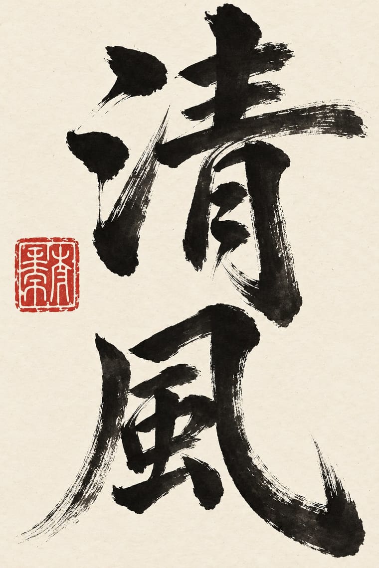
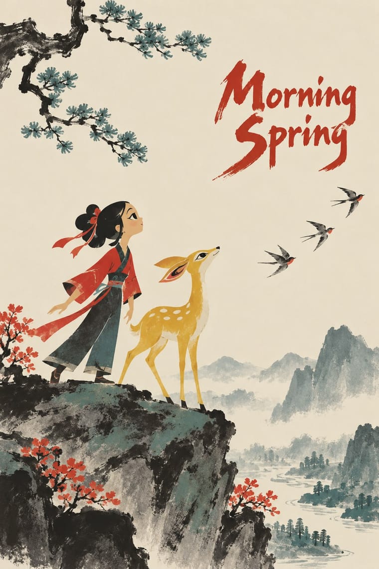
A brush-written title and a red seal sit naturally on a frame of graded ink and empty paper, as on the paintings the ink-wash films animate.
Mix them and make something Chinese Calligraphy Chinese National-Style Animation
01
What each style brings
Each part of the design comes from the style with the stronger say in it, and each style gives at least two.
Chinese Calligraphy & Seal Carving (Shufa & Zhuanke) Chinese National-Style Animation (Shanghai Animation Film Studio)
- Type from Chinese Calligraphy
- Colour from Chinese Calligraphy
- Form from Chinese National-Style Animation
- Composition from Chinese National-Style Animation
- Surface from Chinese Calligraphy
02
The type
Open fonts standing in for each style’s own type, which is often hand-drawn or commercial.
Display · Chinese Calligraphy
Calm
Shippori Mincho, standing in for Regular script (kaishu) after Ouyang Xun and Yan Zhenqing (the 'Yan style', Yanti)
Text · Chinese National-Style Animation
The 'national style' of the Shanghai Animation Film Studio, which turned from Disney and Soviet models to Chinese media: Peking-opera masks and movement, paper-cut and folded-paper figures, mural and New Year print colour and, from 1960, ink-wash painting set in motion after Qi Baishi and Li Keran. Graded ink on empty paper, flat outlined figures over painted grounds and brush-written titles carried fables and myths, from Havoc in Heaven (1961-1964) to Feeling from Mountain and Water (1988).
Zen Maru Gothic; Chinese National-Style Animation used Running-script brush calligraphy for main titles and Regular-script brush calligraphy for credits, written in black on pale paper
03
The colours
The ground and leading colours come from Chinese Calligraphy, with a counter-accent from Chinese National-Style Animation. The ink reads on the ground at 4.5:1 or more.
Chinese Calligraphy & Seal Carving (Shufa & Zhuanke) Chinese National-Style Animation (Shanghai Animation Film Studio)
-
#f2ebdcground · 36% -
#151311ink · 14% -
#b8282eaccent · 18% -
#e3bb3aaccent · 14% -
#d8c7a0accent · 10% -
#5e5a55accent · 8%
As CSS
:root {
  --ground: #f2ebdc;
  --ink: #151311;
  --accent-1: #b8282e;
  --accent-2: #e3bb3a;
  --accent-3: #d8c7a0;
  --accent-4: #5e5a55;
  --font-display: "Shippori Mincho", serif;
  --font-text: "Zen Maru Gothic", sans-serif;
}
Use it with care
Chinese Calligraphy & Seal Carving (Shufa & Zhuanke): Chinese calligraphy and seal engraving are living arts, inscribed on UNESCO's Representative List in 2009 and passed on from master to apprentice, so commission or credit calligraphers and seal carvers rather than tracing their hands, and never present generated writing as the work of a named master. Japanese shodō and Korean seoye grew from this root but are distinct living traditions with their own masters; do not label them Chinese or use this entry as a stand-in for them. Have every character written or checked by a fluent reader: image models produce pseudo-characters, and mirrored, reversed or wrongly ordered characters read as nonsense (the upside-down 福 posted at the New Year is a deliberate exception). A seal is a personal signature and is still used on official documents, so never make a seal bearing a real person's or institution's name without their consent, never copy a historical collector's or emperor's seal onto new work, and remember the seal face is cut in reverse so that the impression reads correctly. Never write a living person's name in red ink, a traditional taboo that marks the condemned and the dead. Buddhist sutras and other devotional texts written as calligraphy should not be cropped into texture or put on floors and throwaway items.
Chinese National-Style Animation (Shanghai Animation Film Studio): The films and their character designs, from Zhang Guangyu's Monkey King to Zhang Ding's Nezha, are the work of named designers at a studio that survives as Shanghai Animation Film Studio Co., Ltd. and still exhibits them: borrow the method (graded ink on empty paper, a jointed paper figure, an opera-mask face), never copy a particular character, and never present a generated image as a studio film. The paper-cut films drew on a living folk craft and shadow theatre, so credit those traditions and their makers rather than treating them as free motifs. Opera-mask colours and patterns mark particular character types, so do not paint them onto real people or ethnic groups as caricature. The national style was itself pursued with state backing (a vice premier proposed animating Qi Baishi, and Nezha was made for the People's Republic's thirtieth anniversary), and the studio also made didactic and political films; in the Cultural Revolution its classics were denounced as 'poisonous weeds' and its artists, Te Wei among them, imprisoned or sent to the countryside. Do not present the films as propaganda or as apolitical folk art, and do not dress a design in revolutionary slogans as period decor.
04
The two styles
05
More combinations
With Chinese Calligraphy
- International Typographic Style Contrasts · Set a single large brushed character against a flush-left grotesque grid to stage the gesture of the hand against impersonal order.
- Ottoman Tughra & Dîvânî Chancery Calligraphy Contrasts · The tughra makes a ruler's written name the giant emblem of a document; the Chinese seal keeps the name small, square and red beside the writing, so decide whether the signature is the picture or the counterweight.
- Ma & Wabi-sabi Aesthetics Pairs well · Both treat empty ground as active; let one brushed character and a small seal sit off-centre in a wide, quiet field of paper-toned space.
- Guochao (China-Chic National Trend) Pairs well · Guochao branding borrows brush characters and red seals; commission real calligraphy and a properly cut seal instead of a generic brush-texture font and a fake stamp.
- Edo-moji Commercial Lettering (Kanteiryū, Yose-moji, Sumō-ji) Contrasts · Edo-moji fattens brush strokes until they fill every gap, for crowds and luck; calligraphy keeps the stroke's pressure and leaves the paper open, so choose between packed commercial display and spare personal writing.
- Song–Ming Woodblock Book Typography (Songti / Mincho) Pairs well · The printed letter was cut from the regular script of Tang calligraphers and straightened for the knife; put a brushed title or preface and a red seal above a Song-style text column so the written and the cut letter speak together.
With Chinese National-Style Animation
- Socialist Realist Propaganda Poster Contrasts · Made in the same state and decades, and like it an official art: the national style was pursued with state backing and its fables carried lessons. But where socialist realism pictured idealised heroes in legible, illusionistic realism, the studio found its forms in ink painting, cut paper, opera and murals; set one against the other to separate a painted, traditional idiom from heroic realism.
- Zagreb School of Animated Film Contrasts · Its contemporary among state-funded animation schools: both broke with Disney's full animation and staged short fables in flat figures and empty fields. Zagreb reduces its small men to geometric caricature for ironic satire of mass society; Shanghai takes its figures from ink painting, opera, paper-cut and murals and tells gentle fables and myths.
- Lianhuanhua Picture-Story Books Contrasts · Its printed contemporary: both told myths and fables, the Monkey King among them, to a mass audience under the same state, but the palm-sized picture-story books drew in black ink line, one framed picture to a page with a caption, while the studio moved painted and cut-paper figures over empty grounds with few or no words.
- Guochao (China-Chic National Trend) Pairs well · For China-chic packaging and campaigns, borrow the method (an opera-mask face, scrolling clouds, an ink wash on empty paper) rather than quoting the studio's licensed characters.
- UPA & Cartoon Modern Contrasts · Both flattened the cartoon in the 1950s, but UPA took its flat colour and caricature from modern painting, while Shanghai took flatness from cut paper and murals and atmosphere from graded ink washes.