Style combination · Contrasts
Chinese Calligraphy × International Typographic Style
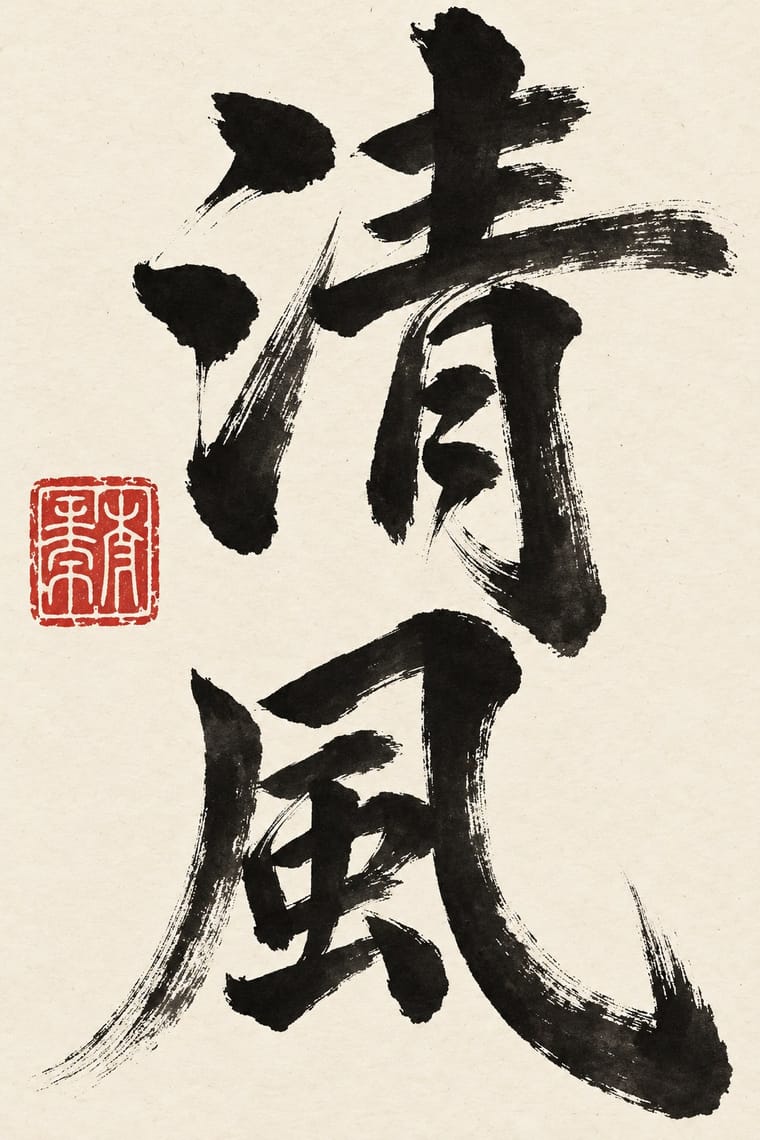
Set a single large brushed character against a flush-left grotesque grid to stage the gesture of the hand against impersonal order.
Mix them and make something Chinese Calligraphy International Typographic Style
01
What each style brings
Each part of the design comes from the style with the stronger say in it, and each style gives at least two.
Chinese Calligraphy & Seal Carving (Shufa & Zhuanke) International Typographic Style
- Type from Chinese Calligraphy
- Colour from International Typographic Style
- Form from Chinese Calligraphy
- Composition from International Typographic Style
- Surface from Chinese Calligraphy
02
The type
Open fonts standing in for each style’s own type, which is often hand-drawn or commercial.
Display · Chinese Calligraphy
Notice
Shippori Mincho, standing in for Regular script (kaishu) after Ouyang Xun and Yan Zhenqing (the 'Yan style', Yanti)
Text · International Typographic Style
A post-war refinement of the New Typography in which the mathematical grid, objective photography and neo-grotesque sans-serifs were used to communicate with clarity and neutrality. Taught at the Basel and Zurich schools, it became the default language of international corporate and institutional communication.
Inter; International Typographic Style used Akzidenz-Grotesk and Helvetica
03
The colours
The ground and leading colours come from International Typographic Style, with a counter-accent from Chinese Calligraphy. The ink reads on the ground at 4.5:1 or more.
Chinese Calligraphy & Seal Carving (Shufa & Zhuanke) International Typographic Style
-
#f2f0e9ground · 36% -
#111111ink · 14% -
#e1251baccent · 18% -
#1f4e9caccent · 14% -
#d8c7a0accent · 10% -
#7a7a7aaccent · 8%
As CSS
:root {
  --ground: #f2f0e9;
  --ink: #111111;
  --accent-1: #e1251b;
  --accent-2: #1f4e9c;
  --accent-3: #d8c7a0;
  --accent-4: #7a7a7a;
  --font-display: "Shippori Mincho", serif;
  --font-text: "Inter", sans-serif;
}
Use it with care
Chinese Calligraphy & Seal Carving (Shufa & Zhuanke): Chinese calligraphy and seal engraving are living arts, inscribed on UNESCO's Representative List in 2009 and passed on from master to apprentice, so commission or credit calligraphers and seal carvers rather than tracing their hands, and never present generated writing as the work of a named master. Japanese shodō and Korean seoye grew from this root but are distinct living traditions with their own masters; do not label them Chinese or use this entry as a stand-in for them. Have every character written or checked by a fluent reader: image models produce pseudo-characters, and mirrored, reversed or wrongly ordered characters read as nonsense (the upside-down 福 posted at the New Year is a deliberate exception). A seal is a personal signature and is still used on official documents, so never make a seal bearing a real person's or institution's name without their consent, never copy a historical collector's or emperor's seal onto new work, and remember the seal face is cut in reverse so that the impression reads correctly. Never write a living person's name in red ink, a traditional taboo that marks the condemned and the dead. Buddhist sutras and other devotional texts written as calligraphy should not be cropped into texture or put on floors and throwaway items.
04
The two styles

05
More combinations
With Chinese Calligraphy
- Ottoman Tughra & Dîvânî Chancery Calligraphy Contrasts · The tughra makes a ruler's written name the giant emblem of a document; the Chinese seal keeps the name small, square and red beside the writing, so decide whether the signature is the picture or the counterweight.
- Ma & Wabi-sabi Aesthetics Pairs well · Both treat empty ground as active; let one brushed character and a small seal sit off-centre in a wide, quiet field of paper-toned space.
- Guochao (China-Chic National Trend) Pairs well · Guochao branding borrows brush characters and red seals; commission real calligraphy and a properly cut seal instead of a generic brush-texture font and a fake stamp.
- Edo-moji Commercial Lettering (Kanteiryū, Yose-moji, Sumō-ji) Contrasts · Edo-moji fattens brush strokes until they fill every gap, for crowds and luck; calligraphy keeps the stroke's pressure and leaves the paper open, so choose between packed commercial display and spare personal writing.
- Song–Ming Woodblock Book Typography (Songti / Mincho) Pairs well · The printed letter was cut from the regular script of Tang calligraphers and straightened for the knife; put a brushed title or preface and a red seal above a Song-style text column so the written and the cut letter speak together.
- Chinese National-Style Animation (Shanghai Animation Film Studio) Pairs well · A brush-written title and a red seal sit naturally on a frame of graded ink and empty paper, as on the paintings the ink-wash films animate.
With International Typographic Style
- Art Nouveau Contrasts · Ornamental curves against an orthogonal grid make a strong deliberate tension.
- Brutalist Web Design Pairs well · Strip the grid to raw HTML defaults to get a rawer, contemporary take on Swiss honesty.
- Psychedelic Poster Contrasts · Its exact opposite on legibility; borrow one swirling element to break a too-cold Swiss layout.
- Japanese Postwar Modernism Pairs well · Add Japanese restraint and emblematic colour fields to the grid for warmth without losing order.
- American Traditional Tattoo Flash Contrasts · Rational grid and sans-serif against sentimental, hand-lettered emblems: one flash motif on a Swiss layout makes a sharp contrast.
- Graffiti & Hip-Hop Graphics Contrasts · Put a single tag or throw-up over a strict Swiss grid to stage the clash between institutional order and a street voice.
- Pop Art Graphics Contrasts · Set one loud appropriated Pop image inside a strict grid with a neutral grotesque so the irony reads as deliberate rather than chaotic.
- Italian Painted Film Poster (Rome Studios) Contrasts · Grid, restraint and photographic objectivity are the opposite of a crowded painted montage.