Style combination · Pairs well
Chaekgeori × Cubist Pictorial Space
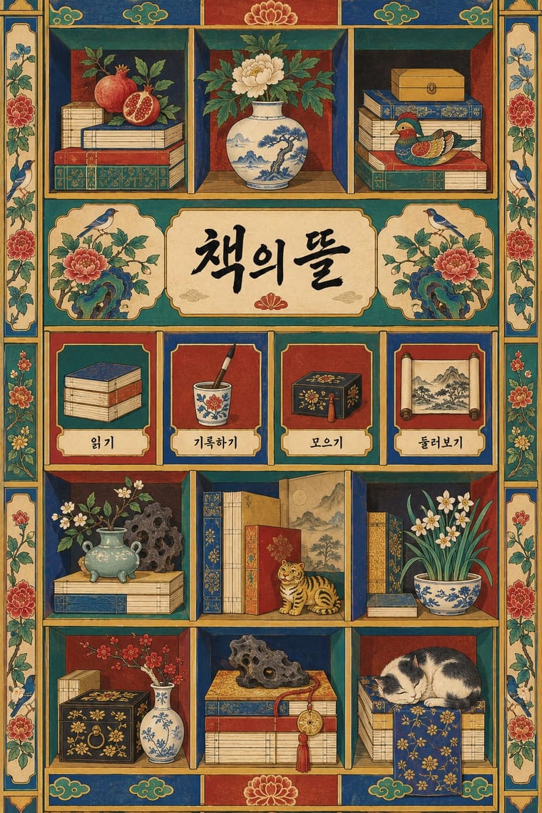
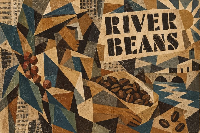
Chaekgeori already shows objects from several viewpoints at once; borrow Cubist faceting to push its tilted shelves further, or cite chaekgeori as an East Asian precedent for multi-view still life.
Mix them and make something Chaekgeori Cubist Pictorial Space
01
What each style brings
Each part of the design comes from the style with the stronger say in it, and each style gives at least two.
Chaekgeori & Minhwa Screen Painting Cubist Pictorial Space
- Type from Chaekgeori
- Colour from Cubist Pictorial Space
-
Chaekgeori avoids monochrome: this is where the two pull against each other.
- Form from Cubist Pictorial Space
- Composition from Chaekgeori
- Surface from Cubist Pictorial Space
02
The type
Open fonts standing in for each style’s own type, which is often hand-drawn or commercial.
Display · Chaekgeori
Hello
Shippori Mincho; Chaekgeori used Haeseo (regular script) brush characters and Munjado pictorial ideographs built from emblematic motifs
Text · Cubist Pictorial Space
The pictorial revolution of Picasso and Braque that shattered single-point perspective into overlapping, faceted planes seen from several viewpoints at once. Through papier collé and stencilled lettering it brought real printed matter and type onto the picture plane, handing graphic design the fragment, the shallow layered plane and collage as working tools.
Newsreader; Cubist Pictorial Space used Sign-painters' stencilled capitals and Clipped newspaper mastheads and headline grotesques
03
The colours
The ground and leading colours come from Cubist Pictorial Space, with a counter-accent from Chaekgeori. The ink reads on the ground at 4.5:1 or more.
Chaekgeori & Minhwa Screen Painting Cubist Pictorial Space
-
#e6dcc3ground · 36% -
#2a241dink · 14% -
#8b6b3eaccent · 18% -
#d9a23aaccent · 14% -
#c9b48aaccent · 10% -
#b8392baccent · 8%
As CSS
:root {
  --ground: #e6dcc3;
  --ink: #2a241d;
  --accent-1: #8b6b3e;
  --accent-2: #d9a23a;
  --accent-3: #c9b48a;
  --accent-4: #b8392b;
  --font-display: "Shippori Mincho", serif;
  --font-text: "Newsreader", serif;
}
04
The two styles
05
More combinations
With Chaekgeori
- Out-of-Square Hangul Typography Pairs well · Set a munjado-style pictorial character beside modular out-of-square Hangul to bridge Joseon folk painting and contemporary Korean type.
- Skeuomorphic UI Pairs well · A wooden bookshelf interface is a digital chaekgado; use its compartment grid and trompe-l'oeil objects for a playful library or catalogue UI.
- Nianhua & Chinese Folk Print Pairs well · Both are auspicious household pictures; drop nianhua rebuses (a fish for surplus, a bat for fortune) into the compartments of a chaekgado grid for festive packaging.
- Ma & Wabi-sabi Aesthetics Contrasts · Chaekgeori fills the screen with prized possessions where ma leaves it empty; isolate one shelf object on a blank ground to move between display and restraint.
- Song–Ming Woodblock Book Typography (Songti / Mincho) Pairs well · Chaekgeori screens paint stacks of the scholar's books; pair a painted bookcase grid with real ruled, framed Myeongjo text pages for a Korean scholarly identity.
- Burmese Parabaik Painting (Konbaung Folding Books) Pairs well · Both are court paintings on a folding support that took Western-derived shading and recession into a local convention; set a parabaik procession beside a chaekgado shelf to compare how each folds depth into panels.
- Korean Commercial Calligraphy (Kaelligeurapi) Pairs well · Munjado paints a character full of pictures and commercial calligraphy bends a brushed word into a picture of its meaning; pair them for a Korean identity in which writing and image are the same mark.
- Minjung Woodcut Graphics (Korean People's Art) Pairs well · Minjung artists studied folk painting; borrow minhwa's flat colour and folk motifs to warm a black-and-white print.
With Cubist Pictorial Space
- Risograph & Indie Print Culture Pairs well · Print synthetic-Cubist planes as overlapping flat riso inks so the overprints do the faceting for you.
- Art Deco Pairs well · Fracture a Deco poster subject into crisp Cubist planes, as Cassandre did, to add depth and movement without losing polish.
- Isotype Pictorial Statistics Contrasts · Isotype shows one thing from one view, Cubism one thing from many; choose Cubist fragmentation only when ambiguity is the point.
- Art Nouveau Contrasts · Set faceted, straight-edged planes against a single whiplash curve to dramatise the break with organic ornament.
- Woodland School (Legend Painting) Pairs well · Daphne Odjig took the overlapping planes of the Cubism she encountered in Toronto into her own curving, strongly outlined Woodland painting; when a layout wants overlapping flat planes, overlap type and colour panels around a commissioned Woodland image rather than imitating her hand.
- Low Poly Illustration Contrasts · Cubism breaks an object into planes seen from several viewpoints at once and flattens the space; low poly facets it from one consistent viewpoint and keeps the perspective. Borrow Cubist overlap only when ambiguity, not legibility, is the point.