Style combination · Pairs well
Black Metal Graphics × Expressionist Woodcut Graphics
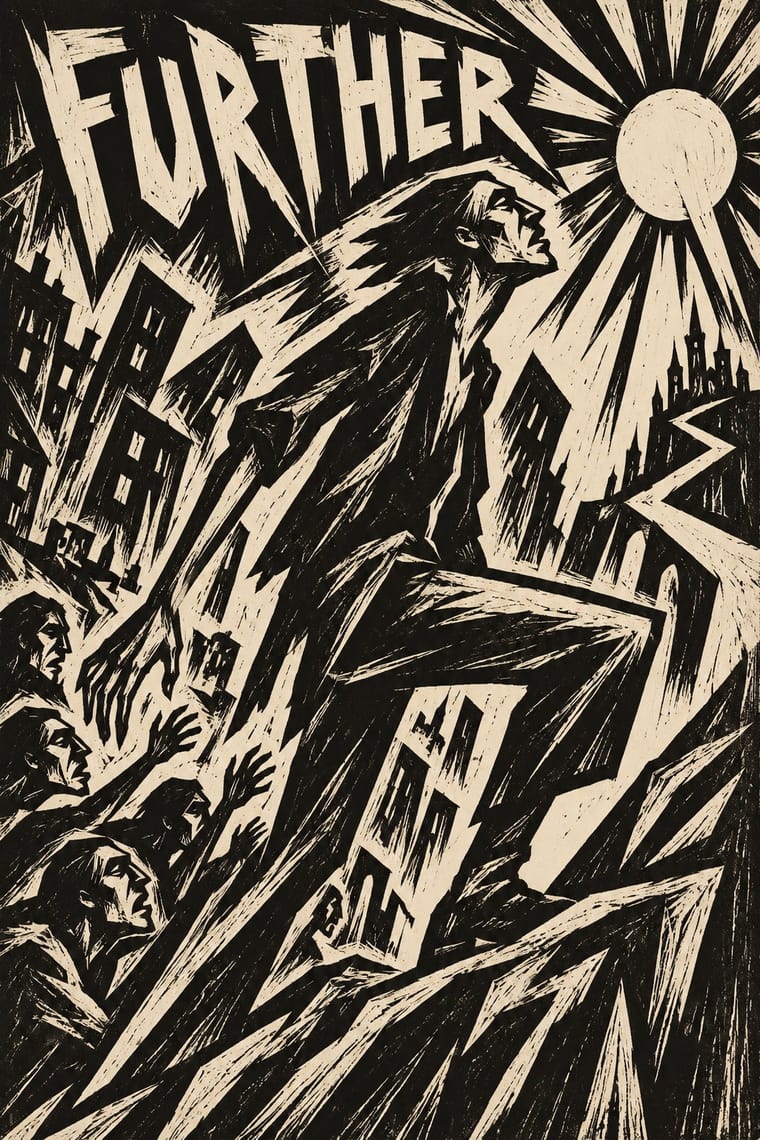
Both work in black and white with jagged, angular marks and dread; cut a forest or a church as a black woodcut for a cover that needs a picture but not a photograph.
Mix them and make something Black Metal Graphics Expressionist Woodcut Graphics
01
What each style brings
Each part of the design comes from the style with the stronger say in it, and each style gives at least two.
Black Metal Graphics Expressionist Woodcut Graphics
- Type from Black Metal Graphics
- Colour from Black Metal Graphics
- Form from Expressionist Woodcut Graphics
- Composition from Black Metal Graphics
- Surface from Expressionist Woodcut Graphics
02
The type
Open fonts standing in for each style’s own type, which is often hand-drawn or commercial.
Display · Black Metal Graphics
No!
UnifrakturMaguntia, standing in for Old English Text and Fraktur capitals
Text · Expressionist Woodcut Graphics
The graphic arm of German Expressionism, from Die Brücke in Dresden (1905) to the Berlin journals Der Sturm and Die Aktion and Frans Masereel's woodcut novels. Artists revived the woodcut as a raw, subjective medium: they gouged distorted figures and jagged lettering into the same block and printed them in harsh black or a single flat ink, often on coloured paper, for exhibition posters, portfolios, manifestos and magazine covers.
Special Elite; Expressionist Woodcut Graphics used Hand-cut woodcut capitals and Rudolf Koch's Neuland (Klingspor, 1923), a display face in the same hand-cut spirit
03
The colours
The ground and leading colours come from Black Metal Graphics, with a counter-accent from Expressionist Woodcut Graphics. The ink reads on the ground at 4.5:1 or more.
Black Metal Graphics Expressionist Woodcut Graphics
-
#0a0a0aground · 36% -
#e6e2d8ink · 14% -
#6f6f6faccent · 18% -
#d9932faccent · 14% -
#2a2a2aaccent · 10% -
#c8432baccent · 8%
As CSS
:root {
  --ground: #0a0a0a;
  --ink: #e6e2d8;
  --accent-1: #6f6f6f;
  --accent-2: #d9932f;
  --accent-3: #2a2a2a;
  --accent-4: #c8432b;
  --font-display: "UnifrakturMaguntia", serif;
  --font-text: "Special Elite", monospace;
}
Use it with care
Black Metal Graphics: The Norwegian scene's early-1990s fame rests partly on real crimes: church arsons from 1992 and two murders. Varg Vikernes of Burzum, sentenced in 1994 for the murder of Euronymous and four church arsons, is credited with bringing neo-Nazi views into the scene, and a small National Socialist black metal minority still spreads them through lyrics and imagery; even Darkthrone had to remove a slogan about race from a 1994 back cover after distributors objected. Cite Burzum sleeves only as history, and take mood from the public-domain Kittelsen and Doré pictures instead. Borrow the mirrored logo, the black field and the bleak photograph, but never a burnt or burning church, a photograph of a real death, or far-right symbols: no Black Sun (Sonnenrad), winged or serifed odal rune, wolfsangel, SS runes or Totenkopf, and no slogan about race or nation in blackletter. Inverted crosses and pentagrams signal hostility to Christianity; weigh them before using them for a general audience. Logos are the commissioned, living work of named letterers such as Szpajdel: commission or credit one rather than copying a band's name or mark.
04
The two styles
05
More combinations
With Black Metal Graphics
- Punk & DIY Zine Contrasts · Punk fed black metal's birth (Hellhammer's Tom G. Warrior heard Discharge as 'a revolution, much like Venom'), and both run off a photocopier for a scene that refuses polish; but punk crowds the sheet with ransom-note collage and irony while black metal leaves one dark photograph and one mirrored logo on an empty black field; choose between noise and silence.
- Gothic Blackletter & Fraktur Tradition Pairs well · Take one broken-script title from the gothic tradition and set it small under a hand-drawn thorned logo, in white on black, so the old letter reads as menace instead of a page of text.
- Post-Punk Record Sleeve (Stiff, Factory, 4AD) Contrasts · Both put one image on a quiet, often black field, but post-punk shrinks, codes or omits the band's name, prints offset on special stock and hides riddles for the art-literate, while black metal makes a hand-drawn, near-illegible logo the centre of a xeroxed, earnest sleeve; choose between a coded name and a sigil.
- Screenprinted Gig & Alt-Movie Poster Contrasts · The gig poster sells a show with fluorescent inks, cartoons and a knowing wink; strip it to black, bone white and a mirrored logo to see how much the wink was doing.
- Art Nouveau Pairs well · Szpajdel's cited source: borrow Art Nouveau's vegetal, space-filling lettering and mirror it, then sharpen every curve into a thorn and drop the colour.
- Grunge Typography Contrasts · Both made legibility negotiable in the 1990s, but grunge layered and eroded digital type across a broken grid, while black metal draws one logo by hand and centres it in emptiness; pick analogue symmetry or digital disorder.
- Gabber and Hardcore Graphics (Rotterdam and Thunderdome) Contrasts · Both use menace and emblems, but one is neon and rendered, the other monochrome and hand-inked.
- Nordic Fairy-Tale and Troll Illustration (Werenskiold, Kittelsen, Bauer) Contrasts · Burzum's Filosofem (1996) put Kittelsen's 'Op under Fjeldet toner en Lur' on its cover; mind the caution before borrowing that framing, and keep the folk-tale humour and tenderness the sleeves leave out.
With Expressionist Woodcut Graphics
- Art Nouveau Contrasts · The parent's smooth whiplash and floral harmony is exactly what the gouge splinters; use one against the other to stage order breaking down.
- Punk & DIY Zine Pairs well · Hand-cut jagged letters and one cheap ink suit gig posters and zines that want anger without photocopy clichés.
- Plakatstil / Sachplakat Contrasts · Same country and years: Bernhard's calm flat object poster against an anguished Brücke woodcut shows commercial clarity versus inner expression.
- Taller de Gráfica Popular Pairs well · Both gouge black-and-white relief images; add TGP's legible headlines and social subjects to steady expressionist distortion for a public message.
- Chinese Modern Woodcut Movement Pairs well · Lu Xun's movement learned from Kollwitz and Masereel; set the two side by side to show subjective anguish turning into collective resistance.
- Simplicissimus Satirical Style (Munich) Contrasts · Both distort the figure in protest, but Expressionist prints gouge it from the woodblock with angular, raw marks; Simplicissimus keeps a clean brush contour and flat tints, and adds a punchline.
- Argentine Adventure Historieta (Oesterheld–Breccia) Pairs well · Breccia's white scraped out of a black ground looks like the gouge of a Brücke woodcut; borrow the woodcut's jagged hand-cut capitals for a historieta title page or cover, and keep the comic's panels and captions inside.
- Hungarian Revolutionary Poster Pairs well · Kinchin sees 'a burgeoning taste for Futurist and Expressionist design' in the MA circle's exhibition poster (Bortnyik); add a gouged, splintered edge to the red body when the hero should look anguished rather than triumphant.