Style combination · Contrasts
Black Metal Graphics × Screenprinted Gig
The gig poster sells a show with fluorescent inks, cartoons and a knowing wink; strip it to black, bone white and a mirrored logo to see how much the wink was doing.
Mix them and make something Black Metal Graphics Screenprinted Gig
01
What each style brings
Each part of the design comes from the style with the stronger say in it, and each style gives at least two.
Black Metal Graphics Screenprinted Gig & Alt-Movie Poster
- Type from Black Metal Graphics
- Colour from Screenprinted Gig
- Form from Screenprinted Gig
- Composition from Black Metal Graphics
- Surface from Black Metal Graphics
02
The type
Open fonts standing in for each style’s own type, which is often hand-drawn or commercial.
Display · Black Metal Graphics
Noise
UnifrakturMaguntia, standing in for Old English Text and Fraktur capitals
Text · Screenprinted Gig
Hand-pulled, numbered screenprints that revived the rock poster in Austin from 1991, led by Frank Kozik, and spread via Flatstock fairs and, from 2004, Mondo to 'alternative' film posters, for collectors as much as the show. The gig posters lean to fluorescent inks, innocent cartoons in bizarre scenes and dense psychedelic layers; the film posters, often by the same artists, to Bass-like silhouettes or a whole cast on one sheet. A few flat inks, opaque or overprinting, sometimes metallic, carry hand-drawn lettering and usually one witty idea, sweet and sinister, nostalgic and knowing.
Oswald; Screenprinted Gig used Hand-drawn display lettering by the poster artist, drawn into the image and Condensed sans-serif and wood-type-style capitals for the band, venue and date line
03
The colours
The ground and leading colours come from Screenprinted Gig, with a counter-accent from Black Metal Graphics. The ink reads on the ground at 4.5:1 or more.
Black Metal Graphics Screenprinted Gig & Alt-Movie Poster
-
#1d1c1aground · 36% -
#f1ead8ink · 14% -
#f2b134accent · 18% -
#6f6f6faccent · 14% -
#e2482faccent · 10% -
#a6a6a6accent · 8%
As CSS
:root {
  --ground: #1d1c1a;
  --ink: #f1ead8;
  --accent-1: #f2b134;
  --accent-2: #6f6f6f;
  --accent-3: #e2482f;
  --accent-4: #a6a6a6;
  --font-display: "UnifrakturMaguntia", serif;
  --font-text: "Oswald", sans-serif;
}
Use it with care
Black Metal Graphics: The Norwegian scene's early-1990s fame rests partly on real crimes: church arsons from 1992 and two murders. Varg Vikernes of Burzum, sentenced in 1994 for the murder of Euronymous and four church arsons, is credited with bringing neo-Nazi views into the scene, and a small National Socialist black metal minority still spreads them through lyrics and imagery; even Darkthrone had to remove a slogan about race from a 1994 back cover after distributors objected. Cite Burzum sleeves only as history, and take mood from the public-domain Kittelsen and Doré pictures instead. Borrow the mirrored logo, the black field and the bleak photograph, but never a burnt or burning church, a photograph of a real death, or far-right symbols: no Black Sun (Sonnenrad), winged or serifed odal rune, wolfsangel, SS runes or Totenkopf, and no slogan about race or nation in blackletter. Inverted crosses and pentagrams signal hostility to Christianity; weigh them before using them for a general audience. Logos are the commissioned, living work of named letterers such as Szpajdel: commission or credit one rather than copying a band's name or mark.
Screenprinted Gig & Alt-Movie Poster: Film characters, logos and band names belong to their owners: Mondo's Star Wars and Marvel posters were made under licence from Lucasfilm and Disney, so clear the rights before printing a fan 'alt poster'; gig posters are the living trade of named independent printmakers, so commission or credit them rather than generating look-alikes of a recognisable artist's hand; and when you borrow the scene's sweet-and-sinister mix, keep the sinister half to monsters, skulls and noir rather than hate symbols or real atrocities: Kozik's own art drew on the iconography of Franco's fascist regime, under which he spent his earliest years in Spain, and that is not a costume to reuse.
04
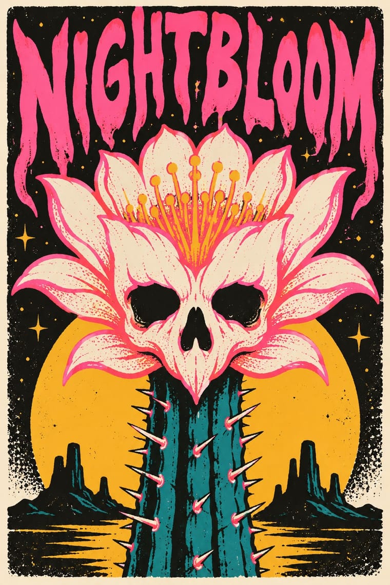
The two styles
05
More combinations
With Black Metal Graphics
- Expressionist Woodcut Graphics Pairs well · Both work in black and white with jagged, angular marks and dread; cut a forest or a church as a black woodcut for a cover that needs a picture but not a photograph.
- Punk & DIY Zine Contrasts · Punk fed black metal's birth (Hellhammer's Tom G. Warrior heard Discharge as 'a revolution, much like Venom'), and both run off a photocopier for a scene that refuses polish; but punk crowds the sheet with ransom-note collage and irony while black metal leaves one dark photograph and one mirrored logo on an empty black field; choose between noise and silence.
- Gothic Blackletter & Fraktur Tradition Pairs well · Take one broken-script title from the gothic tradition and set it small under a hand-drawn thorned logo, in white on black, so the old letter reads as menace instead of a page of text.
- Post-Punk Record Sleeve (Stiff, Factory, 4AD) Contrasts · Both put one image on a quiet, often black field, but post-punk shrinks, codes or omits the band's name, prints offset on special stock and hides riddles for the art-literate, while black metal makes a hand-drawn, near-illegible logo the centre of a xeroxed, earnest sleeve; choose between a coded name and a sigil.
- Art Nouveau Pairs well · Szpajdel's cited source: borrow Art Nouveau's vegetal, space-filling lettering and mirror it, then sharpen every curve into a thorn and drop the colour.
- Grunge Typography Contrasts · Both made legibility negotiable in the 1990s, but grunge layered and eroded digital type across a broken grid, while black metal draws one logo by hand and centres it in emptiness; pick analogue symmetry or digital disorder.
- Gabber and Hardcore Graphics (Rotterdam and Thunderdome) Contrasts · Both use menace and emblems, but one is neon and rendered, the other monochrome and hand-inked.
- Nordic Fairy-Tale and Troll Illustration (Werenskiold, Kittelsen, Bauer) Contrasts · Burzum's Filosofem (1996) put Kittelsen's 'Op under Fjeldet toner en Lur' on its cover; mind the caution before borrowing that framing, and keep the folk-tale humour and tenderness the sleeves leave out.
With Screenprinted Gig
- Pop Art Graphics Pairs well · Shepard Fairey called Kozik 'the punk rock Warhol'; take Pop's appropriated cartoons and halftones and give them a gig poster's single idea and hand-lettered title.
- Psychedelic Poster Pairs well · The 1960s Fillmore and Avalon posters are its ancestor; borrow one swelling, shape-filling title from them, but keep the band, date and venue line readable.
- Polish Poster School Pairs well · Both swap the star's photograph for one idea; add the Polish school's painted ambiguity to a flat screenprint when a film poster needs to unsettle rather than wink.
- Australian Poster Collective Screenprints Contrasts · Both hand-pull flat, hand-lettered screenprints from the same psychedelic root and both reach for fluoro inks; the Australian collectives printed for unions, marches and community causes (and some bands), often from photo stencils, and pasted them up at night, while the gig and alt-movie poster prints for one show, one film and a collector's wall, trading agitation for wit and nostalgia.
- American Mid-Century Modernism Pairs well · Saul Bass's film posters are a favourite model of the alternative movie poster (Film Comment found the Bass homages 'far too plentiful' in 2014); borrow his one cut-paper symbol that holds the whole story.
- WPA Silkscreen Posters Pairs well · Firewatch, the game Olly Moss art-directed, takes its look from National Park posters, and Killscreen (2014) likened its trailer to the Federal Art Project's 1930s national-park posters; give a fannish subject that calm public-service look and the wit shows.
- Risograph & Indie Print Culture Contrasts · Riso gives translucent soy inks and grain on small sheets; choose the screenprint for heavier ink, opaque where it must cover, on a large sheet that collectors frame, and riso for cheap, quick runs.
- Bandung Distro Graphics Pairs well · Both screenprint scene-made graphics for bands; distro moves the print from paper onto cloth.