Style combination · Contrasts
Black Metal Graphics × Nordic Fairy-Tale and Troll Illustration
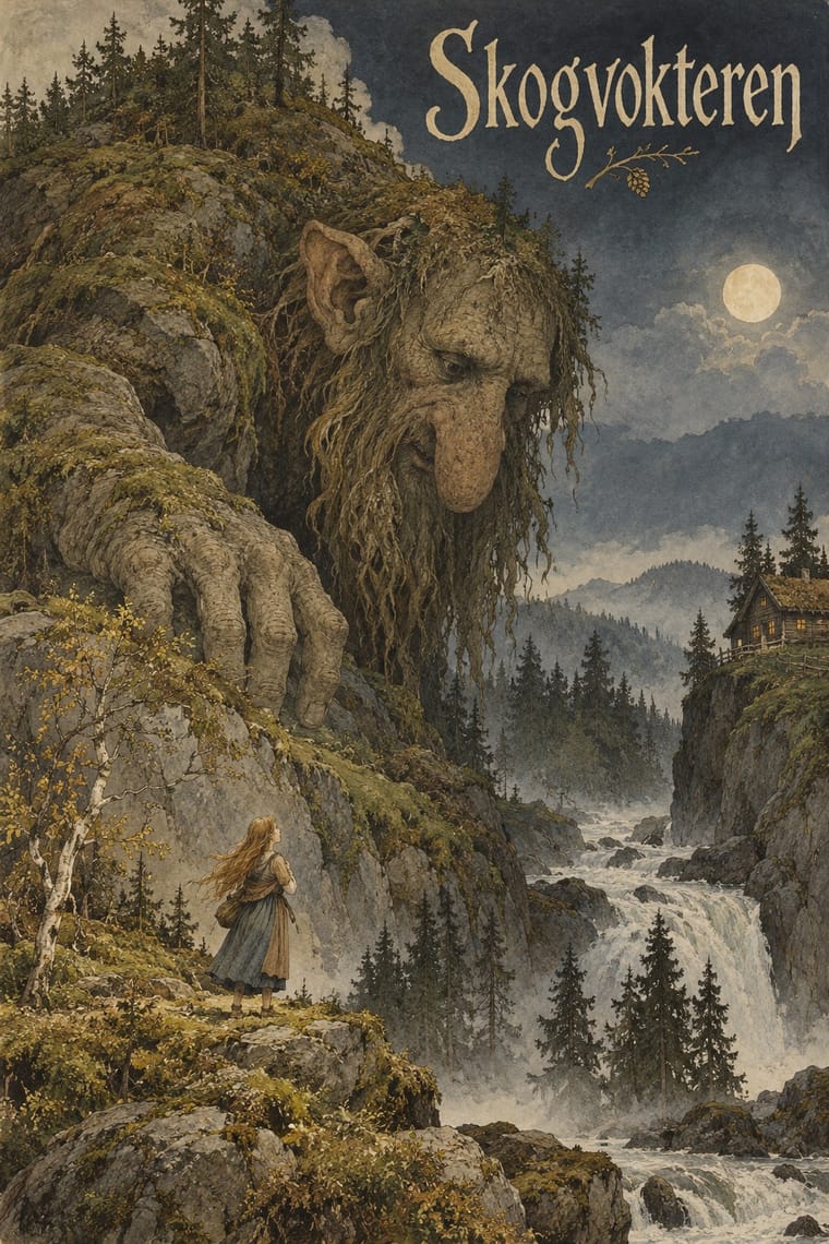
Burzum's Filosofem (1996) put Kittelsen's 'Op under Fjeldet toner en Lur' on its cover; mind the caution before borrowing that framing, and keep the folk-tale humour and tenderness the sleeves leave out.
Mix them and make something Black Metal Graphics Nordic Fairy-Tale and Troll Illustration
01
What each style brings
Each part of the design comes from the style with the stronger say in it, and each style gives at least two.
Black Metal Graphics Nordic Fairy-Tale and Troll Illustration (Werenskiold, Kittelsen, Bauer)
- Type from Black Metal Graphics
- Colour from Black Metal Graphics
- Form from Nordic Fairy-Tale and Troll Illustration
- Composition from Nordic Fairy-Tale and Troll Illustration
- Surface from Black Metal Graphics
02
The type
Open fonts standing in for each style’s own type, which is often hand-drawn or commercial.
Display · Black Metal Graphics
Bloom
UnifrakturMaguntia, standing in for Old English Text and Fraktur capitals
Text · Nordic Fairy-Tale and Troll Illustration
Norwegian and Swedish folk-tale illustration in which trolls, nøkken and huldra live in a real, observed northern landscape of forest, mountain, bog and farm. Werenskiold invented the forest troll type for Asbjørnsen and Moe in 1879, Kittelsen made it grow out of rock, root and water in hatched pen and wash, and Bauer, in muted watercolour plates for Bland tomtar och troll, set small, still princesses among towering firs and lumbering trolls.
EB Garamond; Nordic Fairy-Tale and Troll Illustration used Fraktur text and caption type in the Copenhagen Eventyrbog for Børn (1883–87), e.g. the caption '„Hutetu!" sagde Troldet. Tegning af E. Werenskiold.' under a full-page drawing in vol. 2 (1884) and Ornamented fantasy display lettering in red on a gilt panel, with nisser (gnomes), a cat and a porridge pot above it, on the publisher's binding of Eventyrbog for Børn vol. 1 (1883), drawn by Gotfred Albert Hartvig and engraved by J. C. S. Danielsen
03
The colours
The ground and leading colours come from Black Metal Graphics, with a counter-accent from Nordic Fairy-Tale and Troll Illustration. The ink reads on the ground at 4.5:1 or more.
Black Metal Graphics Nordic Fairy-Tale and Troll Illustration (Werenskiold, Kittelsen, Bauer)
-
#0a0a0aground · 36% -
#e6e2d8ink · 14% -
#6f6f6faccent · 18% -
#c4a04eaccent · 14% -
#2a2a2aaccent · 10% -
#6b5238accent · 8%
As CSS
:root {
  --ground: #0a0a0a;
  --ink: #e6e2d8;
  --accent-1: #6f6f6f;
  --accent-2: #c4a04e;
  --accent-3: #2a2a2a;
  --accent-4: #6b5238;
  --font-display: "UnifrakturMaguntia", serif;
  --font-text: "EB Garamond", serif;
}
Use it with care
Black Metal Graphics: The Norwegian scene's early-1990s fame rests partly on real crimes: church arsons from 1992 and two murders. Varg Vikernes of Burzum, sentenced in 1994 for the murder of Euronymous and four church arsons, is credited with bringing neo-Nazi views into the scene, and a small National Socialist black metal minority still spreads them through lyrics and imagery; even Darkthrone had to remove a slogan about race from a 1994 back cover after distributors objected. Cite Burzum sleeves only as history, and take mood from the public-domain Kittelsen and Doré pictures instead. Borrow the mirrored logo, the black field and the bleak photograph, but never a burnt or burning church, a photograph of a real death, or far-right symbols: no Black Sun (Sonnenrad), winged or serifed odal rune, wolfsangel, SS runes or Totenkopf, and no slogan about race or nation in blackletter. Inverted crosses and pentagrams signal hostility to Christianity; weigh them before using them for a general audience. Logos are the commissioned, living work of named letterers such as Szpajdel: commission or credit one rather than copying a band's name or mark.
Nordic Fairy-Tale and Troll Illustration (Werenskiold, Kittelsen, Bauer): Bauer took bent knives, shoes, spears, pots and belts from his 1904 sketches of Sámi life and made them part of his trolls' clothes and ornament: do not dress trolls or other monsters in Sámi gáktis, duodji or tools, or cast the Sámi, a living Indigenous people, as fairy-tale creatures of the northern wilderness. Kittelsen's pictures have also been reused by Norwegian black metal, including on Filosofem by Varg Vikernes, a neo-Nazi, so keep this imagery away from ethnic-nationalist and 'pure North' framings.
04
The two styles
05
More combinations
With Black Metal Graphics
- Expressionist Woodcut Graphics Pairs well · Both work in black and white with jagged, angular marks and dread; cut a forest or a church as a black woodcut for a cover that needs a picture but not a photograph.
- Punk & DIY Zine Contrasts · Punk fed black metal's birth (Hellhammer's Tom G. Warrior heard Discharge as 'a revolution, much like Venom'), and both run off a photocopier for a scene that refuses polish; but punk crowds the sheet with ransom-note collage and irony while black metal leaves one dark photograph and one mirrored logo on an empty black field; choose between noise and silence.
- Gothic Blackletter & Fraktur Tradition Pairs well · Take one broken-script title from the gothic tradition and set it small under a hand-drawn thorned logo, in white on black, so the old letter reads as menace instead of a page of text.
- Post-Punk Record Sleeve (Stiff, Factory, 4AD) Contrasts · Both put one image on a quiet, often black field, but post-punk shrinks, codes or omits the band's name, prints offset on special stock and hides riddles for the art-literate, while black metal makes a hand-drawn, near-illegible logo the centre of a xeroxed, earnest sleeve; choose between a coded name and a sigil.
- Screenprinted Gig & Alt-Movie Poster Contrasts · The gig poster sells a show with fluorescent inks, cartoons and a knowing wink; strip it to black, bone white and a mirrored logo to see how much the wink was doing.
- Art Nouveau Pairs well · Szpajdel's cited source: borrow Art Nouveau's vegetal, space-filling lettering and mirror it, then sharpen every curve into a thorn and drop the colour.
- Grunge Typography Contrasts · Both made legibility negotiable in the 1990s, but grunge layered and eroded digital type across a broken grid, while black metal draws one logo by hand and centres it in emptiness; pick analogue symmetry or digital disorder.
- Gabber and Hardcore Graphics (Rotterdam and Thunderdome) Contrasts · Both use menace and emblems, but one is neon and rendered, the other monochrome and hand-inked.
With Nordic Fairy-Tale and Troll Illustration
- Finnish Bold Print (Marimekko Modernism) Contrasts · Nordic flat, abstract repeat printing of the 1950s against this tonal, figurative forest; set a single troll silhouette into a bold flat field to bridge them.
- Norwegian and Finnish National Romantic Graphics (Munthe & Karelianism) Contrasts · The same decades and some of the same artists (Werenskiold led the illustrators of the 1899 Kongesagaer), but flat, frontal and ornamental where this is deep, tonal and atmospheric; frame one deep troll forest with a Munthe-style flat border to show the two branches side by side.
- Mir iskusstva Book Art Pairs well · Bilibin's Russian fairy tales are its eastern neighbour; take Bilibin's framed page and lettering and fill it with a Bauer-like deep forest for a northern storybook, keeping Norse and Russian sources distinct.
- Victorian Colour Toy Books (Evans, Crane, Caldecott and Greenaway) Contrasts · Both are children's picture books of the same era, but the toy book's bright flat key-block colour and nursery cheer stand against this dusky, modelled and uncanny northern mood.