Style combination · Pairs well
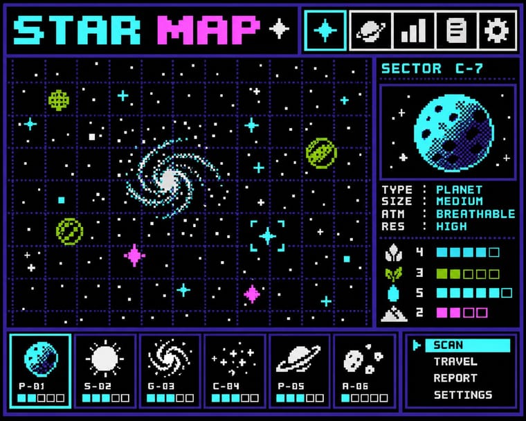
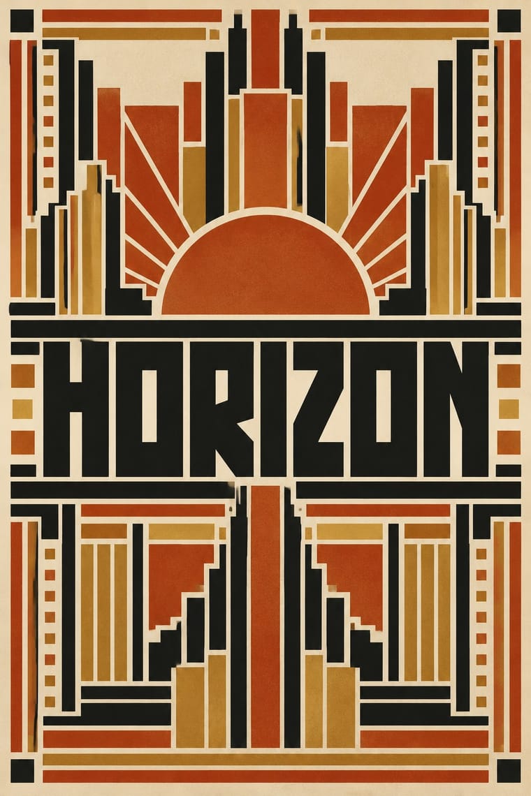
Bitmap × Wendingen
Rule-built capitals are already modular; map Wijdeveld's brass-rule construction onto a pixel or LED grid to make screen display type with an Amsterdam School accent.
01
What each style brings
Each part of the design comes from the style with the stronger say in it, and each style gives at least two.
Bitmap & Pixel Graphics Wendingen & Amsterdam School Typography
- Type from Bitmap
- Colour from Wendingen
- Form from Wendingen
- Composition from Bitmap
- Surface from Bitmap
02
The type
Open fonts standing in for each style’s own type, which is often hand-drawn or commercial.
Text · Wendingen
The graphic language of Wendingen (1918–1932), monthly of the Amsterdam architects' society Architectura et Amicitia, and its editor H. Th. Wijdeveld: the Amsterdam School's brick Expressionism in print. Wijdeveld built heavy capitals and meanders from compositors' brass rules and centred them in thick rule frames on square, Japanese-sewn pages; invited artists drew the covers. The School also built such capitals in brick and on bridge nameplates. Avant-garde covers, such as El Lissitzky's Proun (1921 no. 11, out 1922) and Vilmos Huszár's De Stijl design (1929), sit outside the house style.
Newsreader; Wendingen used H. Th. Wijdeveld's capitals and meanders assembled from compositors' brass rules and type-case pieces and Architectuur NF (Nick Curtis, Nick's Fonts, 2006), a digital revival of the rule-built letters of Wijdeveld's 1925 Frank Lloyd Wright issue, with his meander ornaments
03
The colours
The ground and leading colours come from Wendingen, with a counter-accent from Bitmap. The ink reads on the ground at 4.5:1 or more.
Bitmap & Pixel Graphics Wendingen & Amsterdam School Typography
-
#efe6d2ground · 36% -
#141414ink · 14% -
#c4561eaccent · 18% -
#9bbc0faccent · 14% -
#b8913aaccent · 10% -
#ff55ffaccent · 8%
As CSS
:root {
  --ground: #efe6d2;
  --ink: #141414;
  --accent-1: #c4561e;
  --accent-2: #9bbc0f;
  --accent-3: #b8913a;
  --accent-4: #ff55ff;
  --font-display: "Pixelify Sans", monospace;
  --font-text: "Newsreader", serif;
}
04
The two styles
05
More combinations
With Bitmap
- Andean Woven Graphic Systems Pairs well · The woven cell of Andean tapestry is a pre-digital pixel grid; draw pixel icons with its stepped diagonals, but credit weaving communities rather than copying their motifs.
- Skeuomorphic UI Contrasts · Photoreal leather and glass are the opposite pole of 1-bit honesty; jump from one to the other to tell a story of interface history.
- International Typographic Style Pairs well · Snap pixel type and icons to a strict Swiss grid for a rational, screen-native take on modernist order.
- Art Nouveau Contrasts · Whiplash curves cannot survive a coarse pixel grid; staging that clash makes a memorable, deliberately jagged ornament.
- Kawaii Design Pairs well · Sprite-scale characters and kawaii roundness merge naturally; keep the palette limited so pixel mascots stay crisp.
- Demoscene Graphics (Cracktros, Demos & Text-Mode Art) Contrasts · Bitmap graphics is the legible, flat pixel of icons, sprites and system fonts; scene graphics spend the same pixels on chrome, gradients and motion for show. Pick the icon grid for an interface and the scene logo for a title screen.
- Square Kufic (Bannāʾī) Pairs well · Both build letters from square units, and Sakkal compares building bricks to large pixels; set a bitmap Latin wordmark on the same cell size as a square-Kufic mark for a bilingual identity, but keep sacred formulas out of jokey, game-like pixel contexts.
- Isometric Pixel Art Contrasts · Same hand-placed pixels, but front-on icons and sprites under hardware limits against a crammed, full-colour 2:1 city made as a picture.
With Wendingen
- Vienna Secession Contrasts · Both square their capitals into dense blocks inside symmetrical frames, but Vienna draws them by hand while Wendingen builds them from type metal; use the comparison to decide whether a heading should look drawn or assembled.
- Die Neue Typographie Contrasts · While Wijdeveld centred ornamental rule frames, Tschichold's asymmetric programme threw them out; pit a centred Wendingen title page against a flush-left sans layout to make the choice between monument and function explicit.
- De Stijl Contrasts · Same country, same years and the same rules and bars: De Stijl set them asymmetrically in primaries as pure abstraction, Wendingen piled them symmetrically into monumental, decorative frames; set one against the other to choose between open balance and a formal facade.
- Risograph & Indie Print Culture Pairs well · Black plus one warm ink on cream suits two-colour riso; assemble heavy capitals and borders from rectangles for zines and posters that echo Wendingen without a letterpress.
- Nieuwe Kunst (Dutch Art Nouveau) Pairs well · Its Amsterdam successor kept the symmetry, the closed frame and the systematic construction (Lauweriks drew Wendingen's first cover) but traded plants and batik for heavy capitals built from brass rules; combine them for a vegetal pattern inside a monumental frame.