Style combination · Contrasts
De Stijl × Wendingen
Same country, same years and the same rules and bars: De Stijl set them asymmetrically in primaries as pure abstraction, Wendingen piled them symmetrically into monumental, decorative frames; set one against the other to choose between open balance and a formal facade.
01
What each style brings
Each part of the design comes from the style with the stronger say in it, and each style gives at least two.
De Stijl Wendingen & Amsterdam School Typography
- Type from Wendingen
- Colour from De Stijl
- Form from De Stijl
- Composition from De Stijl
-
Wendingen avoids dynamic asymmetry: this is where the two pull against each other, which is the point of the contrast.
- Surface from Wendingen
02
The type
Open fonts standing in for each style’s own type, which is often hand-drawn or commercial.
Display · Wendingen
Dawn
Rubik Mono One; Wendingen used H. Th. Wijdeveld's capitals and meanders assembled from compositors' brass rules and type-case pieces and Architectuur NF (Nick Curtis, Nick's Fonts, 2006), a digital revival of the rule-built letters of Wijdeveld's 1925 Frank Lloyd Wright issue, with his meander ornaments
Text · De Stijl
A Dutch movement formed around Theo van Doesburg's journal De Stijl and Piet Mondrian's Neoplasticism, which sought universal harmony through the most elementary means: horizontal and vertical lines, rectangles, the three primaries and black, white and grey. In typography it produced block-constructed letters and orthogonal, asymmetric layouts whose principles flowed directly into the Bauhaus and the New Typography.
Archivo; De Stijl used Theo van Doesburg's rectilinear alphabet and Vilmos Huszár's block-letter De Stijl masthead
03
The colours
The ground and leading colours come from De Stijl, with a counter-accent from Wendingen. The ink reads on the ground at 4.5:1 or more.
De Stijl Wendingen & Amsterdam School Typography
-
#f5f3eeground · 36% -
#111111ink · 14% -
#f4c20daccent · 18% -
#c4561eaccent · 14% -
#b8913aaccent · 10% -
#1f4ea1accent · 8%
As CSS
:root {
  --ground: #f5f3ee;
  --ink: #111111;
  --accent-1: #f4c20d;
  --accent-2: #c4561e;
  --accent-3: #b8913a;
  --accent-4: #1f4ea1;
  --font-display: "Rubik Mono One", sans-serif;
  --font-text: "Archivo", sans-serif;
}
04
The two styles
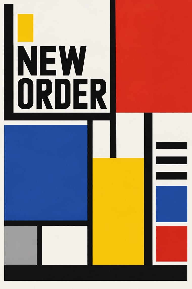
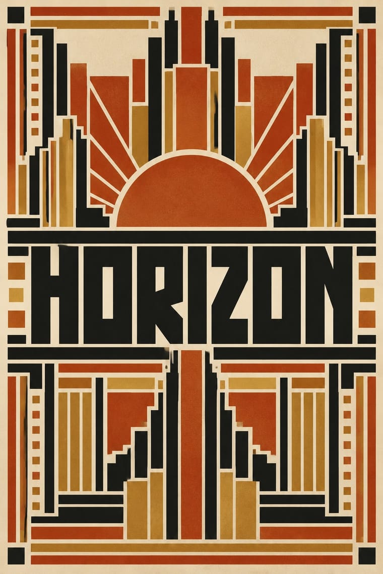
05
More combinations
With De Stijl
- Memphis Design Contrasts · Memphis reuses the primaries with squiggles and irony; compare the two to decide whether geometry should be earnest or playful.
- International Typographic Style Pairs well · Drop one De Stijl primary field into a Swiss grid for structure with a jolt of colour.
- Psychedelic Poster Contrasts · Vibrating, melting colour against still primaries: contrast them to present order and ecstasy as opposite poles.
- Flat Design Pairs well · Flat UI colour blocking descends from De Stijl; use black separators and primary fields for bold, legible interfaces.
- Dutch Expressive Postmodernism (Studio Dumbar & Hard Werken) Pairs well · Dumbar's forerunner at Teldesign, the Mondriaan poster for the Gemeentemuseum Den Haag (1971–72), photographed De Stijl's coloured bars standing in real space like an installation, and his De Stijl poster with Lex van Pieterson (1982) was a staged arrangement of objects, among them a portrait of Rietveld; lift the primaries and bars off the page, build them as a set and photograph it for the Dutch postmodern twist on the movement.
- Mechano-Faktura & Polish Constructivist Advertising Pairs well · Shared flat colour and orthogonal discipline; swap the Dutch primaries for red-black-white.
- NK Textilkammare Geometric Print (Astrid Sampe, Signerad Textil) Pairs well · Sampe's late-1940s fabrics followed Mondrian: take De Stijl's black lines and primary accents and turn them into an even, directionless repeat.
With Wendingen
- Vienna Secession Contrasts · Both square their capitals into dense blocks inside symmetrical frames, but Vienna draws them by hand while Wendingen builds them from type metal; use the comparison to decide whether a heading should look drawn or assembled.
- Die Neue Typographie Contrasts · While Wijdeveld centred ornamental rule frames, Tschichold's asymmetric programme threw them out; pit a centred Wendingen title page against a flush-left sans layout to make the choice between monument and function explicit.
- Bitmap & Pixel Graphics Pairs well · Rule-built capitals are already modular; map Wijdeveld's brass-rule construction onto a pixel or LED grid to make screen display type with an Amsterdam School accent.
- Risograph & Indie Print Culture Pairs well · Black plus one warm ink on cream suits two-colour riso; assemble heavy capitals and borders from rectangles for zines and posters that echo Wendingen without a letterpress.
- Nieuwe Kunst (Dutch Art Nouveau) Pairs well · Its Amsterdam successor kept the symmetry, the closed frame and the systematic construction (Lauweriks drew Wendingen's first cover) but traded plants and batik for heavy capitals built from brass rules; combine them for a vegetal pattern inside a monumental frame.