Style combination · Contrasts
Basel Object Poster × Pop Art Graphics
Both make an icon of a consumer product, but Pop repeats it in flat screenprinted colour with irony, where Basel paints one specimen with reverent, tactile care.
Mix them and make something Basel Object Poster Pop Art Graphics
01
What each style brings
Each part of the design comes from the style with the stronger say in it, and each style gives at least two.
Basel Object Poster (Swiss Sachplakat) Pop Art Graphics
- Type from Basel Object Poster
- Colour from Pop Art Graphics
- Form from Basel Object Poster
- Composition from Basel Object Poster
- Surface from Pop Art Graphics
02
The type
Open fonts standing in for each style’s own type, which is often hand-drawn or commercial.
Display · Basel Object Poster
Hello
Fira Sans, standing in for Brand name painted on the product (the woven MARQUE PKZ label, 1923; BINACA on the tube and METAMETA embossed on the fuel tablet, 1941)
Text · Pop Art Graphics
Pop turned the commercial imagery of post-war consumer culture (comics, packaging, celebrity photographs and advertising) into both its subject and its method. Images are appropriated, enlarged, flattened and repeated; colour is bright and unmodulated; and the printing process itself, from Ben-Day dots to off-register silkscreen, is left visible as a sign of mass production.
Archivo; Pop Art Graphics used Comic-book hand lettering and Franklin Gothic
03
The colours
The ground and leading colours come from Pop Art Graphics, with a counter-accent from Basel Object Poster. The ink reads on the ground at 4.5:1 or more.
Basel Object Poster (Swiss Sachplakat) Pop Art Graphics
-
#fbf8f0ground · 36% -
#111111ink · 14% -
#ffd400accent · 18% -
#e10600accent · 14% -
#e0472baccent · 10% -
#0057b8accent · 8%
As CSS
:root {
  --ground: #fbf8f0;
  --ink: #111111;
  --accent-1: #ffd400;
  --accent-2: #e10600;
  --accent-3: #e0472b;
  --accent-4: #0057b8;
  --font-display: "Fira Sans", sans-serif;
  --font-text: "Archivo", sans-serif;
}
04
The two styles
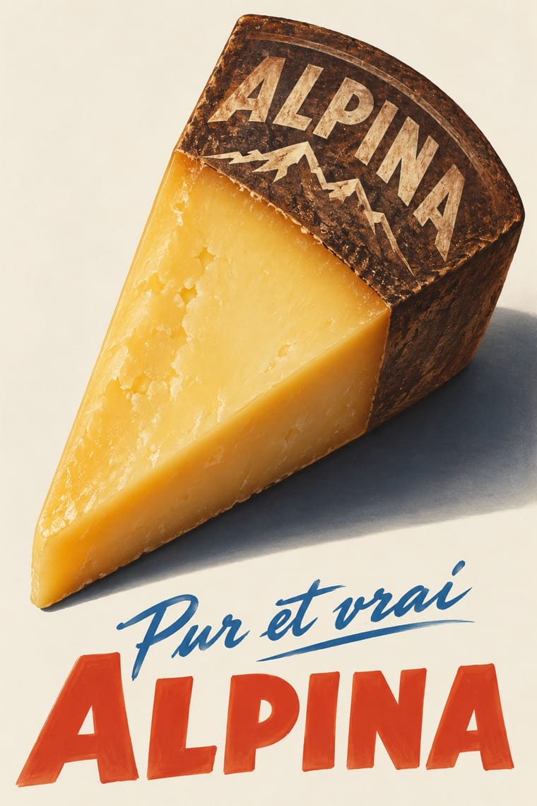
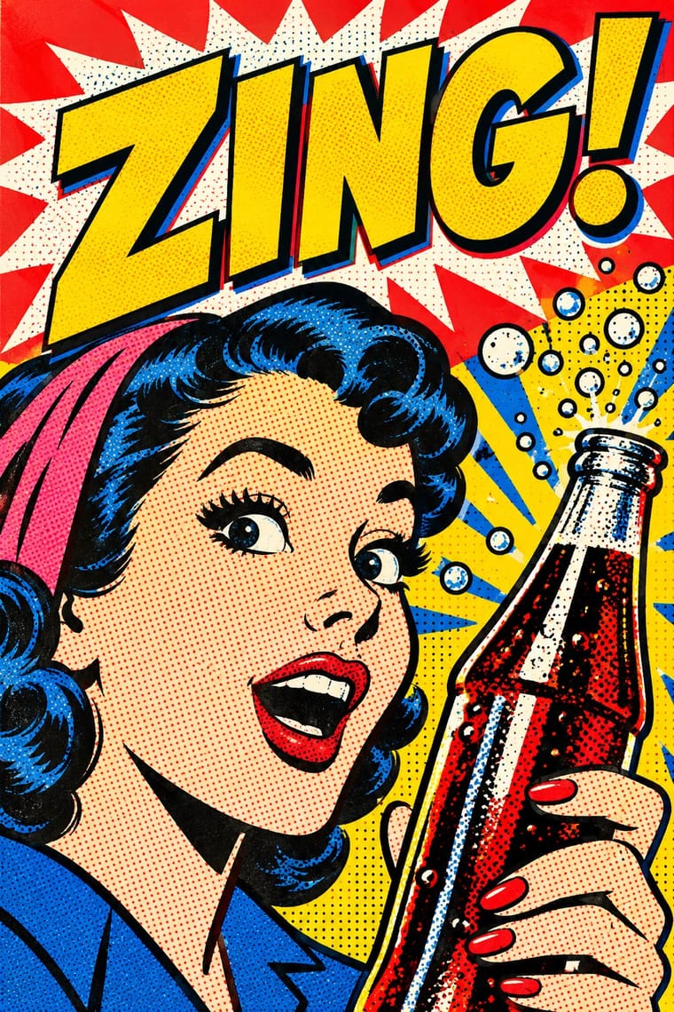
05
More combinations
With Basel Object Poster
- Art Deco Contrasts · A source as well as a foil: Leupin studied at the École Paul Colin in Paris in 1935-36 and took strong impressions from Colin and from Colin's rival Cassandre. Both make a product a heroic icon, but Deco stylises it into a geometric silhouette with airbrushed gradation and geometric capitals, while Basel paints the real object, its material and its label, as a still life.
- International Typographic Style Contrasts · The style that displaced it in the same cities around 1950: a grid, objective photography and a neutral grotesque instead of one painted object and a hand-lettered name. Set the two side by side to show the shift from crafted illusion to systematic information.
- Skeuomorphic UI Pairs well · Skeuomorphic app icons rendered glass, metal and leather the same way for screens; a Basel-style single product with a soft cast shadow on a dark ground makes a strong hero image for packaging or a product launch.
- Plakatstil / Sachplakat Contrasts · Its parent and nearest relative: Berlin's Sachplakat flattens the product into a silhouette in two to four flat colours with heavy block lettering, while Basel paints the same single object in full light and shadow, glass and tweed included. Choose Basel when the material of the product should sell it.
- Surrealist Graphics Pairs well · Both paint ordinary things with illusionistic precision until they look strange; borrow a Magritte-like juxtaposition to push a Basel still life from product portrait to visual riddle, as Leupin did with his newspaper and globe.
- West German Conceptual Film & Culture Poster (Hillmann and Rambow) Contrasts · Both isolate one object on a plain ground, but Basel paints a product in glossy lithographic realism to sell it; here the object stands for a film's theme, is cut to a flat silhouette or a grainy photograph, and rarely flatters.
- French Post-War Visual-Gag Poster (Savignac, Villemot, Morvan) Contrasts · Its Swiss contemporary paints the product as a modelled, larger-than-life icon; choose between wit by cartoon drawing and wit by illusion, or set one against the other.
- Finnish Symbol Poster (the 'Finnish School', 1954–1995) Contrasts · Kamekura compared Varis's humour to Leupin's, but the Basel poster paints the object in glossy relief where the Finnish one flattens it into a sign.
With Pop Art Graphics
- International Typographic Style Contrasts · Set one loud appropriated Pop image inside a strict grid with a neutral grotesque so the irony reads as deliberate rather than chaotic.
- Ma & Wabi-sabi Aesthetics Contrasts · Where Pop multiplies glossy commodities, wabi-sabi values the single worn object; use one to puncture the mood of the other.
- Guna Mola Pairs well · Guna women redraw brand logos and cartoons (RCA Victor, Bullwinkle) in reverse appliqué; let that act of translation inspire Pop work, but buy or commission molas rather than imitating them.
- Neo-Brutalism Pairs well · Lift Pop's thick black outlines and flat primaries into UI cards and buttons for a confident, comic-strip interface.
- Risograph & Indie Print Culture Pairs well · Print Ben-Day dot screens in fluorescent pink and yellow riso inks to give Pop's mass-media imagery a small-run, handmade warmth.
- Screenprinted Gig & Alt-Movie Poster Pairs well · Shepard Fairey called Kozik 'the punk rock Warhol'; take Pop's appropriated cartoons and halftones and give them a gig poster's single idea and hand-lettered title.
- Finnish Bold Print (Marimekko Modernism) Pairs well · Contemporaries in saturated flat colour at a giant scale; borrow pop's isolated, enlarged object for a poster, but drop its halftone and irony to keep Marimekko's sincerity.
- Superflat Contrasts · Both turn commodities into art; take Pop's repetition and frontal commodity but swap its halftone and off-register silkscreen for Superflat's smooth vector fills and anime characters, so the print process disappears.