Style combination · Contrasts
Art Deco × Basel Object Poster
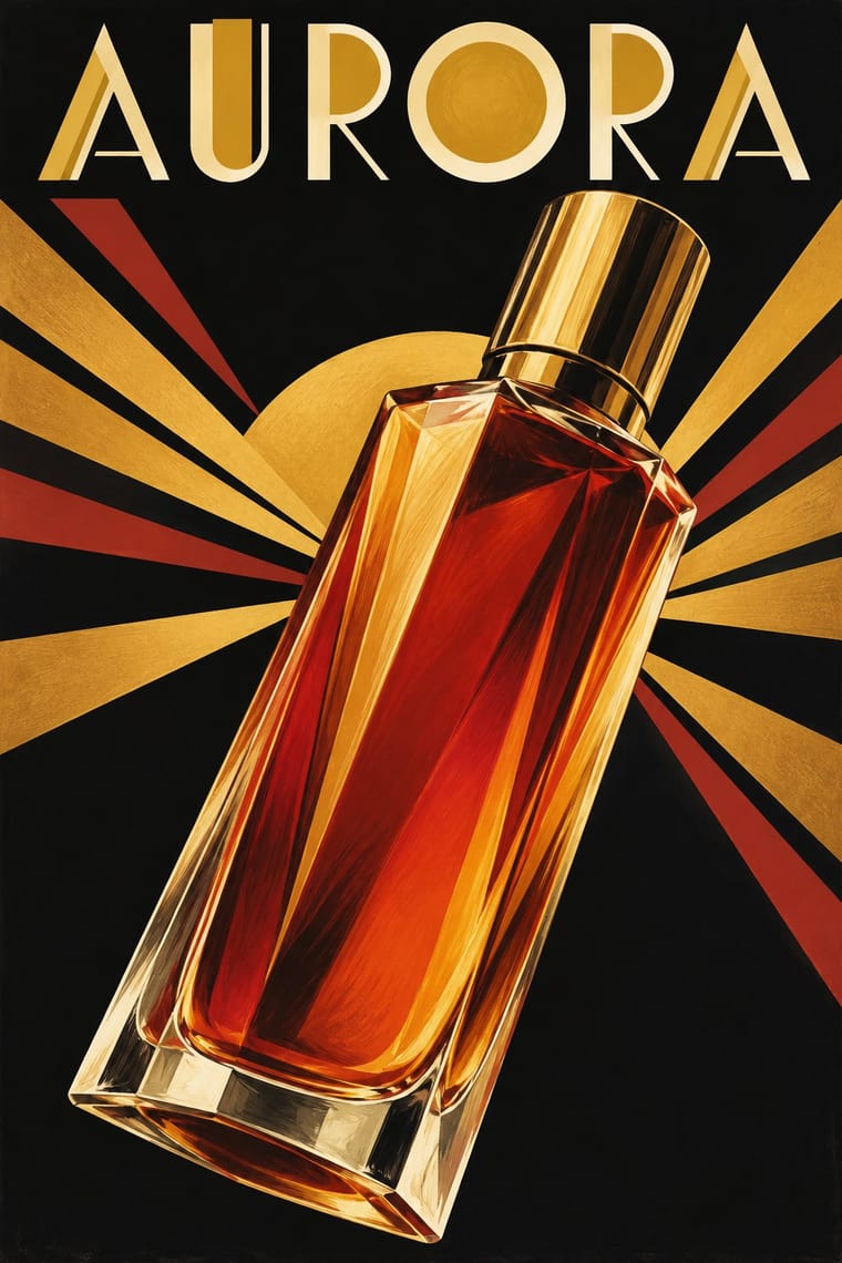
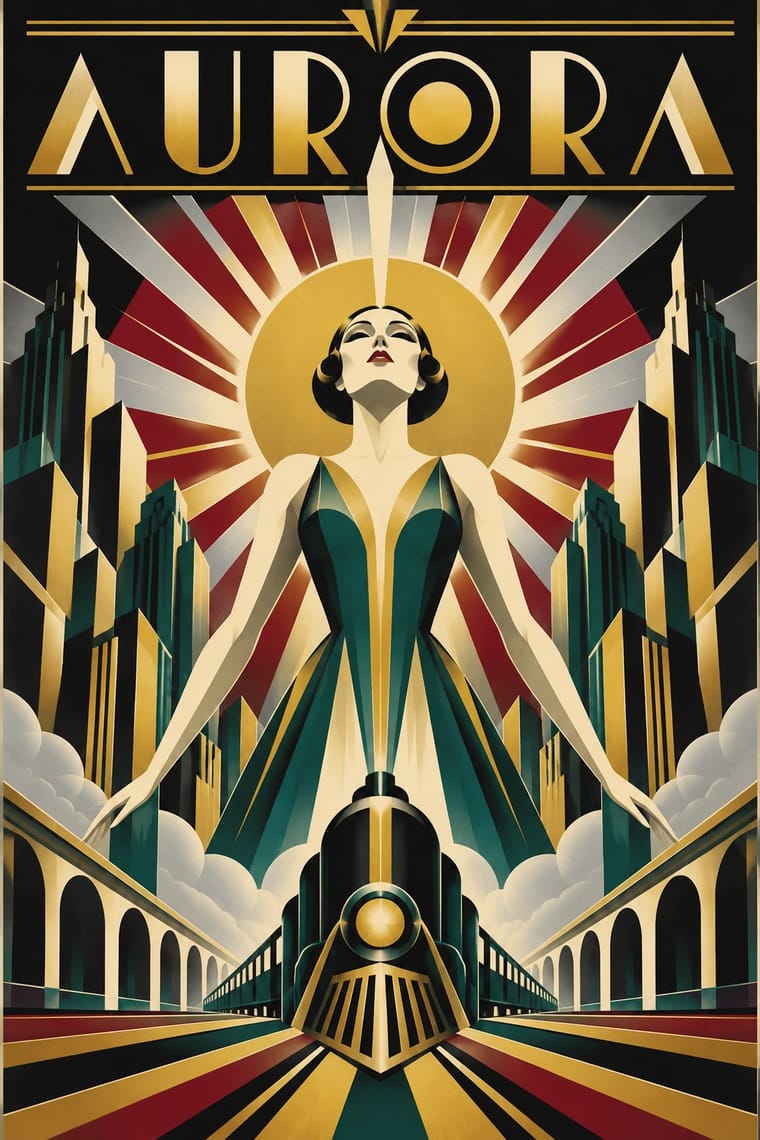
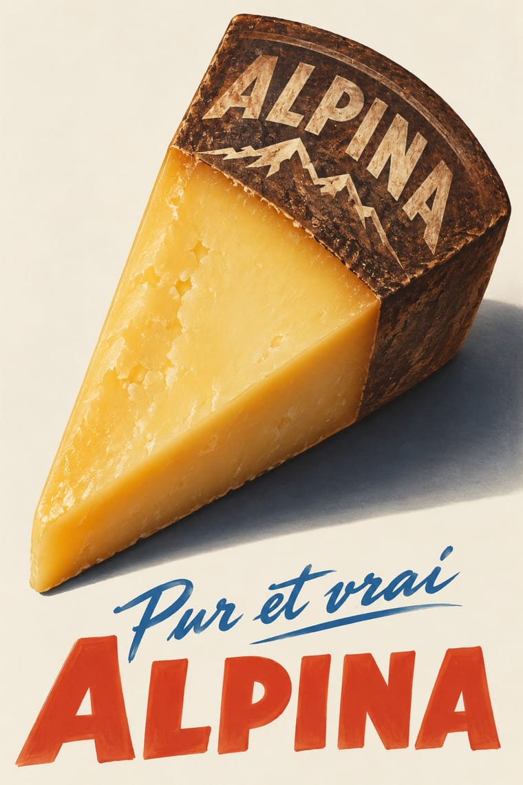
A source as well as a foil: Leupin studied at the École Paul Colin in Paris in 1935-36 and took strong impressions from Colin and from Colin's rival Cassandre. Both make a product a heroic icon, but Deco stylises it into a geometric silhouette with airbrushed gradation and geometric capitals, while Basel paints the real object, its material and its label, as a still life.
01
What each style brings
Each part of the design comes from the style with the stronger say in it, and each style gives at least two.
Art Deco Basel Object Poster (Swiss Sachplakat)
- Type from Art Deco
- Colour from Art Deco
- Form from Art Deco
- Composition from Basel Object Poster
- Surface from Basel Object Poster
02
The type
Open fonts standing in for each style’s own type, which is often hand-drawn or commercial.
Text · Basel Object Poster
The Swiss descendant of the German object poster, made in Zurich and above all Basel from 1919 to the early 1950s. One everyday product (a top hat, a tweed coat, a toothpaste tube, a fountain-pen nib, a match, a curl of butter) is painted larger than life with modelled light, cast shadows and tactile surfaces, set on a plain dark, pale or softly graded ground, with little more than the brand name as text. Rooted in the Neue Sachlichkeit, it raises the product to a quiet, uncanny icon; from about 1940 Leupin and Brun added humour and visual puns.
Fira Sans; Basel Object Poster used Brand name painted on the product and Light italic slogan over a heavy name
03
The colours
The ground and leading colours come from Art Deco, with a counter-accent from Basel Object Poster. The ink reads on the ground at 4.5:1 or more.
Art Deco Basel Object Poster (Swiss Sachplakat)
-
#111111ground · 36% -
#f1e6cfink · 14% -
#c9a227accent · 18% -
#f0c419accent · 14% -
#8c1c26accent · 10% -
#e0472baccent · 8%
As CSS
:root {
  --ground: #111111;
  --ink: #f1e6cf;
  --accent-1: #c9a227;
  --accent-2: #f0c419;
  --accent-3: #8c1c26;
  --accent-4: #e0472b;
  --font-display: "Poiret One", sans-serif;
  --font-text: "Fira Sans", sans-serif;
}
04
The two styles
05
More combinations
With Art Deco
- Googie & Atomic Age Pairs well · Googie's atomic starbursts extend Deco's celestial ornament; mix them for retro hospitality and signage.
- Punk & DIY Zine Contrasts · Puncture Deco polish with a single torn, photocopied edge when luxury needs irony.
- Art Nouveau Contrasts · Deco straightened Nouveau's whiplash; place a rigid sunburst beside one sinuous curve to show the evolution.
- Streamline Moderne Pairs well · Fold Streamline speed lines and rounded corners into a Deco layout to move from stepped geometry toward aerodynamic sweep.
- Estridentismo (Stridentist) Graphics Pairs well · Both drew the 1920s skyline; pair Deco's setback towers and block display letters with Stridentist black-and-white relief for a skyscraper poster with a rougher, revolutionary edge.
- Vienna Secession Pairs well · Carry the Secession's squares, chequers and gold into Deco's stepped geometry for a luxurious but disciplined look.
- Greek Tourism Modernism (EOT) Contrasts · Katzourakis studied poster design under Paul Colin in Paris; set a Deco travel poster's heroic, airbrushed destination beside this flat, cut-out sign to show how the tourist poster was stripped down after the war.
- Cubist Pictorial Space Pairs well · Fracture a Deco poster subject into crisp Cubist planes, as Cassandre did, to add depth and movement without losing polish.
With Basel Object Poster
- International Typographic Style Contrasts · The style that displaced it in the same cities around 1950: a grid, objective photography and a neutral grotesque instead of one painted object and a hand-lettered name. Set the two side by side to show the shift from crafted illusion to systematic information.
- Skeuomorphic UI Pairs well · Skeuomorphic app icons rendered glass, metal and leather the same way for screens; a Basel-style single product with a soft cast shadow on a dark ground makes a strong hero image for packaging or a product launch.
- Plakatstil / Sachplakat Contrasts · Its parent and nearest relative: Berlin's Sachplakat flattens the product into a silhouette in two to four flat colours with heavy block lettering, while Basel paints the same single object in full light and shadow, glass and tweed included. Choose Basel when the material of the product should sell it.
- Surrealist Graphics Pairs well · Both paint ordinary things with illusionistic precision until they look strange; borrow a Magritte-like juxtaposition to push a Basel still life from product portrait to visual riddle, as Leupin did with his newspaper and globe.
- Pop Art Graphics Contrasts · Both make an icon of a consumer product, but Pop repeats it in flat screenprinted colour with irony, where Basel paints one specimen with reverent, tactile care.
- West German Conceptual Film & Culture Poster (Hillmann and Rambow) Contrasts · Both isolate one object on a plain ground, but Basel paints a product in glossy lithographic realism to sell it; here the object stands for a film's theme, is cut to a flat silhouette or a grainy photograph, and rarely flatters.
- French Post-War Visual-Gag Poster (Savignac, Villemot, Morvan) Contrasts · Its Swiss contemporary paints the product as a modelled, larger-than-life icon; choose between wit by cartoon drawing and wit by illusion, or set one against the other.
- Finnish Symbol Poster (the 'Finnish School', 1954–1995) Contrasts · Kamekura compared Varis's humour to Leupin's, but the Basel poster paints the object in glossy relief where the Finnish one flattens it into a sign.