Style combination · Pairs well
Contemporary Arabic × Baybayin Revival Graphics
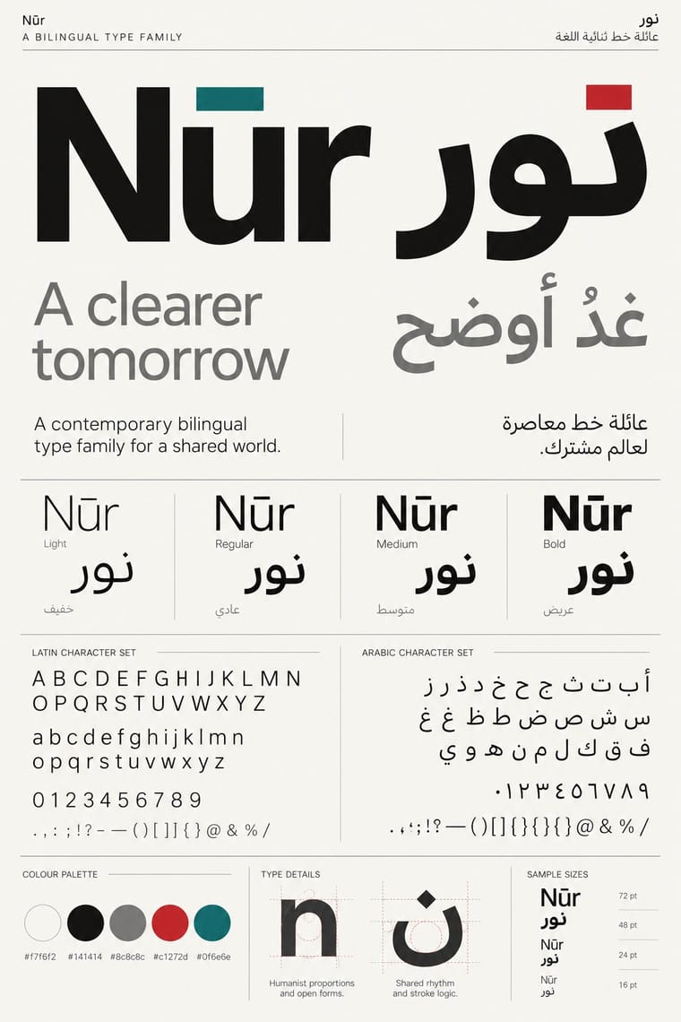
Borrow dual-script matchmaking to give baybayin and its Latin companion matched weight, stroke and proportion on bilingual signs, labels and certificates, even where the Latin is set smaller as the reading line.
Mix them and make something Contemporary Arabic Baybayin Revival Graphics
01
What each style brings
Each part of the design comes from the style with the stronger say in it, and each style gives at least two.
Contemporary Arabic & Dual-Script Type Design Baybayin Revival Graphics
- Type from Contemporary Arabic
- Colour from Contemporary Arabic
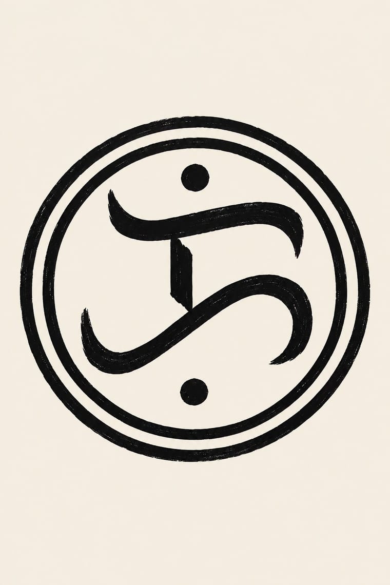
- Form from Baybayin Revival Graphics
- Composition from Baybayin Revival Graphics
- Surface from Baybayin Revival Graphics
-
Contemporary Arabic avoids painterly brushwork: this is where the two pull against each other.
02
The type
Open fonts standing in for each style’s own type, which is often hand-drawn or commercial.
Display · Contemporary Arabic
Atlas
Fira Sans, standing in for Frutiger Arabic and Helvetica Arabic (Nadine Chahine)
Text · Baybayin Revival Graphics
The revival of baybayin, the precolonial Tagalog abugida, as a mark of Filipino identity. Its compact glyphs of hooks, bowls and loops, with kudlit marks above or below to change the vowel, rarely run as text: one character or a short word sits alone in an agency seal or a rayed sun, beside Latin on a peso note, or on a shirt, pendant or tattoo, in one ink, written with brush or pen, cut angular as if on bamboo, or redrawn as even-stroked digital type. Spread by free fonts online from the late 1990s and by Unicode from 2002, it is carried by state emblems and by diaspora calligraphers.
Space Mono; Baybayin Revival Graphics used The woodblock letterforms of the Doctrina Christiana (Manila, 1593), the model most modern baybayin fonts follow and Noto Sans Tagalog (Google Noto, SIL Open Font License; the 2022 build covers the Unicode 14 additions ra U+170D and pamudpod U+1715), the safe choice for real Unicode text
03
The colours
The ground and leading colours come from Contemporary Arabic, with a counter-accent from Baybayin Revival Graphics. The ink reads on the ground at 4.5:1 or more.
Contemporary Arabic & Dual-Script Type Design Baybayin Revival Graphics
-
#f7f6f2ground · 36% -
#141414ink · 14% -
#c1272daccent · 18% -
#0f6e6eaccent · 14% -
#0038a8accent · 10% -
#8c8c8caccent · 8%
As CSS
:root {
  --ground: #f7f6f2;
  --ink: #141414;
  --accent-1: #c1272d;
  --accent-2: #0f6e6e;
  --accent-3: #0038a8;
  --accent-4: #8c8c8c;
  --font-display: "Fira Sans", sans-serif;
  --font-text: "Space Mono", monospace;
}
Use it with care
Contemporary Arabic & Dual-Script Type Design: Arabic must be set with correct contextual shaping and right-to-left direction; disconnected or reversed letters are a common and offensive error. Have every Arabic word checked by a fluent reader, avoid setting Qur'anic verses or the names of God and the Prophet as decorative texture, and commission or credit Arabic type designers rather than deriving Arabic glyphs from a Latin font.
Baybayin Revival Graphics: Baybayin is shared heritage, but its revival touches living Indigenous scripts and contested claims. Hanunóo, Buhid and Tagbanwa are still written by their communities, the Mangyan of Mindoro and the Tagbanwa and Pala'wan of Palawan, and their documents are on UNESCO's Memory of the World register (1999, 'Philippine Paleographs'); do not use their letters, ambahan verses or community signage as generic 'baybayin', and work with the communities and bodies such as the Mangyan Heritage Center when their scripts are involved. Baybayin wrote Tagalog and neighbouring lowland languages, and Kapampangan Kulitan has its own form and keepers, so do not present baybayin as the old writing of every Filipino people; even the bills moved in 2022 from a baybayin-only national script to baybayin 'and other indigenous and traditional writing systems'. 'Alibata', coined by Paul Versoza in 1914 from the Arabic alif-ba-ta, is a misnomer. Have every word spelled by a reader of the script: it writes syllables, so English spelled letter by letter, wrong or missing kudlit, mirrored glyphs and invented letters read as nonsense, and a tattoo makes the error permanent; write personal and organisation names in Latin unless the bearer has chosen a baybayin spelling. Image models cannot write baybayin and invent glyphs: leave the sign blank or set real text in a Unicode font (one that covers ra and the pamudpod, with the text entered as Unicode, not typed on Latin keys mapped to glyphs), and never present generated pseudo-script as genuine. Some of the best-known baybayin emblems carry politics: the CCP's triple ka is, in the Inquirer's words, a remnant of the Marcos New Society, and the ka in a rayed sun, attributed to the Katipunan, was flown by the July 2003 mutineers the press called the Magdalo Group and is the logo of the Magdalo party-list; do not use them as neutral Filipino marks. Agency seals, state insignia and the peso notes are official marks, so draw new emblems instead of copying them. Baybayin tattoos sit beside batok, the Indigenous hand-tapped tattooing whose patterns, placements and rituals belong to particular ethnolinguistic groups and their practitioners: a baybayin word does not license batok patterns or hand-tapping outside those lineages, and invented tribal motifs must not pass as Indigenous designs. Credit or commission Filipino calligraphers, type designers and tattoo artists.
04
The two styles
05
More combinations
With Contemporary Arabic
- Corporate Identity Modernism Pairs well · Roll a matched Arabic–Latin family through a standards manual so both scripts carry the identity with equal authority.
- Urdu Katib Lithography Contrasts · The katib's stacked Nastaʿlīq cascade is everything a screen-optimised Arabic sans gives up; quote it where warmth and history matter more than efficiency.
- International Typographic Style Pairs well · Use a strict, mirrored grid and a neutral sans so Arabic and Latin columns align in rhythm and weight.
- Machine-Age Simplified Arabic Type Pairs well · Its digital successor: dual-script families pair Arabic with a matched Latin while keeping the firm baseline, even colour and reduced stacking that simplification made familiar. 29LT's UA Neo (2013), detached revivals of Khattar's Unified Arabic, is where the two touch.
- Ottoman Tughra & Dîvânî Chancery Calligraphy Pairs well · Keep hand-drawn calligraphy for the mark itself and set the running text in a well-made contemporary Arabic typeface with a matched Latin companion, instead of imitating Dîvânî in body text.
- Post-Binary Typography (Bye Bye Binary and Inclusive French Type) Contrasts · Both extend a typeface's character set for a language need, but dual-script design matches two scripts for neutral, institutional legibility, while post-binary type invents new characters within one script and keeps them visible as a political statement.
- Early Turkish Republican Graphic Design Contrasts · Turkey replaced Arabic letters with Latin in 1928, and Emin Barın carried calligraphic habits into the new script; contemporary dual-script type design keeps both scripts and matches them as equals. Compare the two to show replacement against coexistence.
- Bulaq (Amiriyya) Naskh Book Printing Pairs well · Set long reading text in an Amiri-style calligraphic Naskh and use a low-contrast contemporary Arabic sans for headings, captions and screens, so each register does one job.
With Baybayin Revival Graphics
- Jeepney Art Contrasts · Both speak for Filipino identity, but jeepney art crowds chrome, airbrush and polychrome lettering, while baybayin revival sets a single one-ink character in open space; use the contrast to decide between festive abundance and a quiet mark of origin.
- Arabic Calligraffiti Pairs well · Kabuay applies calligraphy and graffiti methods to baybayin; borrow calligraffiti's large painted gesture for murals, but keep each glyph legible and correctly spelled.
- Thai Yantra (Yant) Diagrams Contrasts · Both put a Southeast Asian script on skin and cloth, but a yantra packs sacred formulae into a consecrated diagram, while a baybayin tattoo or shirt carries a word of identity rather than a consecrated formula; never borrow yantra structure or Khom letters for a baybayin design.
- Kamon (Japanese Family Crests) Pairs well · Set one baybayin character inside a kamon-style monochrome roundel with compass-drawn rings for a seal or mark, as Philippine cultural agencies already do; draw a new emblem rather than copying an agency's.
- Mongol Bichig Calligraphy & Ugalz Ornament Contrasts · Both revive an old script as a national mark beside a dominant one, Cyrillic in Mongolia and Latin in the Philippines, but bichig runs in vertical columns framed by ugalz ornament, while baybayin stands as one bare horizontal character or word; choose between a framed ornamental seal and a single unadorned sign.
- Amazigh Sign System & Tifinagh Contrasts · Both turn a revived script into an identity sign, but Tifinagh is carried by a woven and painted geometric repertoire and appears on public signage, while baybayin is a looped brush or pen hand used almost only as emblem; do not swap one script's look for the other's.
- Out-of-Square Hangul Typography Pairs well · Both modernise a national script from its own structure; borrow out-of-square Hangul's monoline, enlarged letters for a modern baybayin poster, keeping the kudlit placement and the spelling correct.