Style combination · Pairs well
Baybayin Revival Graphics × Kamon
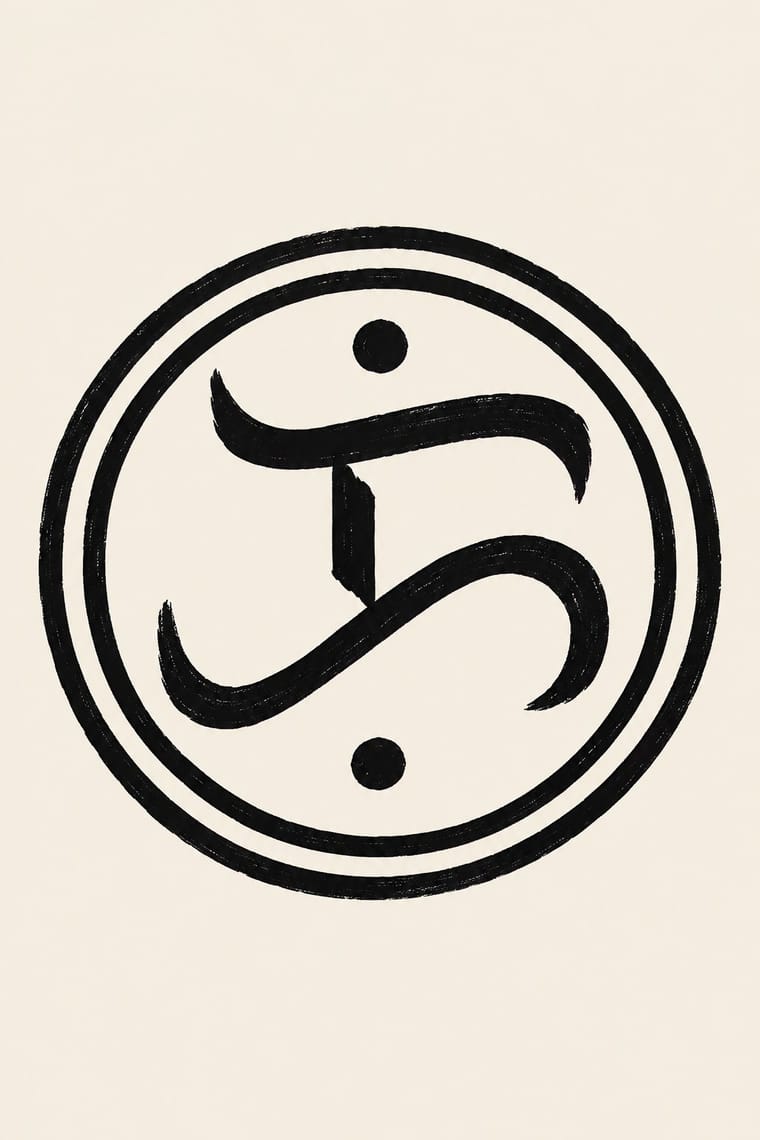
Set one baybayin character inside a kamon-style monochrome roundel with compass-drawn rings for a seal or mark, as Philippine cultural agencies already do; draw a new emblem rather than copying an agency's.
01
What each style brings
Each part of the design comes from the style with the stronger say in it, and each style gives at least two.
Baybayin Revival Graphics Kamon (Japanese Family Crests)
- Type from Baybayin Revival Graphics
- Colour from Kamon
- Form from Kamon
- Composition from Kamon
- Surface from Baybayin Revival Graphics
-
Kamon avoids painterly brushwork: this is where the two pull against each other.
02
The type
Open fonts standing in for each style’s own type, which is often hand-drawn or commercial.
Display · Baybayin Revival Graphics
Civic
Yatra One; Baybayin Revival Graphics used The woodblock letterforms of the Doctrina Christiana (Manila, 1593), the model most modern baybayin fonts follow and Noto Sans Tagalog (Google Noto, SIL Open Font License; the 2022 build covers the Unicode 14 additions ra U+170D and pamudpod U+1715), the safe choice for real Unicode text
Text · Kamon
Japan's family crests: small one-colour emblems that reduce a plant, animal, tool or pattern to a flat silhouette, mirrored or repeated around a centre, often ringed and drawn with compass and brush. Begun on Heian court carriages and spread to samurai and all of society, mon are usually inherited, granted or freely chosen rather than designed, varied in small codified ways for branch families, and placed in fixed positions on formal kimono, shop curtains, lacquer and banners. Covers the formal crest (jōmon), not the decorative coloured kaga-mon or pictorial date-mon and share-mon.
Shippori Mincho; Kamon used Kago-moji, the thick, squared Edo lettering often reversed out in white, for names set beside a crest and Brush-written kaisho (regular-script) kanji for shop names and family names on curtains and lanterns
03
The colours
The ground and leading colours come from Kamon, with a counter-accent from Baybayin Revival Graphics. The ink reads on the ground at 4.5:1 or more.
Baybayin Revival Graphics Kamon (Japanese Family Crests)
-
#f3efe6ground · 36% -
#121212ink · 14% -
#b38f3daccent · 18% -
#ce1126accent · 14% -
#8c2d25accent · 10% -
#0038a8accent · 8%
As CSS
:root {
  --ground: #f3efe6;
  --ink: #121212;
  --accent-1: #b38f3d;
  --accent-2: #ce1126;
  --accent-3: #8c2d25;
  --accent-4: #0038a8;
  --font-display: "Yatra One", cursive;
  --font-text: "Shippori Mincho", serif;
}
Use it with care
Baybayin Revival Graphics: Baybayin is shared heritage, but its revival touches living Indigenous scripts and contested claims. Hanunóo, Buhid and Tagbanwa are still written by their communities, the Mangyan of Mindoro and the Tagbanwa and Pala'wan of Palawan, and their documents are on UNESCO's Memory of the World register (1999, 'Philippine Paleographs'); do not use their letters, ambahan verses or community signage as generic 'baybayin', and work with the communities and bodies such as the Mangyan Heritage Center when their scripts are involved. Baybayin wrote Tagalog and neighbouring lowland languages, and Kapampangan Kulitan has its own form and keepers, so do not present baybayin as the old writing of every Filipino people; even the bills moved in 2022 from a baybayin-only national script to baybayin 'and other indigenous and traditional writing systems'. 'Alibata', coined by Paul Versoza in 1914 from the Arabic alif-ba-ta, is a misnomer. Have every word spelled by a reader of the script: it writes syllables, so English spelled letter by letter, wrong or missing kudlit, mirrored glyphs and invented letters read as nonsense, and a tattoo makes the error permanent; write personal and organisation names in Latin unless the bearer has chosen a baybayin spelling. Image models cannot write baybayin and invent glyphs: leave the sign blank or set real text in a Unicode font (one that covers ra and the pamudpod, with the text entered as Unicode, not typed on Latin keys mapped to glyphs), and never present generated pseudo-script as genuine. Some of the best-known baybayin emblems carry politics: the CCP's triple ka is, in the Inquirer's words, a remnant of the Marcos New Society, and the ka in a rayed sun, attributed to the Katipunan, was flown by the July 2003 mutineers the press called the Magdalo Group and is the logo of the Magdalo party-list; do not use them as neutral Filipino marks. Agency seals, state insignia and the peso notes are official marks, so draw new emblems instead of copying them. Baybayin tattoos sit beside batok, the Indigenous hand-tapped tattooing whose patterns, placements and rituals belong to particular ethnolinguistic groups and their practitioners: a baybayin word does not license batok patterns or hand-tapping outside those lineages, and invented tribal motifs must not pass as Indigenous designs. Credit or commission Filipino calligraphers, type designers and tattoo artists.
Kamon (Japanese Family Crests): Mon are inherited marks of particular families, shrines, temples and institutions. Only the imperial chrysanthemum is named in Japanese law: the Trademark Act (art. 4(1)(i)) bars registering it or anything like it. The government's paulownia, though the official emblem of the Prime Minister and Cabinet, was never given the same legal restrictions, while famous crests registered as trademarks, such as Mitsubishi's three diamonds, are protected as marks. Do not use the chrysanthemum, the government paulownia, or any identifiable family's, shrine's or temple's crest as decoration or as a brand. Imperial emblems can also recall Japan's wartime empire for audiences in Korea and China. The manji (卍), a standard crest (the Hachisuka clan; the temple crest of Sensō-ji), is read in the West as the Nazi swastika: avoid it outside a Japanese context that explains it. Draw new crests by the tradition's rules instead of borrowing real ones, and commission or credit working monsho uwaeshi, who still draw and paint crests by hand.
04
The two styles
05
More combinations
With Baybayin Revival Graphics
- Jeepney Art Contrasts · Both speak for Filipino identity, but jeepney art crowds chrome, airbrush and polychrome lettering, while baybayin revival sets a single one-ink character in open space; use the contrast to decide between festive abundance and a quiet mark of origin.
- Arabic Calligraffiti Pairs well · Kabuay applies calligraphy and graffiti methods to baybayin; borrow calligraffiti's large painted gesture for murals, but keep each glyph legible and correctly spelled.
- Thai Yantra (Yant) Diagrams Contrasts · Both put a Southeast Asian script on skin and cloth, but a yantra packs sacred formulae into a consecrated diagram, while a baybayin tattoo or shirt carries a word of identity rather than a consecrated formula; never borrow yantra structure or Khom letters for a baybayin design.
- Mongol Bichig Calligraphy & Ugalz Ornament Contrasts · Both revive an old script as a national mark beside a dominant one, Cyrillic in Mongolia and Latin in the Philippines, but bichig runs in vertical columns framed by ugalz ornament, while baybayin stands as one bare horizontal character or word; choose between a framed ornamental seal and a single unadorned sign.
- Contemporary Arabic & Dual-Script Type Design Pairs well · Borrow dual-script matchmaking to give baybayin and its Latin companion matched weight, stroke and proportion on bilingual signs, labels and certificates, even where the Latin is set smaller as the reading line.
- Amazigh Sign System & Tifinagh Contrasts · Both turn a revived script into an identity sign, but Tifinagh is carried by a woven and painted geometric repertoire and appears on public signage, while baybayin is a looped brush or pen hand used almost only as emblem; do not swap one script's look for the other's.
- Out-of-Square Hangul Typography Pairs well · Both modernise a national script from its own structure; borrow out-of-square Hangul's monoline, enlarged letters for a modern baybayin poster, keeping the kudlit placement and the spelling correct.
With Kamon
- Ukiyo-e Woodblock Prints Pairs well · Kabuki actors had their own mon, and actor prints show them on the costume, as on the sleeve of Ichikawa Yaozō III in a print of 1796; pair a flat crest with ukiyo-e figures to identify characters without captions.
- Islamic Geometric & Calligraphic Tradition Contrasts · Both are built with compass and straight edge, but girih tiles the whole surface without end while a mon closes one motif inside a ring; borrow the tessellation for a ground and the crest for the single sign on it.
- Corporate Identity Modernism Pairs well · A mon already behaves like a corporate mark (one colour, scalable, placed in fixed positions), as Mitsubishi's three diamonds show; use crest construction rules to build a logo family with codified variants for subsidiaries.
- Ma & Wabi-sabi Aesthetics Contrasts · Both set a single sign in emptiness, but wabi-sabi wants it off-centre, irregular and brush-marked while a mon is exact, symmetric and compass-drawn; set a crest's geometry against wabi-sabi's rough, quiet grounds when packaging or interiors need that tension.
- Japanese Postwar Modernism Pairs well · Postwar Japanese designers drew on kamon for their single emblematic symbols; pair a compass-drawn crest with a grotesque or Gothic caption on an empty field for an identity that is plainly modern but rooted.
- Northwest Coast Formline Design Contrasts · Both are hereditary crest systems, but formline fills a red-and-black field with split, swelling creatures while a mon is a tiny symmetric silhouette in emptiness; compare them to decide between abundance and reduction.
- Japonisme Pairs well · Through Japonisme, mon fed late-19th-century Western pattern design, Louis Vuitton's monogram among them; borrow a crest's compass-built flat silhouette for a Western repeat or monogram, drawn new rather than copied from a real family.
- European Heraldry Contrasts · Both mark kinship with hereditary emblems varied in small codified ways, but a mon is a one-colour silhouette drawn round a centre, while a coat of arms is a shield of contrasting tinctures read by the rule of tincture.