Style combination · Contrasts
AfriCOBRA × Pop Art Graphics
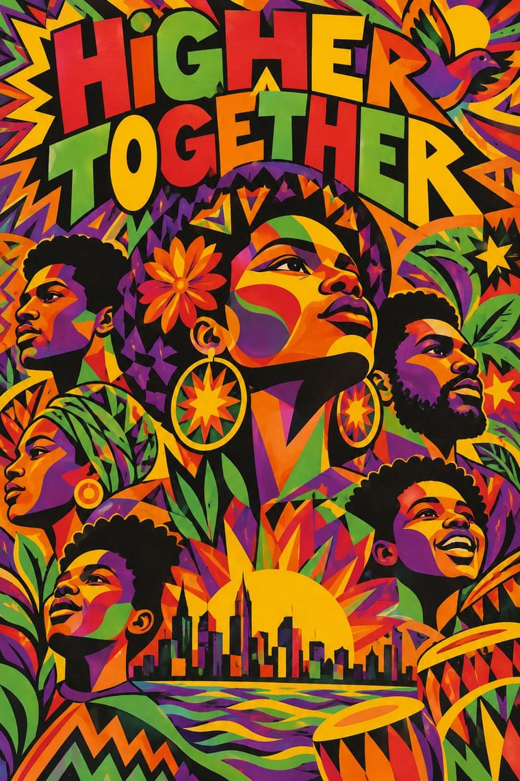
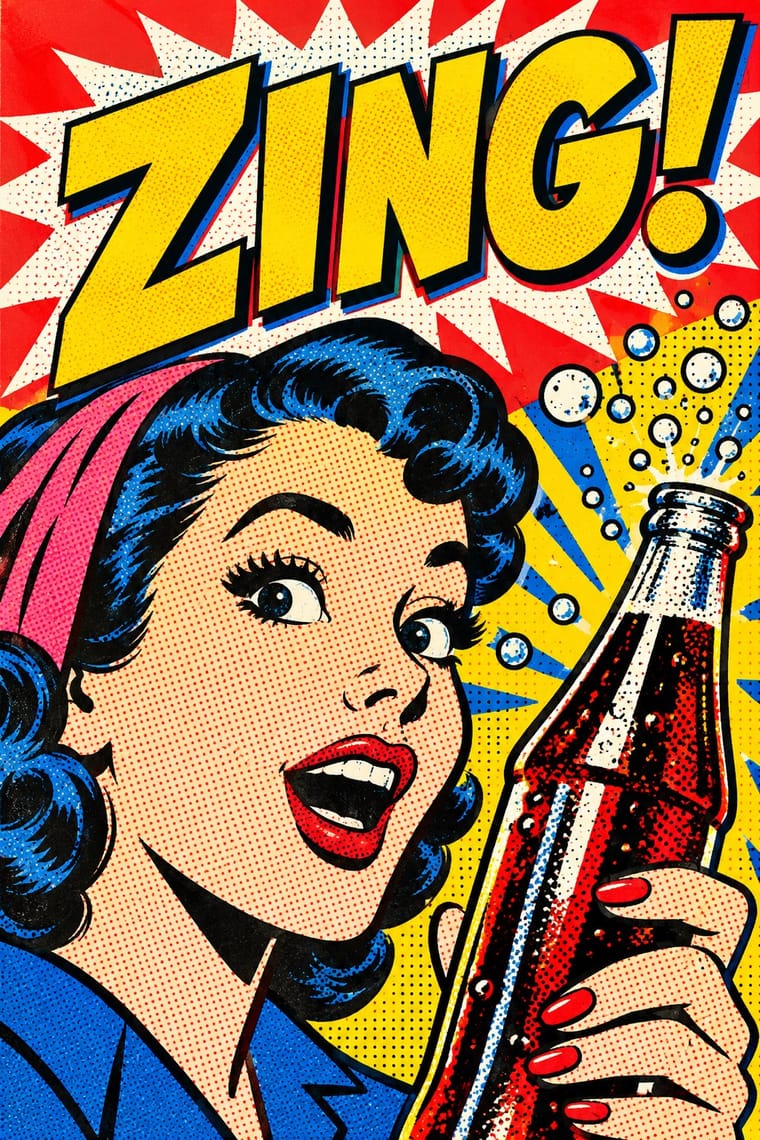
Pop used screenprint, bright colour and slogans with ironic distance from consumer culture; AfriCOBRA used the same tools for sincere, positive messages to Black viewers, so decide which voice the colour speaks in.
01
What each style brings
Each part of the design comes from the style with the stronger say in it, and each style gives at least two.
AfriCOBRA Pop Art Graphics
- Type from AfriCOBRA
- Colour from Pop Art Graphics
- Form from AfriCOBRA
- Composition from AfriCOBRA
- Surface from Pop Art Graphics
02
The type
Open fonts standing in for each style’s own type, which is often hand-drawn or commercial.
Display · AfriCOBRA
Ours
Londrina Solid; AfriCOBRA used Hand-drawn block capitals fractured into coloured shards behind the figures and Letter-built portraits
Text · Pop Art Graphics
Pop turned the commercial imagery of post-war consumer culture (comics, packaging, celebrity photographs and advertising) into both its subject and its method. Images are appropriated, enlarged, flattened and repeated; colour is bright and unmodulated; and the printing process itself, from Ben-Day dots to off-register silkscreen, is left visible as a sign of mass production.
Archivo; Pop Art Graphics used Comic-book hand lettering and Franklin Gothic
03
The colours
The ground and leading colours come from Pop Art Graphics, with a counter-accent from AfriCOBRA. The ink reads on the ground at 4.5:1 or more.
AfriCOBRA Pop Art Graphics
-
#fbf8f0ground · 36% -
#111111ink · 14% -
#ffd400accent · 18% -
#f7861caccent · 14% -
#e10600accent · 10% -
#e8202aaccent · 8%
As CSS
:root {
  --ground: #fbf8f0;
  --ink: #111111;
  --accent-1: #ffd400;
  --accent-2: #f7861c;
  --accent-3: #e10600;
  --accent-4: #e8202a;
  --font-display: "Londrina Solid", cursive;
  --font-text: "Archivo", sans-serif;
}
Use it with care
AfriCOBRA: AfriCOBRA is a self-defined Black aesthetic made by Black artists for Black communities; the collective still exists, its members and estates hold the copyrights, and the raised fist, the ankh, Yoruba orisha imagery and slogans like Nation Time carry political and spiritual meaning. Do not strip the Kool-Aid palette and letter-filled portraits into generic 'retro Black Power' branding: credit the artists, and commission Black artists for work addressed to Black audiences.
04
The two styles
05
More combinations
With AfriCOBRA
- Chicano Screenprint Poster Pairs well · Movement screenprints of the same years, made in and for their own communities: Chicano posters set one emblematic figure on flat colour, often parodying American packaging; AfriCOBRA packs the figure into a lettered, many-coloured field and stays sincere. Pair them, as both pair with the Panthers, for coalition work.
- Harlem Renaissance Graphic Art Pairs well · Aaron Douglas's flat silhouettes are an earlier Black self-portrait in print; set his stepped light and profiles beside AfriCOBRA's lettered colour to trace the line from the New Negro to Black Power.
- Psychedelic Poster Contrasts · Psychedelic lettering melts until it can barely be read; AfriCOBRA also fills figures and grounds with letters, but keeps the slogan legible because the message comes first.
- Afrofuturist Design Contrasts · Both picture Black people with pride in saturated colour, but Afrofuturism goes to cosmic futures in jewel tones on black space; AfriCOBRA stays in the present-day neighbourhood, in daylight Cool-ade colour, with the slogan written into the figure.
- Black Lives Matter Street Murals Pairs well · AfriCOBRA's letter-built portraits and Kool-Aid colours are a ready model for filling each giant capital with Black portraiture and pattern; credit the artists and commission Black painters for the letters.
With Pop Art Graphics
- International Typographic Style Contrasts · Set one loud appropriated Pop image inside a strict grid with a neutral grotesque so the irony reads as deliberate rather than chaotic.
- Ma & Wabi-sabi Aesthetics Contrasts · Where Pop multiplies glossy commodities, wabi-sabi values the single worn object; use one to puncture the mood of the other.
- Guna Mola Pairs well · Guna women redraw brand logos and cartoons (RCA Victor, Bullwinkle) in reverse appliqué; let that act of translation inspire Pop work, but buy or commission molas rather than imitating them.
- Neo-Brutalism Pairs well · Lift Pop's thick black outlines and flat primaries into UI cards and buttons for a confident, comic-strip interface.
- Risograph & Indie Print Culture Pairs well · Print Ben-Day dot screens in fluorescent pink and yellow riso inks to give Pop's mass-media imagery a small-run, handmade warmth.
- Screenprinted Gig & Alt-Movie Poster Pairs well · Shepard Fairey called Kozik 'the punk rock Warhol'; take Pop's appropriated cartoons and halftones and give them a gig poster's single idea and hand-lettered title.
- Finnish Bold Print (Marimekko Modernism) Pairs well · Contemporaries in saturated flat colour at a giant scale; borrow pop's isolated, enlarged object for a poster, but drop its halftone and irony to keep Marimekko's sincerity.
- Superflat Contrasts · Both turn commodities into art; take Pop's repetition and frontal commodity but swap its halftone and off-register silkscreen for Superflat's smooth vector fills and anime characters, so the print process disappears.