Style combination · Pairs well
AfriCOBRA × Harlem Renaissance Graphic Art
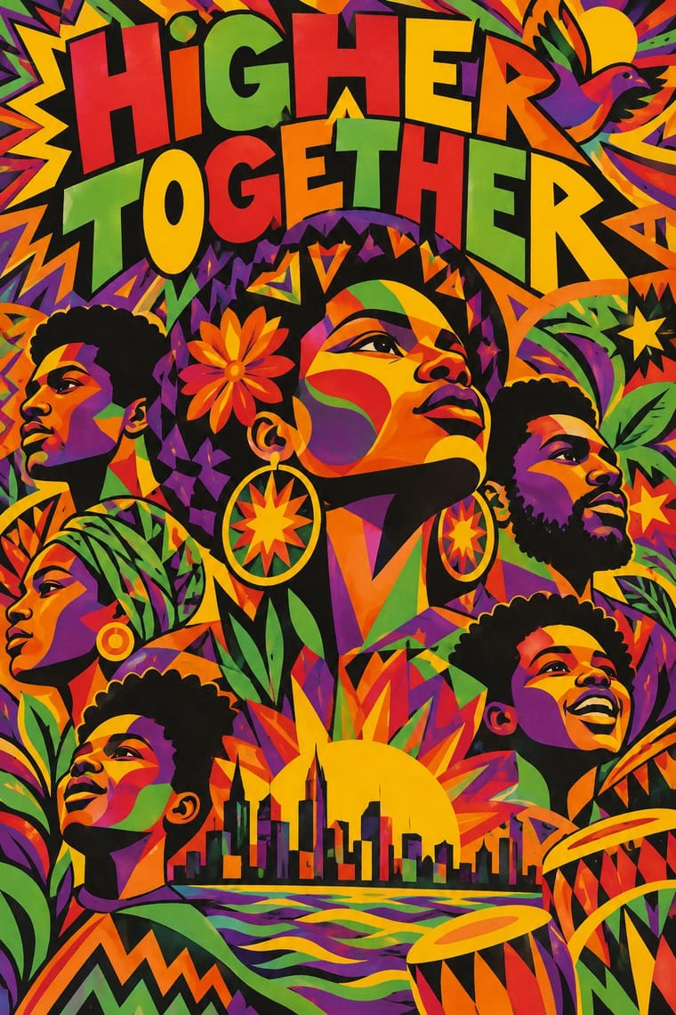
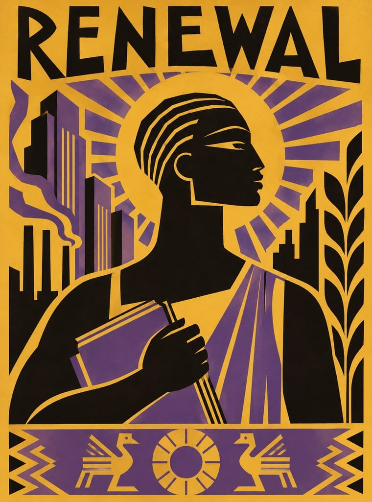
Aaron Douglas's flat silhouettes are an earlier Black self-portrait in print; set his stepped light and profiles beside AfriCOBRA's lettered colour to trace the line from the New Negro to Black Power.
Mix them and make something AfriCOBRA Harlem Renaissance Graphic Art
01
What each style brings
Each part of the design comes from the style with the stronger say in it, and each style gives at least two.
AfriCOBRA Harlem Renaissance Graphic Art
- Type from AfriCOBRA
- Colour from Harlem Renaissance Graphic Art
- Form from Harlem Renaissance Graphic Art
- Composition from AfriCOBRA
- Surface from AfriCOBRA
-
Harlem Renaissance Graphic Art avoids gloss & highlights: this is where the two pull against each other.
02
The type
Open fonts standing in for each style’s own type, which is often hand-drawn or commercial.
Display · AfriCOBRA
Together
Londrina Solid; AfriCOBRA used Hand-drawn block capitals fractured into coloured shards behind the figures and Letter-built portraits
Text · Harlem Renaissance Graphic Art
The illustration, cover and jacket art of the New Negro movement, set by Aaron Douglas after he moved to Harlem in 1925 and studied with Winold Reiss. Flat, hard-edged silhouettes of Black figures, with Egyptian-profile heads and mask-like eyes, stand among skyscrapers, palms, pyramids and radiating shafts of light. Art Deco geometry fuses with African sculpture to picture Black history, faith and modern urban life with dignity.
Jost; Harlem Renaissance Graphic Art used Aaron Douglas's hand-lettered Deco capitals on jackets and covers and C. B. Falls's gothic title lettering for God's Trombones
03
The colours
The ground and leading colours come from Harlem Renaissance Graphic Art, with a counter-accent from AfriCOBRA. The ink reads on the ground at 4.5:1 or more.
AfriCOBRA Harlem Renaissance Graphic Art
-
#efe5cfground · 36% -
#161210ink · 14% -
#e3782baccent · 18% -
#d6b44aaccent · 14% -
#e8202aaccent · 10% -
#e9a3adaccent · 8%
As CSS
:root {
  --ground: #efe5cf;
  --ink: #161210;
  --accent-1: #e3782b;
  --accent-2: #d6b44a;
  --accent-3: #e8202a;
  --accent-4: #e9a3ad;
  --font-display: "Londrina Solid", cursive;
  --font-text: "Jost", sans-serif;
}
Use it with care
AfriCOBRA: AfriCOBRA is a self-defined Black aesthetic made by Black artists for Black communities; the collective still exists, its members and estates hold the copyrights, and the raised fist, the ankh, Yoruba orisha imagery and slogans like Nation Time carry political and spiritual meaning. Do not strip the Kool-Aid palette and letter-filled portraits into generic 'retro Black Power' branding: credit the artists, and commission Black artists for work addressed to Black audiences.
Harlem Renaissance Graphic Art: Douglas built this idiom so that Black artists could picture Black history against minstrel caricature and white primitivist fantasy. Lifted as generic Jazz Age or 'tribal' decoration, the Egyptian profiles, mask-like eyes and black silhouettes can slide back into the stereotypes it answered, so use it to tell Black stories with Black artists and writers, and credit Douglas and the magazines (The Crisis, Opportunity) whose images you draw on.
04
The two styles
05
More combinations
With AfriCOBRA
- Chicano Screenprint Poster Pairs well · Movement screenprints of the same years, made in and for their own communities: Chicano posters set one emblematic figure on flat colour, often parodying American packaging; AfriCOBRA packs the figure into a lettered, many-coloured field and stays sincere. Pair them, as both pair with the Panthers, for coalition work.
- Pop Art Graphics Contrasts · Pop used screenprint, bright colour and slogans with ironic distance from consumer culture; AfriCOBRA used the same tools for sincere, positive messages to Black viewers, so decide which voice the colour speaks in.
- Psychedelic Poster Contrasts · Psychedelic lettering melts until it can barely be read; AfriCOBRA also fills figures and grounds with letters, but keeps the slogan legible because the message comes first.
- Afrofuturist Design Contrasts · Both picture Black people with pride in saturated colour, but Afrofuturism goes to cosmic futures in jewel tones on black space; AfriCOBRA stays in the present-day neighbourhood, in daylight Cool-ade colour, with the slogan written into the figure.
- Black Lives Matter Street Murals Pairs well · AfriCOBRA's letter-built portraits and Kool-Aid colours are a ready model for filling each giant capital with Black portraiture and pattern; credit the artists and commission Black painters for the letters.
With Harlem Renaissance Graphic Art
- Corporate Memphis Contrasts · Both flatten the human figure, but Douglas's silhouettes are specific and historical where corporate Memphis is generic; study the difference before drawing people flat.
- WPA Silkscreen Posters Pairs well · Douglas's 1934 murals were New Deal commissions; pair his silhouettes with WPA screenprint layouts for civic, narrative posters.
- Afrofuturist Design Pairs well · Carry Douglas's Egyptian profiles and radiating light into a jewel-dark cosmos for a Black futurism that knows its own lineage.
- Bezalel School Pairs well · Both built a graphic language for a people's cultural renewal from ancestral ornament and biblical subjects in the 1920s; combine Bezalel's gilded frames with Aaron Douglas's flat silhouettes.
- Woodland School (Legend Painting) Contrasts · Both set flat, stylised figures to spiritual and communal ends, but Aaron Douglas's Harlem graphics print hard-edged silhouettes in one to three flat colours, stepping their tone where concentric rings of light cross them among Deco angles, while Woodland painting closes many bright colours inside a continuous black contour and opens each body in x-ray.