Style combination · Contrasts
AfriCOBRA × Psychedelic Poster
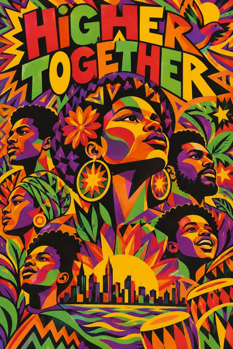
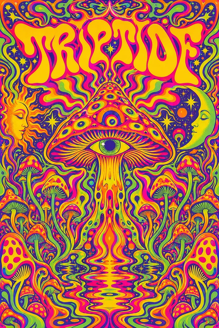
Psychedelic lettering melts until it can barely be read; AfriCOBRA also fills figures and grounds with letters, but keeps the slogan legible because the message comes first.
01
What each style brings
Each part of the design comes from the style with the stronger say in it, and each style gives at least two.
AfriCOBRA Psychedelic Poster
- Type from Psychedelic Poster
- Colour from AfriCOBRA
- Form from Psychedelic Poster
- Composition from AfriCOBRA
- Surface from AfriCOBRA
02
The type
Open fonts standing in for each style’s own type, which is often hand-drawn or commercial.
Text · AfriCOBRA
The Black Arts Movement collective founded in Chicago in 1968 by Jeff Donaldson, Wadsworth and Jae Jarrell, Barbara Jones-Hogu and Gerald Williams, after OBAC's Wall of Respect mural. Its principles call for free symmetry, 'mimesis at mid-point', visibility, 'shine' and 'Cool-ade' colour. Paintings and screenprints pack the surface with bright, high-keyed hues set edge to edge and stylised Black figures, with slogans such as UNITE or Black is Beautiful drawn into faces, hair and ground. Editions (100 of Unite, 300 of Jarrell's Revolutionary) carried it to Black viewers without art training.
Archivo; AfriCOBRA used Hand-drawn block capitals fractured into coloured shards behind the figures and Letter-built portraits
03
The colours
The ground and leading colours come from AfriCOBRA, with a counter-accent from Psychedelic Poster. The ink reads on the ground at 4.5:1 or more.
AfriCOBRA Psychedelic Poster
-
#ffd400ground · 36% -
#151311ink · 14% -
#f7861caccent · 18% -
#e8202aaccent · 14% -
#e4007caccent · 10% -
#5fbf3aaccent · 8%
As CSS
:root {
  --ground: #ffd400;
  --ink: #151311;
  --accent-1: #f7861c;
  --accent-2: #e8202a;
  --accent-3: #e4007c;
  --accent-4: #5fbf3a;
  --font-display: "Federant", sans-serif;
  --font-text: "Archivo", sans-serif;
}
Use it with care
AfriCOBRA: AfriCOBRA is a self-defined Black aesthetic made by Black artists for Black communities; the collective still exists, its members and estates hold the copyrights, and the raised fist, the ankh, Yoruba orisha imagery and slogans like Nation Time carry political and spiritual meaning. Do not strip the Kool-Aid palette and letter-filled portraits into generic 'retro Black Power' branding: credit the artists, and commission Black artists for work addressed to Black audiences.
04
The two styles
05
More combinations
With AfriCOBRA
- Chicano Screenprint Poster Pairs well · Movement screenprints of the same years, made in and for their own communities: Chicano posters set one emblematic figure on flat colour, often parodying American packaging; AfriCOBRA packs the figure into a lettered, many-coloured field and stays sincere. Pair them, as both pair with the Panthers, for coalition work.
- Pop Art Graphics Contrasts · Pop used screenprint, bright colour and slogans with ironic distance from consumer culture; AfriCOBRA used the same tools for sincere, positive messages to Black viewers, so decide which voice the colour speaks in.
- Harlem Renaissance Graphic Art Pairs well · Aaron Douglas's flat silhouettes are an earlier Black self-portrait in print; set his stepped light and profiles beside AfriCOBRA's lettered colour to trace the line from the New Negro to Black Power.
- Afrofuturist Design Contrasts · Both picture Black people with pride in saturated colour, but Afrofuturism goes to cosmic futures in jewel tones on black space; AfriCOBRA stays in the present-day neighbourhood, in daylight Cool-ade colour, with the slogan written into the figure.
- Black Lives Matter Street Murals Pairs well · AfriCOBRA's letter-built portraits and Kool-Aid colours are a ready model for filling each giant capital with Black portraiture and pattern; credit the artists and commission Black painters for the letters.
With Psychedelic Poster
- Rave & Acid House Graphics Pairs well · Carry the vibrating fluorescent palette into rave-style chrome and airbrush to signal the 1960s-to-1990s lineage on purpose.
- Angura Theatre Poster Pairs well · Tokyo's angura theatre posters met psychedelia halfway; swap Art Nouveau curls for collaged Japanese ephemera and ukiyo-e waves while keeping the fluorescent silkscreen inks.
- Minimalist Graphic Design Contrasts · Set a single dense psychedelic panel in a field of white space for maximum shock and a clear focal point.
- Art Nouveau Pairs well · Borrow Art Nouveau's framing borders and flowing hair, then push the colour to fluorescent clash for an instant 1967 look.
- International Typographic Style Contrasts · Its exact opposite on legibility; one melting, shape-filling word can loosen an otherwise rigid Swiss layout.
- Hand-Painted Bollywood Poster Pairs well · 1970s Hindi film titles already flirted with psychedelic lettering; fuse the two for swirling, glowing title logos.
- Screenprinted Gig & Alt-Movie Poster Pairs well · The 1960s Fillmore and Avalon posters are its ancestor; borrow one swelling, shape-filling title from them, but keep the band, date and venue line readable.
- Underground Comix Pairs well · Take the cover from the ballroom poster, with its clashing flat inks and melting letters, and keep the hatched black-and-white panels inside, as Zap did with Moscoso and Griffin.